Before we look at the weekend charts I would like to quickly go over our three portfolios as some of you think I maybe not be managing the risk portion correctly. As you know, we have three portfolios made up of three different types of stocks. The Junior Portfolio is for the small cap Precious Metal (PM) stocks. The Model Portfolio is made up of the bigger cap stocks that can be precious metals stocks or stock market stocks or ETFs. The Kamikaze Portfolio is the speculative portion of the three portfolios , in which we generally trade the 3 X ETFs.
Right now the Junior Portfolio is 100% cash waiting to be invested when the time is right. If you recall, we caught part of the December to the March rally where we were 100% invested. After the March top we went to 100% cash with a small profit.
The Model Portfolio has one small position in the Direxion Daily Small Cap Bear 3X Shares ETF (ARCA:TZA) that represents less the 10% invested. Again this portfolio was 100% invested up into the March high where we went to 100% cash.
The Kamikaze Portfolio is the speculative area of the three portfolios as it can move very fast in either direction. As it’s the speculative area of the three portfolios this is where we have been trading until we get a better feel of when the next impulse move is getting ready to get underway. The Kamikaze Portfolio is worth roughly $358,460 ( up from the initial $100,000 in August 2012) Presently $143,870 is invested, which is well below 50%. There is still a large cash position that we can use when the time is right to either do a little hedging or add to our existing short positions if that is the case.
I just wanted to bring this to your attention so you know we have a very large cash position just sitting on the sideline waiting for the right opportunity to be deployed. The Junior Portfolio and the Model Portfolio are basically in cash with the Kamikaze Portfolio only about 40% or so invested. I don’t know what your idea of risk management is, but I think our current situation represents a pretty conservative approach. Each portfolio is equally important to me but it’s just that the time is not quite right to get fully invested like we were in the December to March rally that petered out and left those long holding the bag with lower price for the most part.
Everyone has their own risk tolerance . Only you can decide for yourself what is right for you. You may want to structure your portfolio differently than how I’ve structured mine. You may only want to trade the more conservative Model Portfolio with a small blend of Juniors and Kamikaze stocks. You may only want to trade the Model Portfolio using a few juniors as the speculative part of your overall portfolio. You should definitely take some time to structure your portfolio so that it matches your personality and then have the discipline to manage it properly. You are ultimately responsible for what you buy and sell based on how you structure your own portfolio. This will help you down the road when you are on your own one day , armed with a Bachelors Degree in Chartology.
.
Let's now look at some charts related to our current short positions in the precious metals complex.
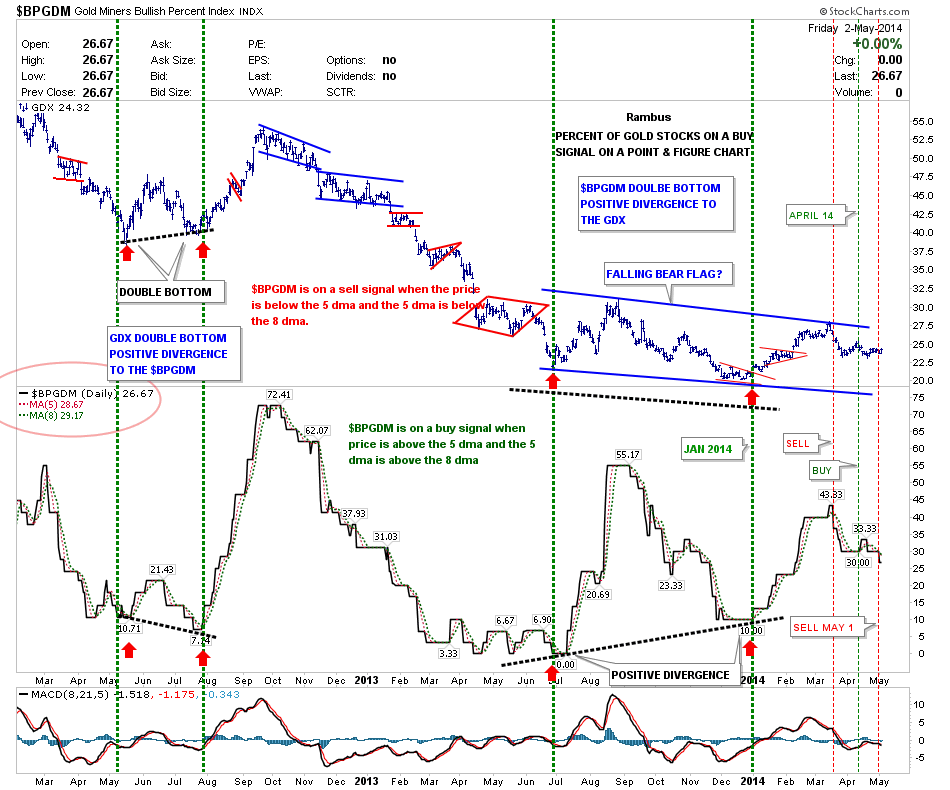
The Gold Miners Bullish Percent Index (BPGDM) gave a sell signal on May 1st that is still in play even after Friday’s rally. This indicator can go through some whipsaws so I only use it as part of the bigger, overall picture.
What About Gold?
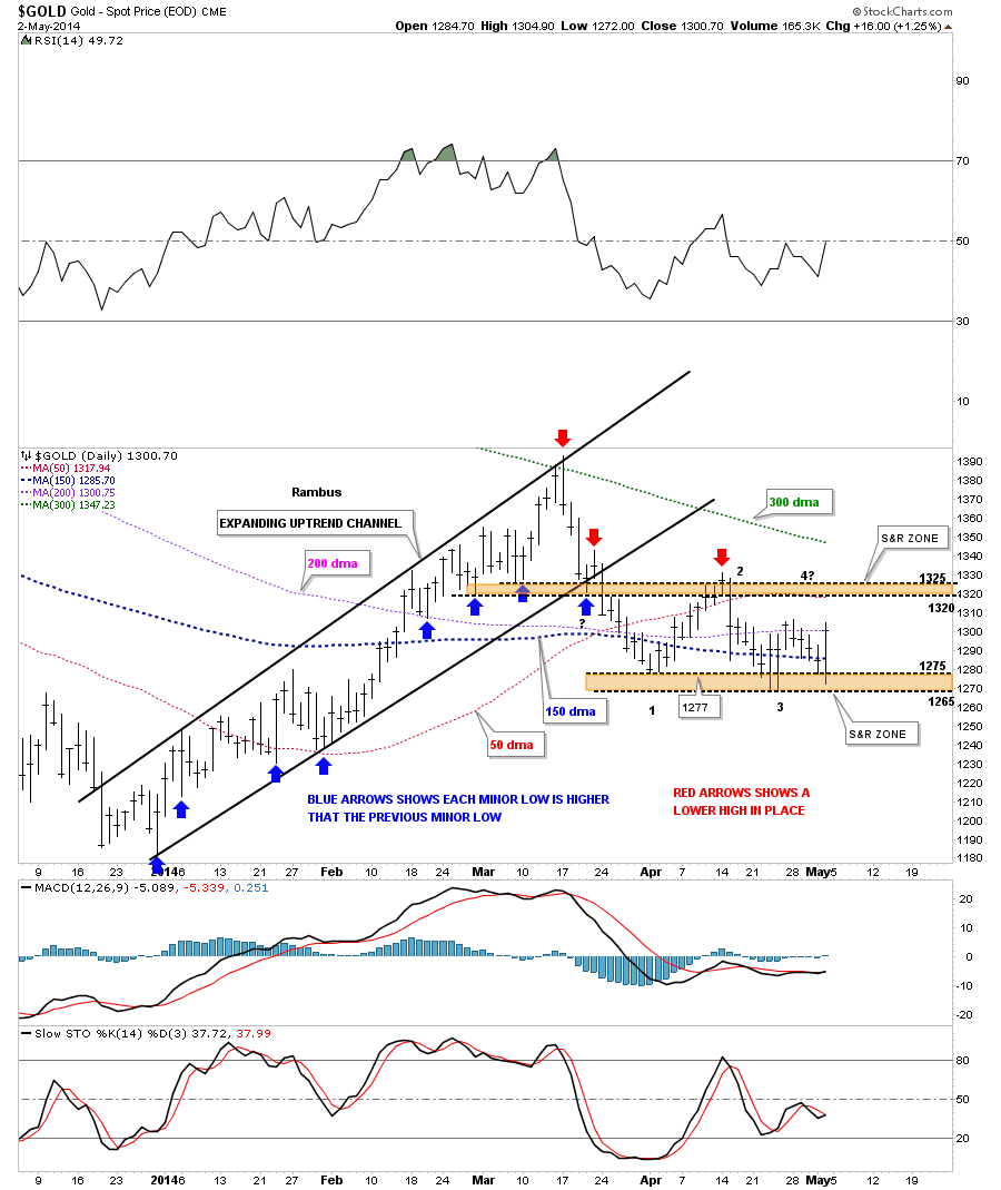
Below is the daily Gold chart we’ve been following that shows what simple uptrends and downtrends tend to look like. The uptrend that started at the December low shows each short term low was higher than the previous short term low, blue arrows. This is a classic uptrend.
On the right side of chart you can see how the red arrows have been showing the way lower with lower highs in place. Gold has attempted to put in a lower low at the brown shaded support and resistance zone but has failed to break through so far. This is setting up a horizontal trading range between the two brown shaded support and resistance zones with $1325 at the top and $1265 at the bottom.
A move to the top of the trading range around the $1325 area that stalls out could be the beginning of the 4th reversal point in a rectangle type of trading range. As you can see, the price action is ping ponging pretty fast between the top and bottom support and resistance zones. Also, this trading range is forming below the previous high which increases the likelihood that the price action will break lower when the trading range is finished building out.
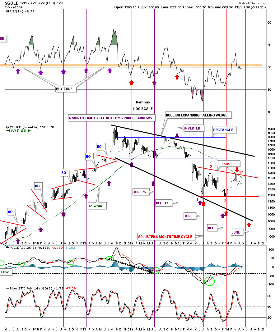
Now I would like to draw to your attention a six month time cycle bottoms chart that has been doing a pretty good job of showing us when to look for a reversal of some duration. It really nailed the bottoms when gold went on its parabolic run after the 2008 crash low to its bull market high at $1920. There was one inverted bottom that turned out to be a high in 2012, but since then it has been working pretty well for calling for a low.
I’ve tweaked it just a tad since the June low last year as it seems to be coming in several weeks early, (red 6 month time cycles). Keep in mind, this doesn’t give us a price objective, only a time objective where we can expect a counter trend move to begin. Right now the red 6 month time cycle bottom comes into play in the last week of June. Again we don’t know where the price will be, only to expect a low. A perfect setup would be to see gold fall over the next two months which would coincide with the late June, six month time cycle low. That, of course, would be in a perfect world.
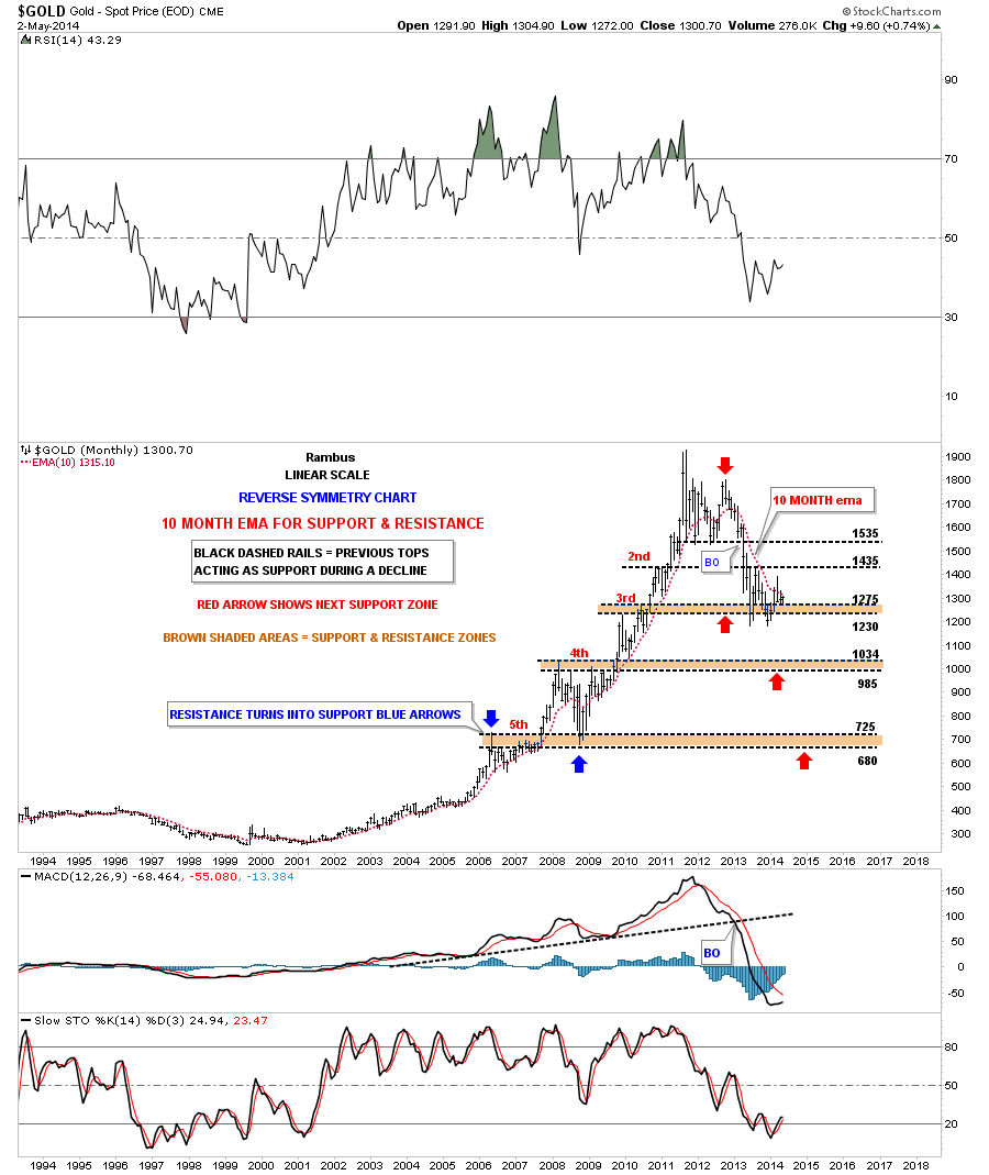
This next chart is a long term monthly chart that I call my reverse symmetry chart, using the 10 month ema. The brown shaded areas show how the previous highs—made during the bull market run—should now act as initial support in a bear market. As you can see, the initial collapse took the price action all the way down to the 3rd brown shaded support zone which has held support since the June low last year. You can also see how gold spiked above the 10 month ema last month but closed back below the 10 month ema by month's end.
Right now the 10 month ema comes in at $1315. If gold eventually breaks below the 3rd brown shaded support zone, the next area of support will be the $985 to the $1054 area, 4th brown shaded support zone.
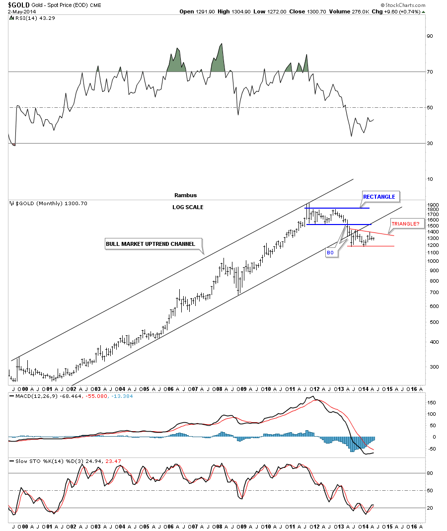
One last chart for gold that shows the bull market uptrend-channel that was broken to the downside last June in the breakout move out of the blue 22 month rectangle. Also notice the backtest to the bottom black rail of the uptrend-channel when the PM complex had that small counter-trend rally off of the June low to the August high. So far, since gold topped out in September of 2011, it has made a series of lower highs regardless of all the reasons it has bottomed or should be rallying. The first real clue that the trend has changed will be when gold can put in a higher low and a higher high, until then it is what it is.
Turning our Attention to Silver, Gold’s Little Unstable Brother (Affectionately known to some members at the Chartology Forum as Bob)
What about Silver?
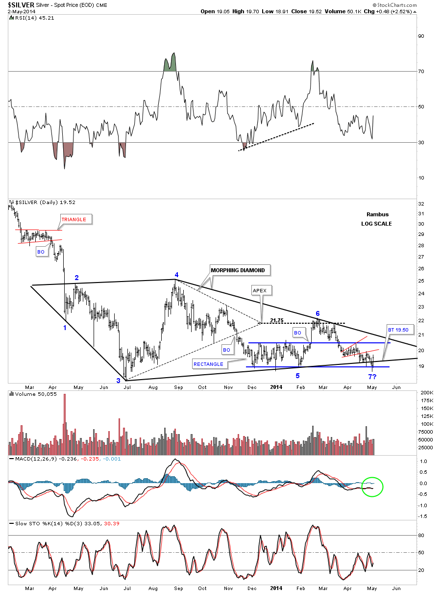
The daily chart for silver shows the price action over the last year or so that contains the original Diamond that morphed into a bigger diamond which now has completed the required even number of reversal points, creating a consolidation pattern to the downside. The only problem now is that silver can now rally back up to the top rail creating a 7th reversal point. If the price action breaks above the top rail of the Diamond or triangle it would then be a reversal pattern to the upside.
That is only speculation at this time as we have 6 reversal points completed and that is what we have to go on until something changes. As you can see, the apex of the smaller, internal-dashed Diamond did hold resistance during the breakout from the blue rectangle.
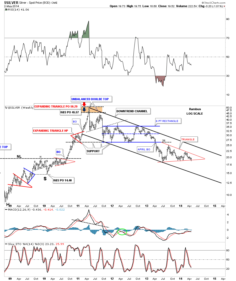
This next chart for silver shows its downtrend channel that has been in place for three years now. There is no law that says silver can’t have a 5th and 6th reversal point similar to the 6 point, 22 month rectangle that formed just above the red triangle. Again, all we know for sure is that silver penetrated the bottom red rail last week but rallied back inside the red triangle, negating the breakout for the time being.
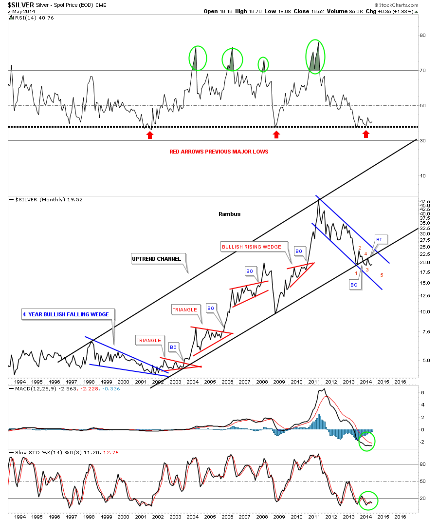
This last chart for silver is a long term monthly line chart that shows an interesting setup. Note the long term uptrend channel that peaked out in April of 2011. You can see the blue downtrend channel that has been in affect since that all-time high.
Note the bottom rail of the major uptrend channel and the price action since the low made last June. I have shown you in the past how a breakout can take on 5 separate moves before it’s completed. First you have the initial hit of the bottom rail, point 1. Next you get a bounce that doesn’t carry too far above the bottom rail, point 2. Next you have the sharp decline that actually breaks the bottom rail, point 3. Then you have the small, counter-trend rally back to the underside of the bottom rail of the uptrend channel, point 4, the backtest. Then you have point 5 which completes the breakout process and is the beginning of the next impulse move lower. So far this is what we are seeing in the big picture.
I would like to wrap up this Report by looking at some Direxion Daily Junior Gold Miners Index Bear 3x Shares ETF (JDST) charts.
What About the Juniors?
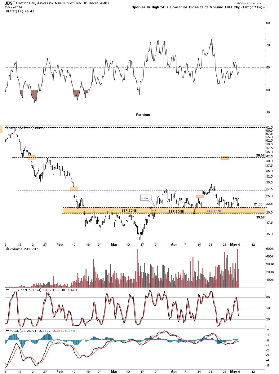
The first chart is a 2 hour bar chart that shows the brown shaded support and resistance zones that have held support since they was broken to the upside in March. As you can see, the topside has been severely tested many times since but so far it's held. So far so good for JDSTers .
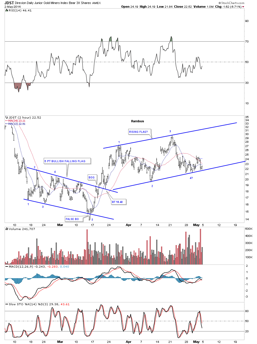
Below is another 2 hour chart that shows JDST has been in an uptrend channel, or rising flag, after breaking out from the blue, 5 point, bullish falling flag that reversed its downtrend from the December high. As you can see, the price action has been bouncing along the bottom blue rail of the potential rising flag formation for over a week or so. So far noting is broken yet. That could change today with a breakout gap to the downside. However, at the close of trading on Friday it was still making higher lows and higher highs which is an uptrend.
This last chart for JDST shows a strongly slanted, inverse H&S bottom that is still in play even though the price action has been backtesting the neckline for close to three weeks now. This kind of price action is what wears out most investors because it tries their patience.
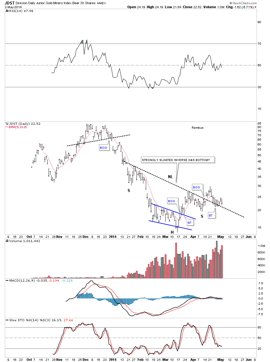
I just want you to understand that I feel your frustration when a stock trades in a very tight trading range where one day it’s up a lot the next day down a lot, and so forth until it eventually wears you out. You have to deal with false breakouts from time time as well.
Welcome to the world of speculating in the markets where nothing is 100% certain. It’s just the nature of the beast to fool as many folks as possible, and on every time scale. I wish there was something I could tell you to make it feel better but every day is a new day with a new set of challenges that weren’t there previously. So stay strong and manage your risk to the best of your ability until things finally come together to produce an impulse move where the real money will be made.