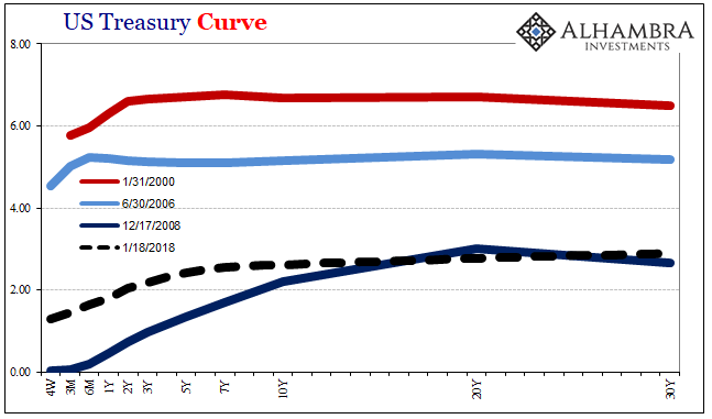
There’s nothing especially special about 2.62%. It’s a level pretty much like any other, given significance by only one phrase: the highest since 2014. It sounds impressive, which is the point. But that only lasts until you remember the same thing was said not all that long ago.
Back last March, the 10-year yield had then, like now, broke above 2.60%. In doing so, it surpassed the previous recent high set in December 2016. So, on March 13, 2017, the media was filled with stories about the benchmark treasury yield being the “highest since 2014.” That break above the December peak didn’t signal anything other than a break above that prior peak. There was no magic in 2.62%.
This doesn’t mean that yields won’t go higher. They can and they might. But we should be aware of what is likely driving them that way – for now. To get a better sense of what’s going on, reviewing the last “rate hike” cycle in the middle 2000’s is very instructive.
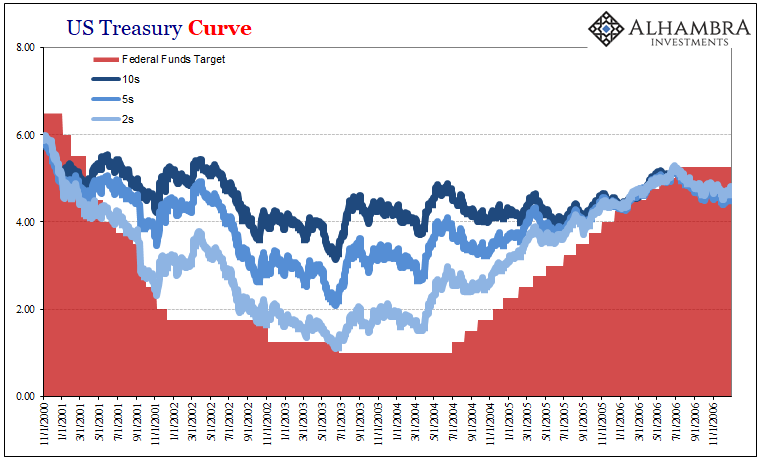
What immediately stands out on the chart above for me is that no matter what the Fed did, and by extension how the short and intermediate parts of the yield curve traded in relation to that, the long bond (for most of the time the 10s were it; the 30s disappeared in 2002 to come back later in 2006) by and large remained steady the whole time. There were, of course, variations, but for the most part the 10s ended up where they started.
That meant the yield curve steepened dramatically as the FOMC voted the federal funds target lower in 2000, and then flattened as all that was reversed. In 17 successive “rate hikes” between June 2004 and June 2006, the federal funds target was increased from 1.00% all the way to 5.25%.
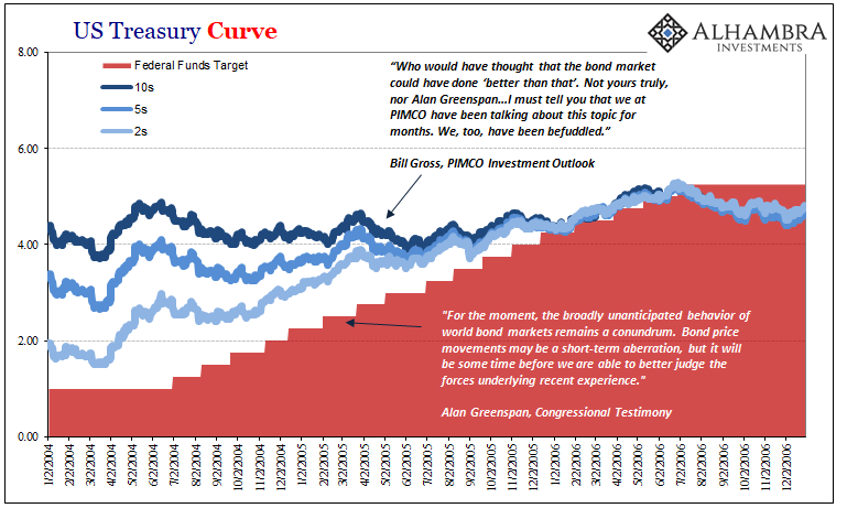
The 10-year was, of course, mostly unmoved for most of the time, leading Alan Greenspan to utter his “conundrum” to Congress in 2005.
Notice, however, toward the end of the monetary policy cycle during the first half of 2006:
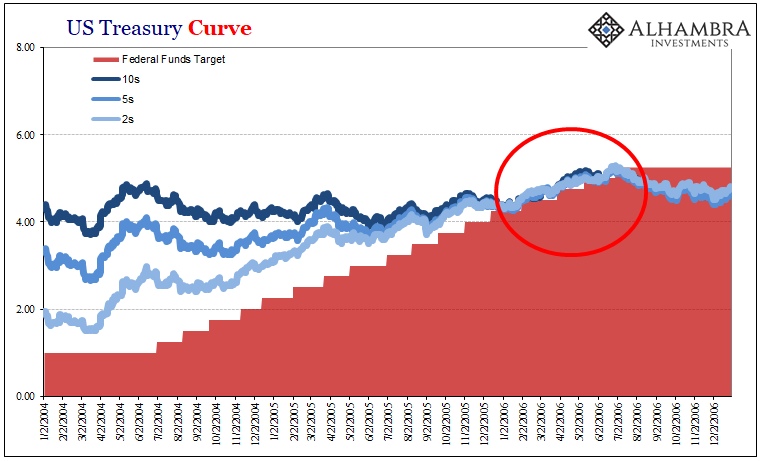
As the yield curve collapsed because of the Fed’s constant actions, eventually all the treasury rates simply compressed into one big, tangled mess. With the 2s indistinguishable from the 5s or the 10s, they all rose in tandem with monetary policy for a period of nearly 6 months.
By the end of those six months, just as some really bad stuff started to go down in the housing market, the 10s had been pushed from around 4.40% to as high as 5.25%. It was some BOND ROUT!!!, leaving the benchmark yield at its highest since 2002.
During that time, however, what the curve was trying to note for anyone not ideologically wedded to the maestro, was that Greenspan’s final policy action was incredibly discordant. His “conundrum” was nothing more than the long end of the treasury curve disagreeing with his economic assessments, particularly those related to where economic (and ultimately liquidity) risks really resided (far more downside than upside). It didn’t matter that long yields had been pushed toward the end to the highest in years, what did was why the curve was flattening where it was at that time.
That’s why it stopped rather than more gently resumed a normal shape closer to where it had closed out the nineties – as conventional wisdom and consensus expectations saw it.
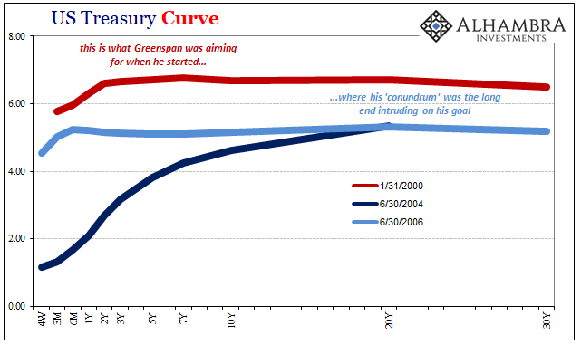
Why did the Fed ultimately stop at 5.25% fed funds? They were several additional “rate hikes” short of pre-dot-com levels. Yet, when long and short treasury rates equalized, they knew they were pressing into inversion.
Ultimately, that’s what happened; the housing bubble finally started to crack, meaning investors flooded into the long end even though short rates were marginally, then significantly, higher. That upside down pattern all but finished the monetary policy cycle for the Fed, leaving the FOMC to wonder and worry about both the housing market as well as what the treasury curve was projecting from it.
In what is the least surprising development in the bond market, we are right back into another “conundrum.” The chart below of the last ten or so years is remarkably similar to the one above showing the prior monetary policy cycle. The resemblances to 2006 are several and important, leaving, however, that one huge difference.
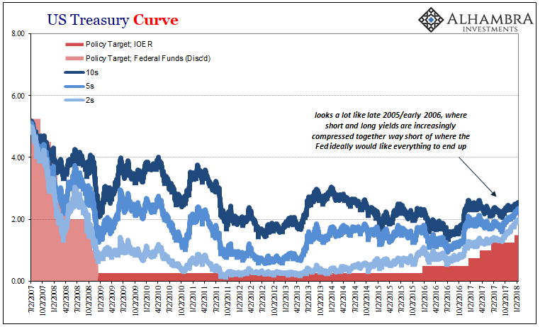
The Fed is now encountering long end resistance in its “rate hikes” far, far less in nominal terms than it did ten years before. They are pushing up short rates into what’s really a much lower ceiling. This is profound, and a challenge FOMC officials are well-aware could derail their efforts (though they have had to come up with increasingly convoluted and often ridiculous reasons for it). The long end is once more confronting the Fed’s assumptions behinds its “rate hikes” this time at less than 3%, which translates into an economic growth paradigm unchanged from 2008 when all that emergency monetary experimentation really began.
That doesn’t mean the 10s or 30s won’t move. They do, and did. What it really means is that there isn’t a meaningful difference where the yield curve flattens at 2.50%, 2.62%, or perhaps even as much as 3.00% on the 10s. At some point, unless something in the monetary system really does change, Jerome Powell (I’m assuming) is going to find himself with dots well above the long end.
Contrary to popular opinion, the Fed does not control the UST market. It has more influence at the short end but only as a matter of mechanics (money substitutes and alternatives). At the long end, interpretation and outlook drive nominal levels and the curve shape even if, especially if, it deviates substantially from the central bank’s.
