While commodities have not been exploding higher this year, they have recently begun to outshine Treasury’s.
Major Pockets
When looking at the larger picture of the market cycle, we can compare the three major pockets – stocks, bonds and commodities. As John Murphy has written in Trading with Intermarket Analysis and Intermarket Analysis, we normally see Treasury prices fall first, followed by equities and then commodities at the end of a business cycle.
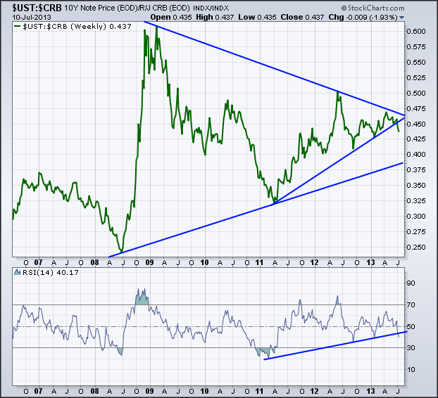
While I’m not calling for the end of a business cycle or for bonds to fall flat on their face, there has been a breakdown in the relationship between 10-year Treasury’s (ZN_F) and commodities (CRB). Below you can see the weekly chart of the ratio between the 10-year and the commodities index. It’s been putting in higher lows since mid-2008 as Treasury’s outperform their commodity brethren.
Broken Trend Line
We are still above the long-term trend line connecting the 2008 and 2011 lows, however we are breaking the short-term trend line off the 2011 and the recent 2013 lows. The trend in the Relative Strength Index has also been broken as Treasury’s momentum against commodities weakens.
Going forward I’ll be watching to see if commodities dig their feet in to continue to outpace bonds and if RSI is unable to regain the 50 level. If we continue to see yields rise and thus prices fall then we could be signaling the first step to the end of the current cycle as mentioned above. However it’s still early in the ball game to make that type of assumption but that does appear to be what the charts are starting to hint at -- we’ll see how it plays out in the coming months.
- English (UK)
- English (India)
- English (Canada)
- English (Australia)
- English (South Africa)
- English (Philippines)
- English (Nigeria)
- Deutsch
- Español (España)
- Español (México)
- Français
- Italiano
- Nederlands
- Português (Portugal)
- Polski
- Português (Brasil)
- Русский
- Türkçe
- العربية
- Ελληνικά
- Svenska
- Suomi
- עברית
- 日本語
- 한국어
- 简体中文
- 繁體中文
- Bahasa Indonesia
- Bahasa Melayu
- ไทย
- Tiếng Việt
- हिंदी
What's Driving Treasury’s Breakdown Against Commodities?
Published 07/11/2013, 12:11 PM
Updated 07/09/2023, 06:31 AM
What's Driving Treasury’s Breakdown Against Commodities?
Latest comments
Loading next article…
Install Our App
Risk Disclosure: Trading in financial instruments and/or cryptocurrencies involves high risks including the risk of losing some, or all, of your investment amount, and may not be suitable for all investors. Prices of cryptocurrencies are extremely volatile and may be affected by external factors such as financial, regulatory or political events. Trading on margin increases the financial risks.
Before deciding to trade in financial instrument or cryptocurrencies you should be fully informed of the risks and costs associated with trading the financial markets, carefully consider your investment objectives, level of experience, and risk appetite, and seek professional advice where needed.
Fusion Media would like to remind you that the data contained in this website is not necessarily real-time nor accurate. The data and prices on the website are not necessarily provided by any market or exchange, but may be provided by market makers, and so prices may not be accurate and may differ from the actual price at any given market, meaning prices are indicative and not appropriate for trading purposes. Fusion Media and any provider of the data contained in this website will not accept liability for any loss or damage as a result of your trading, or your reliance on the information contained within this website.
It is prohibited to use, store, reproduce, display, modify, transmit or distribute the data contained in this website without the explicit prior written permission of Fusion Media and/or the data provider. All intellectual property rights are reserved by the providers and/or the exchange providing the data contained in this website.
Fusion Media may be compensated by the advertisers that appear on the website, based on your interaction with the advertisements or advertisers.
© 2007-2025 - Fusion Media Limited. All Rights Reserved.
