I hope everyone had a good weekend. With today being President’s Day, we have a shortened trading week with U.S. markets being closed today. It was nice to see the equities move back to the green last week, with the S&P 500 (SPX) finishing up a little over 2% and small caps (IWM) up nearly 3%. I’ve decided to add a new ‘section’ to this weekly post, focusing on one specific sector. This week I’ll be taking a look at the tech sector and digging into its daily chart.
Equity Trend
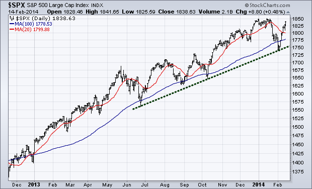
You’ll notice I’ve re-drawn the trend line that we’ve been monitoring since I started writing the Weekly Technical Market Outlook. Previously we had been using a trend line that began at the start of 2013. However, with the bout of weakness we had to kick off 2014 I feel an adjustment needed to be made to better reflect recent price action; so I’ve redrawn the green dotted trend line to connect the June ’13, October ’13, and February ’14 lows.
Last week’s strength pushed the S&P 500 back above its 100-day and 20-day moving averages and got withinin spitting distance of a new all-time high.
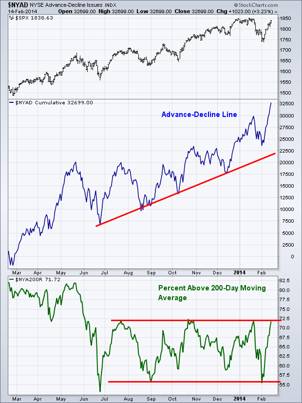
During the recent dip in equity markets I noted that the Advance-Decline Line was not reflecting the selling pressure that had taken over the airwaves of major financial networks. This was one of the first potential clues we got that the it may just be a short-lived drop and not the beginning of something more protracted. Well with stocks rallying back near new highs, the Advance-Decline Line has already broken above its January high – a positive sign for equity bulls.
Turning the focus to the Percentage of Stocks Trading Above Their 200-day Moving Averages, this measure of market breadth has broken out of the triangle we’ve previously discussed; and as of Friday is now in a range between 72.5% and 55%. If buyers remain in control, then we’ll likely break out to the upside as more stocks retake their 200-day moving averages. While this measure is still not confirming the price action in the S&P, at this point, breadth continues to favor the bulls.
Equity Momentum
This chart of momentum for the S&P 500 (SPX) is what worries me most about the current up trend. In August and November of last year many technicians, myself included, showed concern for the divergences in the Relative Strength Index (RSI) as price headed higher and this measure of momentum refused to confirm. After both instances we saw price continue higher, as trader’s appetite for stocks refused to shown concern for weakening momentum.
Well now once again as the S&P approaches new highs, we will likely have another negative divergence in the RSI indicator. The one note to make here is that this divergence is more pronounced on the daily chart than the previously mentioned ones last year.
If we were to zoom out and look at the weekly chart (not shown), we can see a negative divergence is also developing within momentum there as well. During the current bull market, we’ve seen this lead to varying lengths and severity of corrections – the 2011 drop, as well as the two corrections in 2012. We’ll see if traders continue to beat the drum to the 2013 theme song or if we see a repeat of 2011 and 2012 with prices confirming the bearish tone in the Relative Strength Index. 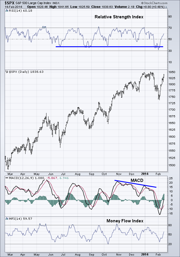
Sector Spotlight – Technology
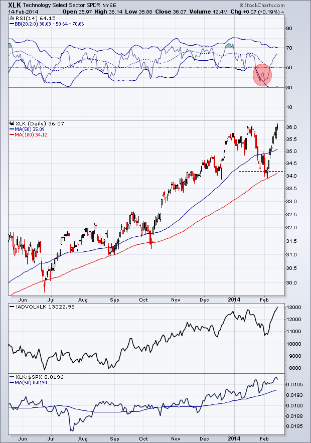
As I mentioned in earlier, I’m adding a new ‘section’ of the Technical Market Outlook to focus on a specific S&P sector. This week I want to discuss the Technology sector (XLK). The chart setup may look a little different from what I normally discuss on the blog, so bear with me as I discuss whats being shown. In her book, Technical Analysis for the Trading Professional, Constance Brown discusses using Bollinger Bands® around the RSI indicator as another layer of momentum analysis. Brown talks about when the RSI line spends a protracted period outside of the bands and how this can lead to bounces (when under the lower band) if the RSI line comes back within the bands and tests the previous low or sets a new low while still inside the bands. I’ve put a red circle around this happening for XLK at the end of January and lead to a strong move to a new high.
As I noted for the S&P 500, we are not seeing confirmation in momentum (via the RSI indicator) of the new high in tech, which can be resolved as a matter of price change or time if buyers continue to push this ETF higher, or we could see price turn lower and put in a false break. We’ll see what happens.
In the panel directly under the price chart I’ve included the Advance-Decline Volume line for XLK. We can see confirmation in this measure of breadth (which takes into account volume compared to the Advance-Decline Line I use in the ‘Breadth’ Section above that just looks at price).
Finally, in the bottom panel we have the relative performance of XLK compared to the SPY 500 (SPY). I use a 50-day Moving Average with this ratio to get a better idea of the trend in relative performance. After being in a period of consolidation where XLK moved with the overall equity market from August until December, for the last two and half months it has shown signs of strength as traders have begun to once again show favor for the technology sector.
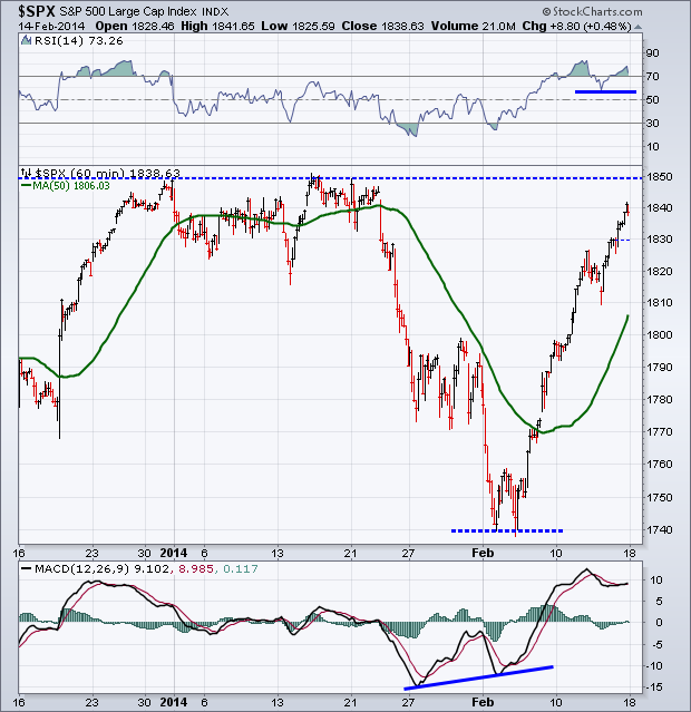
The positive divergence in the MACD and RSI indicators I discussed last week were confirmed as price headed higher and began making higher highs. This week we’ll be watching to see if the previous high at 1850 can be taken out. The Relative Strength Index once again finished the week in ‘overbought’ territory, a sign of strong appetite for stocks. Outside of a major news event I would be surprised if we didn’t at least test 1850 this week. If price consolidates or weakens I’ll be watching the recent low in the RSI as shown by the solid blue line on the chart below.
Last Week’s Sector Performance
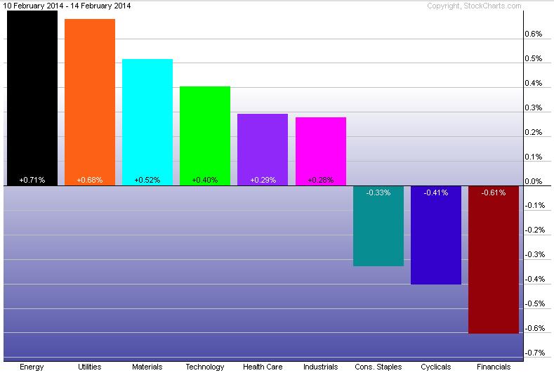
The energy sector (XLE) was able to dethrone utilities (XLU) as the leader in weekly relative performance last week. Financials, which had previously been showing strength, finished out last week as the worst performing sector.
Year-to-Date Sector Performance
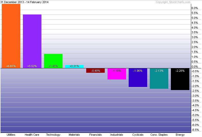
Taking a look at how the nine S&P sectors have done YTD, utilities (XLU) continue to lead the pack, followed by health care (XLV) and technology (XLK). While energy (XLE) was the leader for the last five days, its performance was not strong enough to take it out of last place year-to-date.
Major Events This Week
While this is a shortened trading week, the theme will likely be inflation as we get two major measures on Wednesday and Thursday with PPI and CPI data.
Disclaimer: Do not construe anything written in this post or this blog in its entirety as a recommendation, research, or an offer to buy or sell any securities. Everything in this post is meant for educational and entertainment purposes only. I or my affiliates may hold positions in securities mentioned in the blog. Please see my Disclosure page for full disclaimer.

