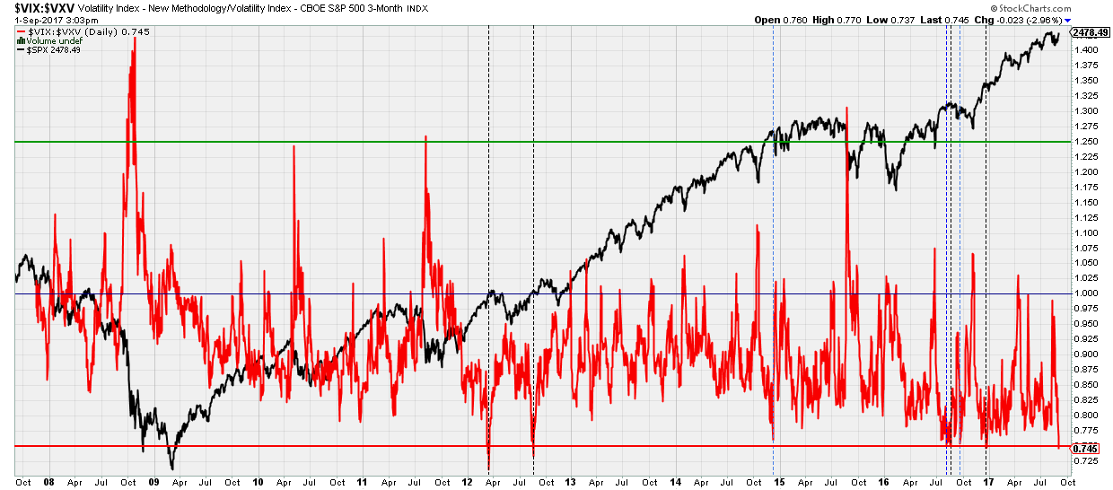
Today the VIX:CBOE S&P500 3-M Volitlity ratio dropped below 0.75. What does this ratio mean and why should we care? To answer the first question. Everybody knows the VIX. It is the volatility index, which measures one-month implied volatility. The VXV ratio, however, is lesser known and measures the 3-month implied volatility. It therefore tends to be less volatile than the VIX. The ratio between the two tells us if expected near term volatility exceeds longer term expected volatility and vice versa. Hence a high ratio (>1.25) means a high current volatility, but expected lower volatility 3 months out, whereas a low ratio (<0.75) means traders and investors expect very little to worry about 3 months out. These extreme high and low readings often coincide with bottoms and tops, respectively (see Figure below)

Today I wanted to look at the extreme low readings as the VIX:VXV ratio dropped below 0.75 today. In it's 10 years of history that is rather uncommon: it has happened only 4 times before (dotted black vertical lines), of which 2 were last year. There were three occasions where the ratio came very close to 0.75 (dotted blue vertical lines) and I'll add those to my analyses too. But first let's focus on the five. In 4 out of these 4 occasions, the market was very close to a top, some more significant than others: March 2012, August 2012, August 2016, and December 2016.
- March 2012: The market dropped within 4 days to below the price the VIX:VXV signal was given, then rallied to a marginal higher high the next few days, only to correct much more into the June 2012 low
- August 2012: The market corrected the next 2 weeks to below the price at which the VIX:VXV signal was given, then rallied for new highs the following month, only to correct much more into the November 2012 low.
- August 2016: The market had topped and declined into it's November low
- December 2016: The market had topped, corrected into it's late-December low and than rallied up to now.
Hence, albeit a small "n" (but that's simple because it's a rare signal), all lead to corrections and 3 out of 4 led to much larger corrections and price eventually well-below levels from which the signal was given.
Now let's take a look at the three "almost <0.75" occasions (dotted blue vertical lines):
- December 2014: the ratio hit 0.76. The market topped that day and the S&P500 lost 5% in 1 week only to rally back up the week after that.
- August 2016: the ratio hit 0.755. The market chopped a little higher the next week, and then corrected into the September low.
- September 2016: the ratio hit 0.755. The market peaked that day in a large b-wave and corrected into the November low.
Hence, also these 3 occasions had all 3 lower prices ahead, with only marginal upside first in one instance. Thus out of these 7 occasions, all lead to prices below from which the signal was given at some point in time, with some corrections more significant than others in both price and time. In two instances the market marched marginally higher first before correcting and in only one instance was the correction small before a large bull run started. Overall, I tend to listen when rare signals are presented to us, which have a solid track record.
Which stock should you buy in your very next trade?
With valuations skyrocketing in 2024, many investors are uneasy putting more money into stocks. Unsure where to invest next? Get access to our proven portfolios and discover high-potential opportunities.
In 2024 alone, ProPicks AI identified 2 stocks that surged over 150%, 4 additional stocks that leaped over 30%, and 3 more that climbed over 25%. That's an impressive track record.
With portfolios tailored for Dow stocks, S&P stocks, Tech stocks, and Mid Cap stocks, you can explore various wealth-building strategies.

