[Warning:This post is loaded with sarcasm] A meteor coming towards the US East Coast is unlikely to stir up more headlines than the Fiscal Cliff – expiring tax cuts and forced spending cuts “destroying” America if Congress and the President cannot agree on taxation and spending. Per the Congressional Budget Office (CBO):
…. if all of that fiscal tightening occurs, real (inflation-adjusted) gross domestic product (GDP) will drop by 0.5 percent in 2013 (as measured by the change from the fourth quarter of 2012 to the fourth quarter of 2013)—reflecting a decline in the first half of the year and renewed growth at a modest pace later in the year.
In today’s crappy economy whose growth is very tiny, each 0.5% of GDP is significant – and some, including the CBO, have said the Fiscal Cliff will drive the USA into a recession. Let us get a grip – a 0.5% change in GDP is not noticeable. The economy will be crappy with or without the Fiscal Cliff or recession.
Note that I believe taxing labor income is illogical, so any income tax increase is unacceptable. However the Fiscal Cliff dire headlines and potential damage of going over the cliff are disconnected. The CBO continues in their analysis:
That contraction of the economy will cause employment to decline and the unemployment rate to rise to 9.1 percent in the fourth quarter of 2013. After next year, by the agency’s estimates, economic growth will pick up, and the labor market will strengthen, returning output to its potential level (reflecting a high rate of use of labor and capital) and shrinking the unemployment rate to 5.5 percent by 2018.
So what is all the fuss about? – Maybe the soap opera in Washington is more interesting than the mind numbing crud being shown on TV. In the universe of things important, it does not appear the Fiscal Cliff is even visible.
Any income tax increase will not be good for an economy in the short term as it takes from the very people who make the economy work.
What will happen to personal income with these tax increases looming? When we fall over the Fiscal Cliff, the 10% personal tax bracket would disappear, and the 15% bracket would become the lowest tax rate. And the 25, 28, 33 and 35% rate brackets would rise to 28, 31, 36 and 39.6% respectively.
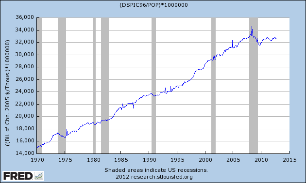
Like any math wizard – the pundits, economists, and goof balls – I can calculate the expected effect. It cannot logically be a positive effect on the economy as the Government is taking more money from its citizens, and will be spending less. But let us see how tax rates effected disposable income when they were instituted over the last 40+ years. The graph below is real disposable personal income divided by population:
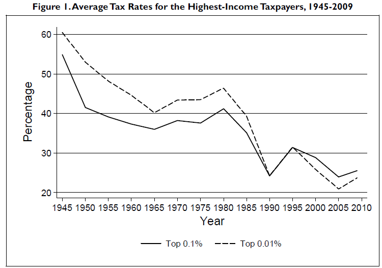
And here are the historical top tax rates:
The study which included the above graph was drafted by the Congressional Research Service (CRS), a public policy research arm of the United States Congress. The CRS is an agency within the Library of Congress, working directly for Members of Congress, their Committees and staff on a confidential, nonpartisan basis. They concluded:
The top income tax rates have changed considerably since the end of World War II. Throughout the late-1940s and 1950s, the top marginal tax rate was typically above 90%; today it is 35%. Additionally, the top capital gains tax rate was 25% in the 1950s and 1960s, 35% in the 1970s; today it is 15%. The average tax rate faced by the top 0.01% of taxpayers was above 40% until the mid-1980s; today it is below 25%. Tax rates affecting taxpayers at the top of the income distribution are currently at their lowest levels since the end of the second World War.
The results of the analysis suggest that changes over the past 65 years in the top marginal tax rate and the top capital gains tax rate do not appear correlated with economic growth. The reduction in the top tax rates appears to be uncorrelated with saving, investment, and productivity growth. The top tax rates appear to have little or no relation to the size of the economic pie.
However, the top tax rate reductions appear to be associated with the increasing concentration of income at the top of the income distribution. As measured by IRS data, the share of income accruing to the top 0.1% of U.S. families increased from 4.2% in 1945 to 12.3% by 2007 before falling to 9.2% due to the 2007-2009 recession. At the same time, the average tax rate paid by the top 0.1% fell from over 50% in 1945 to about 25% in 2009. Tax policy could have a relation to how the economic pie is sliced—lower top tax rates may be associated with greater income
disparities.
I may not be the brightest bulb in the box, but I am hard pressed to correlate disposable income and tax rates – except occasionally in the immediate aftermath of the change. The US has poor economic dynamics, and the 0.5% impact of the fiscal cliff just is not that big of a deal in the scheme of things. The problem is:
- the crappy economy caused by excess credit and a demographic shift,
- laws and regulations which work against job formation, and
- a leadership which is unable to agree on short and long range solutions and objectives.
The Econintersect economic forecast for December 2012 shows weak growth. The underlying dynamics continue to have a downward bent. There are recession markers still in play, and one of our alternate methods to validate our forecast is recessionary. All in all, not a great forecast – but not one which would cause you to jump out the nearest window either.
ECRI believes the recession began in July 2012. ECRI first stated in September 2011 a recession was coming . The size and depth is unknown. The ECRI WLI growth index value is enjoying its fourteenth week in positive territory (but slightly improved from last weeks ten week low). The index is indicating the economy six month from today will be slightly better than it is today.
Current ECRI WLI Growth Index 
Initial unemployment claims fell again from 393,000 (reported last week) to 370,000 this week. Historically, claims exceeding 400,000 per week usually occur when employment gains are less than the workforce growth, resulting in an increasing unemployment rate (background here and here).
The real gauge – the 4 week moving average – rose again from 405,250 (reported last week) to 408,000. Because of the noise (week-to-week movements from abnormal events AND the backward revisions to previous weeks releases), the 4-week average remains the reliable gauge. This is the highest 4 week average in over one year, and is 4.3% above the claims level of the same week one year ago.
Weekly Initial Unemployment Claims – 4 Week Average – Seasonally Adjusted – 2010 (blue line), 2011 (red line), 2012 (green line) 
Bankruptcies this Week: Ahern Rentals
Data released this week which contained economically intuitive components (forward looking) were:
- Rail movements (where the economic intuitive components indicate a moderatelyslightly expanding economy).
- ISM non-manufacturing came in stronger, and the subindex which highly correlates to the economy was even stronger.
- Construction spending (although a shadow of its former self) continues to grow.
All other data released this week either does not have enough historical correlation to the economy to be considered intuitive, or is simply a coincident indicator to the economy.
Click here to view the scorecard table below with active hyperlinks.
