The “equity risk premium” is the compensation investors receive *over and above the risk free rate* for taking on equity risk.
Over the long-run the performance gap between US stocks vs treasuries has tracked around 5%. Stocks have a well-established long-term track record of beating bonds.
And with an annualized performance gap of 12% over the past decade, investors have earned a pretty good premium for taking on equity risk in recent years.
But it’s not always positive, and there have been times when this spread goes to zero or even negative (e.g. the trailing 10-year annualized return spread in March 2009 was -10% following the financial crisis shock to stocks and flight to bonds).
As investors we need to think not just about chasing the best return —but also be mindful about risk & opportunity cost. Thinking in terms of an equity risk premium is a useful framework in this sense.
But this week’s chart takes a pragmatic spin with a forward-looking mandate.
We can learn a lot from studying historical returns, but ultimately we need to be forward-looking because that’s where we’re going.
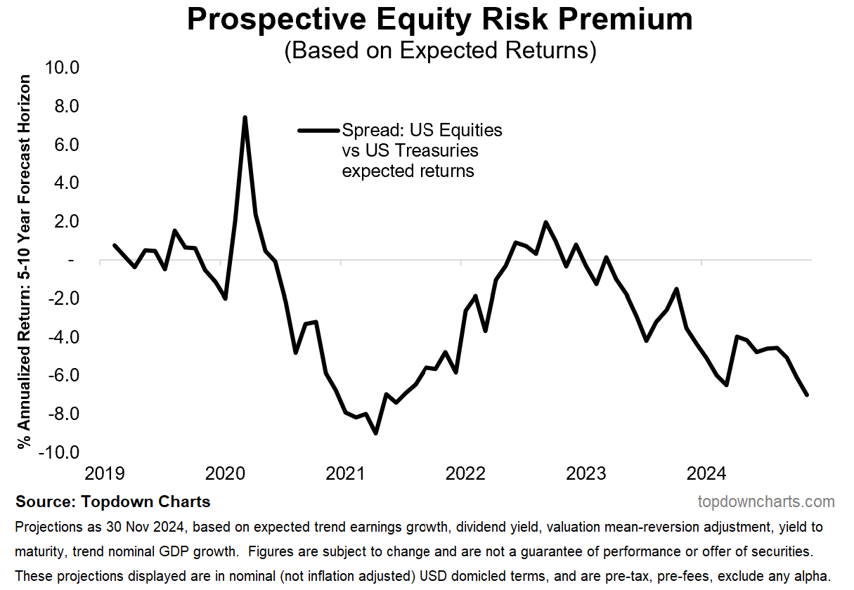
The chart below presents a “prospective equity risk premium“ by taking the spread between expected returns for stocks vs bonds (from my Capital Market Assumptions dataset).
It is a forward-looking equity risk premium. The expected returns cover a 5-10-year projection period and is usually used by asset allocators for analyzing strategic asset allocations. But if you look at the chart there’s a couple of interesting tactical insights that have also been revealed.
For example, in March 2020, the indicator spiked very high (which in hindsight, helped flag the Covid lows in the stock market, and definitely proved prescient). By contrast, the 2021 low flagged the peak and mini-bear of 2022 (and yes, the high point in 2022 on that chart marked the October bear market bottom).
As things stand now, it’s back into deep negative territory (i.e. the equity risk premium is expected to be negative in the coming decade), and is currently at the lowest point since the stimulus frenzy market peak in 2021.
So whether you’re looking at it from a tactical or strategic perspective, there is a clear warning and prompt to rethink asset allocation right here.
Key point: The forward-looking (5-10 year projected) ERP is negative.
CONTINUED: What About the Rest of the World?
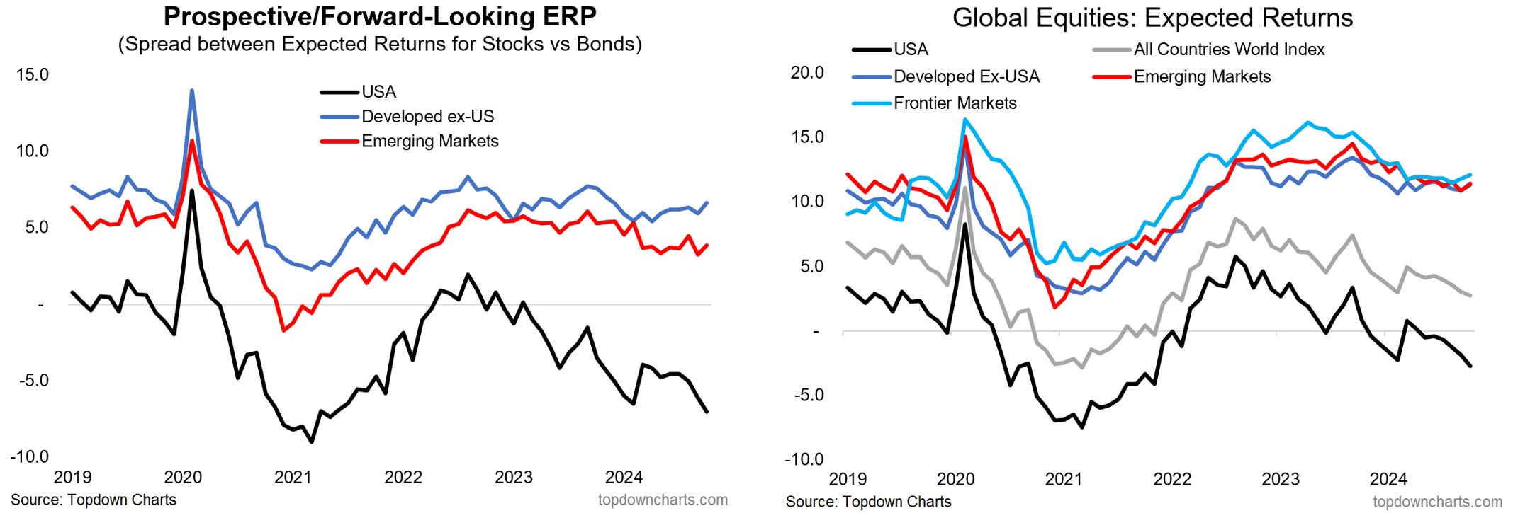
In case you were curious, I thought I would also include the same prospective equity risk premium indicator for developed markets and emerging markets (using their own government bond expected returns in place of treasuries).
As you can see, it is a starkly different story for EM & DM vs US.
The rest of the world is basically sitting there with a decent positive expected equity risk premium, while the US is sitting there deep in the negatives. This reflects higher expected returns for global ex-US equities (vs small negative for US), which in large part is driven by valuations.
I covered the detail behind this in a previous edition: “Chart of the Week - What to Expect“ — and n.b. for reference, the Capital Market Assumptions dataset is a key feature in our monthly Market Cycle Guidebook (in case you wanted the latest data + detail).
Again though, this is telling us loud and clear that the asset allocations that have worked well over the past decade may not work so well in the coming decade and that’s a big problem, because most investors even in a professional capacity have drifted into portfolios optimized for yesterday’s returns (thanks to peer risk, returns chasing, and apathy/inertia). Maybe my numbers will prove to be wrong, but maybe just maybe they are flagging one of the biggest shifts, risks, and opportunities facing asset allocators of this generation…
