US sector insights since 1993
Our work on US sector return data since 1993 was a spin off of the hypothesis that investors have not benefitted from having financials in their market portfolio compared to a portfolio covering all sectors excluding financials.
This led to some insights that we want to share in two articles.
This first article covers the basic overview of statistics on the 10 Global Industry Classification Standard (GICS) sectors for S&P 500 companies and highlights some interesting facts that every investor should consider.
The second article will look into the portfolio performance measurement of different portfolios against the S&P 500 Index and try to answer whether investors should just drop owning financials in their portfolios.
What are the annualised returns since 1993
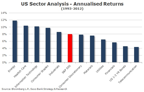
Based on total return data since 1993 the chart below shows that the best performing US sector has been energy with an 11.8 percent annualised return compared to 8.0 and 4.6 percent annualised returns for the S&P 500 and US 1-3 year government bonds.
The data also shows that the telecommunication and financial sectors have been the two worst performing sectors. In fact the telecommunication sector has delivered a return that is below the total return of short-term risk-free US government bonds.
Is the picture different on a risk-adjusted basis?
The picture changes when we calculate the Sharpe Ratio, measuring the excess return or risk premium to the risk-free rate of return per unit of deviation in an investment asset, on the different sectors with the US 1-3 year government bonds as the benchmark risk-free rate of returns.
On this measurement the consumer staples sector (comprising of food, retailing, beverage, tobacco, holding and personal products) is suddenly the best performing sector since 1993 (see chart below). The reason for this is a slightly less annualised return compared to energy but comparably less volatility in returns. As the chart also shows, the consumer staples, energy and health care sectors are the only sectors providing the investor with better risk-adjusted returns compared to the S&P 500 Index.
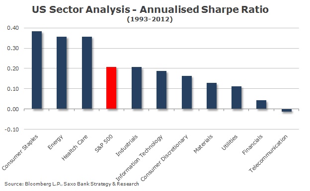 The fact that only three out of 10 sectors are above the S&P 500 Index on a risk-adjusted basis highlights the importance of diversification. Say an investor had been over-weighted in information technology and financials then the risk-adjusted return would have been inferior to a passive investment in the S&P 500 Index. On a last note, observe that the telecommunication sector has delivered negative risk-adjusted returns since 1993.
Three sector bubbles since 1993; which one will be next?
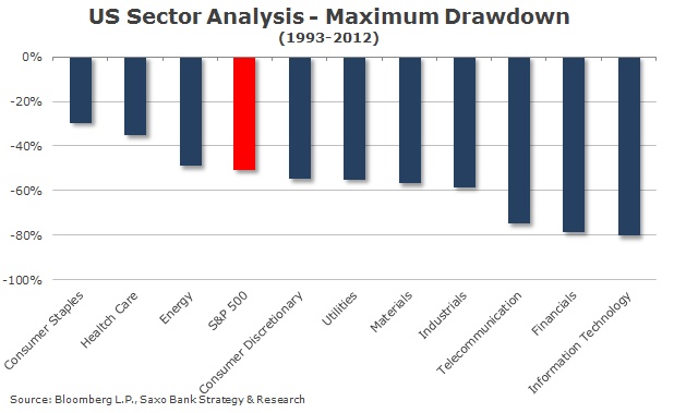
The chart below shows the maximum drawdown experienced in the 10 sectors. It is very clear that the telecommunication, financials and information technology sectors have had the largest drawdowns as those sectors all saw huge speculative activities before the bubble burst.
At the other end of the spectrum we find the consumer staples and health care sectors as the most defensive sectors in a downturn with drawdowns of 29.6 and 35.3 percent respectively.
 Bubbles tend to skew the data and it might not be fair of investors to judge information technology stocks as the most riskiest in the universe going forward because of the dot-com bubble.
If you calculate the maximum drawdown since June 2003 and thus exclude the dot-com bubble the information technology sector has only had a drawdown of 50.6 percent which is very close to the overall market, as the S&P 500 Index experienced a 51.0 percent drawdown during the financial crisis. For the telecommunication sector the drawdown increases to 42.4 percent from 74.8 percent in the whole period.
An interesting question to ask following bubbles in three seperate sectors in only two decades is which one will be the next. One could make the hypothesis that the good risk-adjusted returns in energy will spur over-investment - we have already seen some bubble tendencies in solar and wind - and thus propel a bubble which will undoubtedly burst as all bubbles do.
Investors have to keep changing regimes in mind when judging risk-adjusted performance going forward.
Energy has provided the best risk-adjusted return since 1993
A different way of measuring risk-adjusted return of a security is to use the Information Ratio (IR) which is a refinement of the Sharpe Ratio. Instead of the risk-free return, IR uses the return series of a chosen benchmark. The IR measures the active return divided by the tracking error (volatility of the active return - difference between the sector and S&P 500 returns e.g. alpha).
In our calculations we have chosen the S&P 500 Index (the market) as the benchmark. The chart below shows our findings. The energy sector has been the best performing sector since 1993 on a risk-adjusted basis. Observe how the information technology sector has actually seen a positive development during the period despite high volatility and a big drawdown.
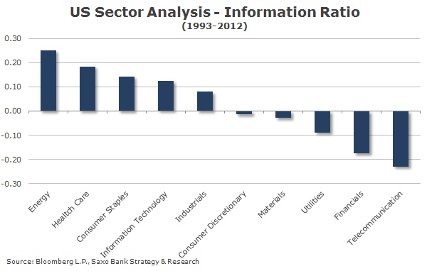 The five sectors that have performed the worst are the consumer discretionary, materials, utilities, financials and telecommunication sectors.
Based on these findings we will delve a little further in the next article and try to answer whether financials stocks should be completely avoided in the future.
Our work on US sector return data since 1993 was a spin off of the hypothesis that investors have not benefitted from having financials in their market portfolio compared to a portfolio covering all sectors excluding financials.
This led to some insights that we want to share in two articles.
This first article covers the basic overview of statistics on the 10 Global Industry Classification Standard (GICS) sectors for S&P 500 companies and highlights some interesting facts that every investor should consider.
The second article will look into the portfolio performance measurement of different portfolios against the S&P 500 Index and try to answer whether investors should just drop owning financials in their portfolios.
What are the annualised returns since 1993
Based on total return data since 1993 the chart below shows that the best performing US sector has been energy with an 11.8 percent annualised return compared to 8.0 and 4.6 percent annualised returns for the S&P 500 and US 1-3 year government bonds.
The data also shows that the telecommunication and financial sectors have been the two worst performing sectors. In fact the telecommunication sector has delivered a return that is below the total return of short-term risk-free US government bonds.

Is the picture different on a risk-adjusted basis?
The picture changes when we calculate the Sharpe Ratio, measuring the excess return or risk premium to the risk-free rate of return per unit of deviation in an investment asset, on the different sectors with the US 1-3 year government bonds as the benchmark risk-free rate of returns.
On this measurement the consumer staples sector (comprising of food, retailing, beverage, tobacco, holding and personal products) is suddenly the best performing sector since 1993 (see chart below). The reason for this is a slightly less annualised return compared to energy but comparably less volatility in returns. As the chart also shows, the consumer staples, energy and health care sectors are the only sectors providing the investor with better risk-adjusted returns compared to the S&P 500 Index.
 The fact that only three out of 10 sectors are above the S&P 500 Index on a risk-adjusted basis highlights the importance of diversification. Say an investor had been over-weighted in information technology and financials then the risk-adjusted return would have been inferior to a passive investment in the S&P 500 Index. On a last note, observe that the telecommunication sector has delivered negative risk-adjusted returns since 1993.
Three sector bubbles since 1993; which one will be next?
The chart below shows the maximum drawdown experienced in the 10 sectors. It is very clear that the telecommunication, financials and information technology sectors have had the largest drawdowns as those sectors all saw huge speculative activities before the bubble burst.
At the other end of the spectrum we find the consumer staples and health care sectors as the most defensive sectors in a downturn with drawdowns of 29.6 and 35.3 percent respectively.
 Bubbles tend to skew the data and it might not be fair of investors to judge information technology stocks as the most riskiest in the universe going forward because of the dot-com bubble.
If you calculate the maximum drawdown since June 2003 and thus exclude the dot-com bubble the information technology sector has only had a drawdown of 50.6 percent which is very close to the overall market, as the S&P 500 Index experienced a 51.0 percent drawdown during the financial crisis. For the telecommunication sector the drawdown increases to 42.4 percent from 74.8 percent in the whole period.
An interesting question to ask following bubbles in three seperate sectors in only two decades is which one will be the next. One could make the hypothesis that the good risk-adjusted returns in energy will spur over-investment - we have already seen some bubble tendencies in solar and wind - and thus propel a bubble which will undoubtedly burst as all bubbles do.
Investors have to keep changing regimes in mind when judging risk-adjusted performance going forward.
Energy has provided the best risk-adjusted return since 1993
A different way of measuring risk-adjusted return of a security is to use the Information Ratio (IR) which is a refinement of the Sharpe Ratio. Instead of the risk-free return, IR uses the return series of a chosen benchmark. The IR measures the active return divided by the tracking error (volatility of the active return - difference between the sector and S&P 500 returns e.g. alpha).
In our calculations we have chosen the S&P 500 Index (the market) as the benchmark. The chart below shows our findings. The energy sector has been the best performing sector since 1993 on a risk-adjusted basis. Observe how the information technology sector has actually seen a positive development during the period despite high volatility and a big drawdown.
 The five sectors that have performed the worst are the consumer discretionary, materials, utilities, financials and telecommunication sectors.
Based on these findings we will delve a little further in the next article and try to answer whether financials stocks should be completely avoided in the future.
