There are four elements of a time series: the actual trend (which is determined using moving averages of various lengths), cyclical movements (regular events that occur over more than 12-months), seasonal movements (regular events that occur over less than 12 months) and irregular events. Hurricanes Irma and Harvey provide an excellent opportunity to revisit the potential impact of irregular movements on a time series – this time focusing on initial unemployment claims, which have an excellent track record as a leading indicator. If a recent spike becomes longer-lasting, it could mean the economy is slowing down.
Here are two charts from the latest report from the Department of Labor:
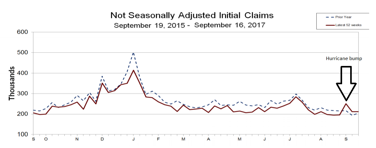
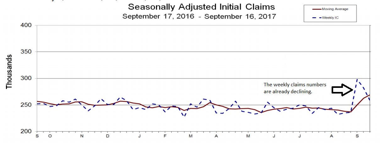
The top chart is the raw, non-adjusted data (in red). Hurricane Harvey caused a spike a few weeks ago, but that has since moved lower. The bottom chart shows the seasonally adjusted weekly number (the dashed blue line) and the 4-week moving average (in red). The weekly claims are already coming down. The 4-week moving average will continue to move higher in the next few weeks but so long as the seasonally adjusted number continues moving lower the 4-week moving average will follow.
The following table places the above charts into numerical context:
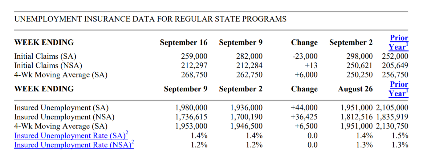
The non-seasonally adjusted number was 251,000 in early September. It has since moved lower to 212,000. While the seasonally-adjusted number increased to 298,000 in early September, it has since declined to 259,000.
A large amount of housing market data was released this week. Building permits increased 5.7% M/M and 8.3% Y/Y.
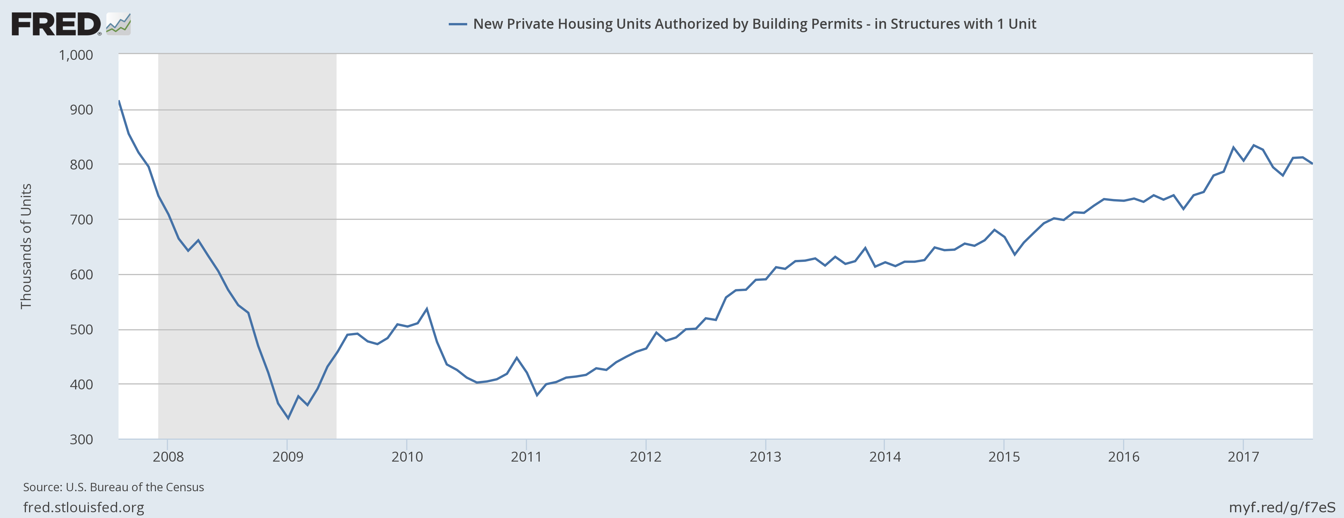
But the 1-unit subset was -1.5% M/M although it increased 7.7% Y/Y. The following chart breaks the data down by Census region:
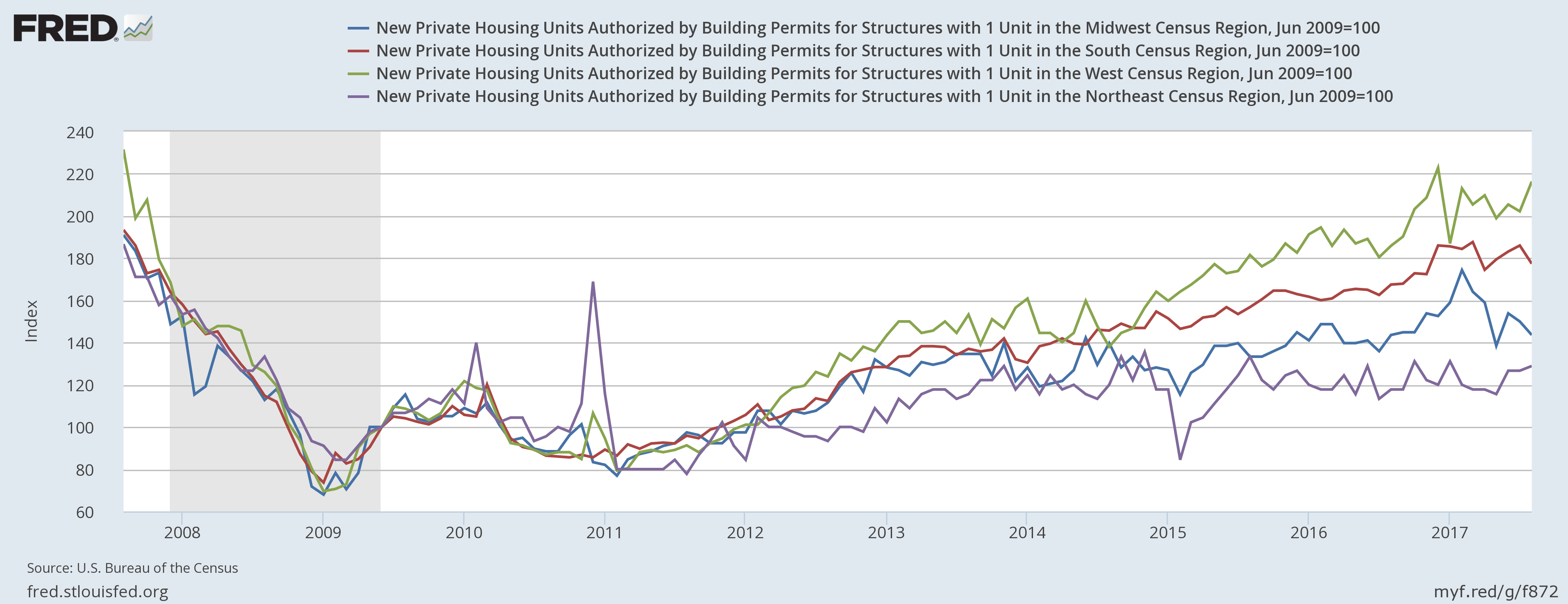
Three areas – the West, South, and Northeast – are moving sideways. The Midwest (in blue) has been declining since the beginning of the year. The NAHB housing market index – also released this week -- confirmed regional softness. The Midwest fell from 72 in March to 59 in September. Existing home sales -- which were also released this past week -- were off 1.7% M/M but up .2% Y/Y. This number is now down in 4 of the last 5 months. But that is probably the result of very low inventory – there are only 3.9 months of supply at the current sales pace.
Economic Conclusion: While the economy experienced two very disruptive events in Hurricanes Irma and Harvey, their impact on one key economic metric is already dissipating. The housing market is still in good shape. While the overall pace of activity is now moving sideways, that could simply indicate supply and demand are aligned. Low interest rates and a strong job market should continue to provide the market with sufficient buyers.
Market overview: This was an slightly odd week for market returns. Despite the headlines of “record high,” the SPYs were up a paltry .1% on the week while the QQQs were down almost 1%. On the positive side, the IWMs were up slightly over 1%.
This week, let’s look at the weekly charts, because they all contain one important characteristic:

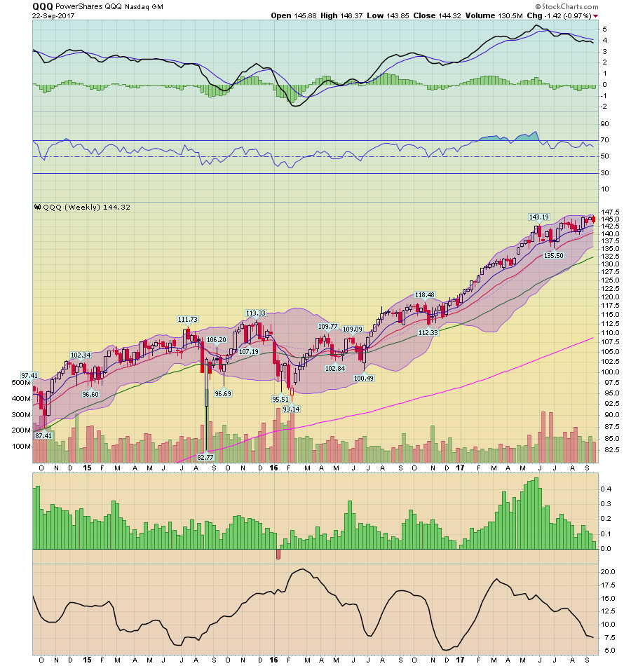

All three charts – the SPYs (top), the QQQs (middle) and IWMs (bottom) – all have one thing in common: declining momentum. The MACD on each chart has been declining for at least several months (the QQQs), 2 quarters (the SPYs) or the entire trading year (the IWMs). This is not fatal; in fact, all three averages have experienced solid gains since the first of the year. That’s due to a solid support from fundamentals: the economy continues to grow and corporate earnings are increasing at strong rates. But when you look closely at the QQQs and especially the IWMs, you’ll see a declining slope. In the case of the IWMs, also note that most of their gain occurred in the first quarter while we now approach the 4th quarter.
We're back where we've been for the last few years -- an expensive market at the end of an economic cycle. Invest cautiously.
