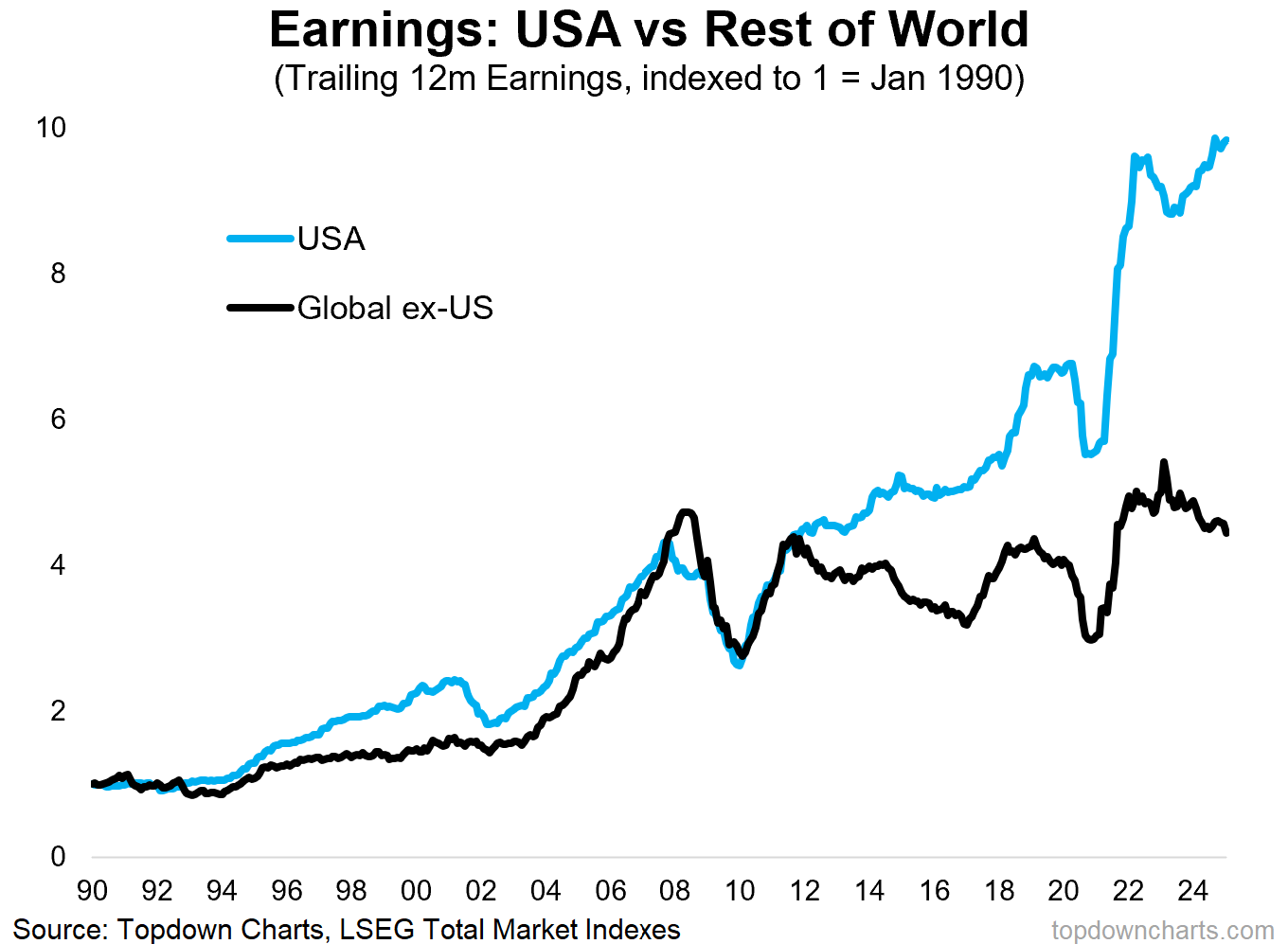
A couple of weeks ago we looked at US Tech vs non-tech earnings… this time we are looking at US vs non-US earnings — the results are surprisingly unsurprising, but very important for global investors to take note.
The first thing that stands out is the trends: US earnings have been trending higher throughout the last 30-years, but rest-of-world earnings have been traveling through a highly cyclical range over the past 15-years.
More recently, global earnings have been declining (makes sense given the economic slowdown and challenging economic conditions in China/EM and Europe).
This stands in contrast to the US which has seen a strong, albeit narrow (tech-driven) cyclical upturn in earnings off the 2022 lows.
A natural question would be: will the gap between them close or narrow?
Here’s a couple of points to ponder:
-
Trump: tax cuts if broad and rapidly implemented would lift the blue line, tariffs would have mixed effects but likely present more of a headwind to the black line.
-
Cycle: Europe has been more aggressive with rate cuts and China is ramping up stimulus, if these major economies can reaccelerate out of slowdown it will boost the black line.
-
AI Hype Cycle: the AI boom if it follows the classic Gartner (NYSE:IT) Hype Cycle will eventually make a journey through the trough of disillusionment, this will take some steam out of US/Tech earnings.
Overall I would say consensus is (based on relative valuations) that the blue line continues to the sky, while the black line will languish in permanent stagnation. To me that says the market as a whole doesn’t even contemplate the prospect of any narrowing of the gap or changes in this chart — and to me that says risk (US) + opportunity (global) [check out the bonus chart below for another angle on this].

Key point: US corporate earnings have strongly outperformed vs global.
Cycles of Relative Performance
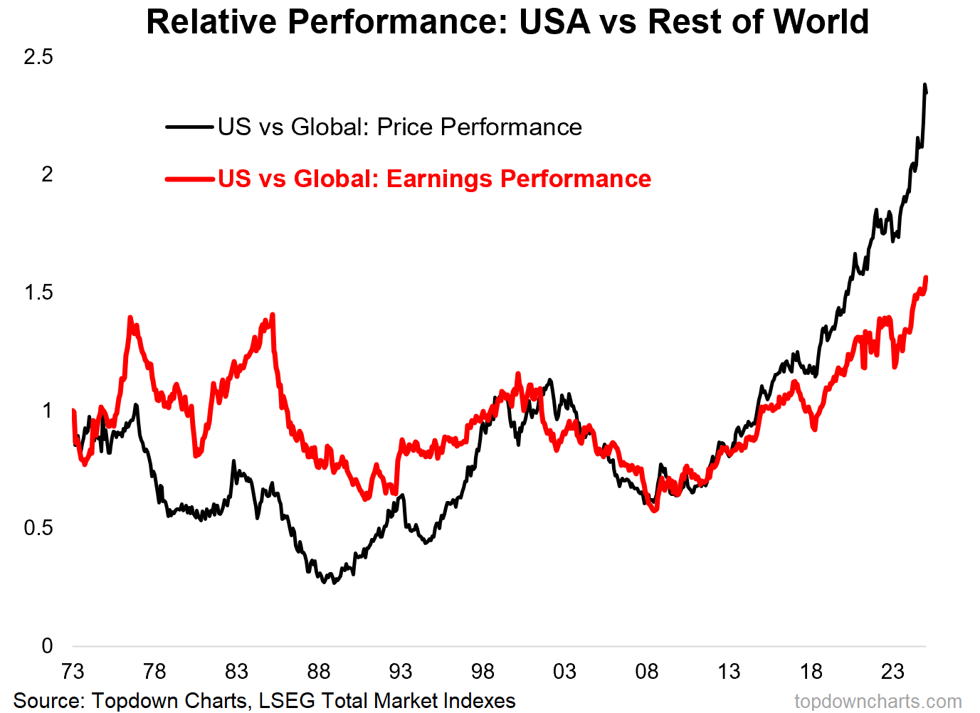
You might have seen those charts of US vs global relative price performance (i.e. the black line in the chart below), showing how extreme it has become. But the red line shows that there is a fundamental reason for the direction of travel in the black line.
Yes US stock prices have significantly outperformed vs global stocks, but US earnings have also significantly outperformed vs global (the red line).
There are 2 key takeaways in this chart: first, the black line while correct in direction of travel given fundamentals, has substantially overshot (this is why when you look at just about every measure of valuations, it’s clear that US stocks trade at a major premium vs global stocks).
Second, for global stocks to turn the corner and start outperforming vs US, you need more than just cheap relative value (and it is very cheap), you need the fundamental trend to change — the red line to go down. As discussed above there are a few ways this could happen, but I will say again: the average investor is not prepared for it (or even contemplating it).

