A few days ago we shared our bearish stance on Royal Bank of Canada. Its price chart revealed a textbook pattern that took 25 years to develop. Today, we are going to examine another one of Canada’s Big Three banks – Toronto-Dominion.
The second largest bank in Canada came into existence after the merger of the Bank of Toronto and Dominion Bank in 1955. The chart below, however, only dates back to 1996, but shows a price pattern very similar to the one drawn by Royal Bank of Canada. That is hardly a coincidence.

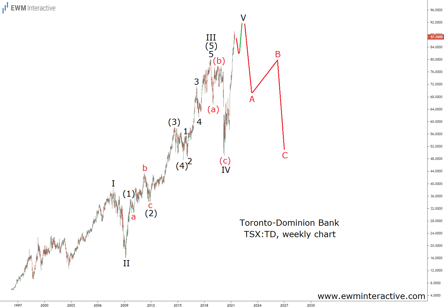
Of Course, the pattern in question is a five-wave impulse. It is labeled I through V, where wave II stands for the 2008 Financial Crisis and wave IV culminated in the 2020 coronavirus selloff. The sub-waves of wave III are also visible and marked (1)-(2)-(3)-(4)-(5). The impulsive structure of wave (5) of III can be traced, as well.
Toronto-Dominion Looks Vulnerable Approaching C$100
If this count is correct, the post-March 2020 surge, which took Toronto-Dominion stock to new records, must be wave V. And that is the problem for the bulls. According to the Elliott Wave principle, a three-wave correction of the same degree follows every impulse.
Corrections usually reach the support area of the impulse’s fourth wave. Here, this translates into a decline back to ~C$50 a share once wave V is over. Assuming Toronto-Dominion is going to approach C$100 first, this would be a ~50% drop.
Some might argue that at a P/E ratio of 11, Toronto-Dominion is actually cheap and should be bought. However, the stock was trading at a P/E below 7 in September 2007. By February 2009, it was down 58% regardless. So despite the seemingly low valuation, we don’t think TD stock is worth the risk at current price levels.
