Weak GDP Means Run For The Exits, Right?
The latest report on economic activity was released Wednesday; the news was not good. From Bloomberg:
The U.S. economy contracted in the first quarter by the most since the depths of the last recession as consumer spending cooled. Gross domestic product fell at a 2.9 percent annualized rate, more than forecast and the worst reading since the same three months in 2009, after a previously reported 1 percent drop, the Commerce Department said today in Washington. It marked the biggest downward revision from the agency’s second GDP estimate since records began in 1976. The revision reflected a slowdown in health care spending.
Leveraging Hard Data In Hand
Economist Edgar R. Fiedler summed up the countless inaccurate forecasts he had seen during his career this way:
“He who lives by the crystal ball soon learns to eat ground glass.”
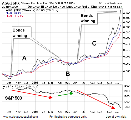
Therefore, to answer the bonds versus stocks question, we will examine the evidence we have in hand rather than attempt to gaze into a highly uncertain future. Over the weekend, we showed how paying attention was helpful for stock investors during the worst part of the 2008 financial crisis. Using similar concepts, when bonds are the better place to be relative to stocks, we can see that on a chart. For example, for the vast majority of the October 2007 – March 2009 bear market in stocks, bonds (ARCA:AGG) were clearly the better place to be relative to stocks (see periods A and C below). During a countertrend rally in stocks (see point B), bonds took a rest, which was also observable.

“A Correction Is Coming” Headlines Never Go Away
In the past year, we have seen stories about an “imminent stock market correction” more times than we can count. Despite the questionable usefulness of those bearish predictions, investors are still clicking on these stories. The headlines below were all published in the past week.
- Investors on high alert for sharp correction in U.S. stocks
- Stocks ‘overpumped’, 15% correction ahead
- Is a summer correction coming for US stocks?
Why do headline writers feature headlines that reference predictions? Answer: Many investors and readers demand them. If we can see bonds are more attractive than stocks during periods A and B in the 2008 chart above, then is it really necessary to use a crystal ball?
What Is The Market Telling Us Now?
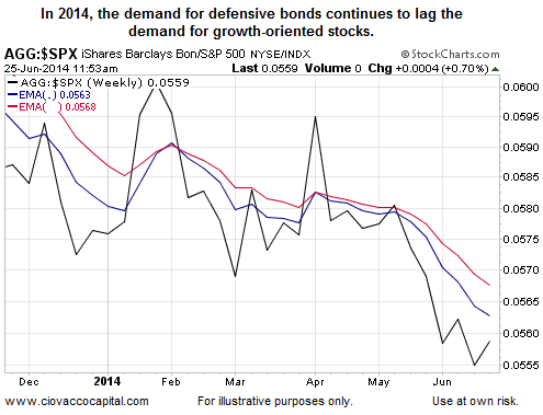
An easy way to evaluate the present day bonds versus stocks ratio is to ask does the present day chart look anything like the crisis periods (A & B) from 2008? As you can see in the chart below, the answer is no, the 2014 chart looks much better than the risk-off periods during the financial crisis. The chart below is as of 11:53 a.m. EDT Wednesday, meaning it takes this morning’s weak GDP report into account.

Investment Implications - Weak Data Versus Fed Policy
Weak economic data is one of many inputs that impact asset prices. Fed policy is another. Rather than forecast which one will dominate the markets in the weeks ahead, we can pay attention and adjust as the evidence changes. So far this week, weakness in equities falls into the volatility to ignore category. Therefore, we continue to have stakes in U.S. stocks (ARCA:SPY), leading sectors (NYSE:XLK) and some off-setting exposure to bonds (ARCA:TLT). Wednesday’s weak GDP report may or may not be meaningful – there is no need to guess. Just as our back of the envelope Iraq risk management plan said not to overreact to the turmoil in the Middle East, we will exercise some prudent patience in regard to today’s weaker than expected read on U.S. economic activity.
