As investors, we regularly track sectors of the stock market - especially the S&P 500. Analysts, newsletter writers, bloggers and traders check the relative performance of cyclicals against defensives, general performance of financials, the recent action in the housing or semiconductor sectors, commodity related sectors such as materials and energy, or the way high yielders such as utilities and telecom are trending.
Chart 1: Commodities bear market remains in progress, but without a lower low: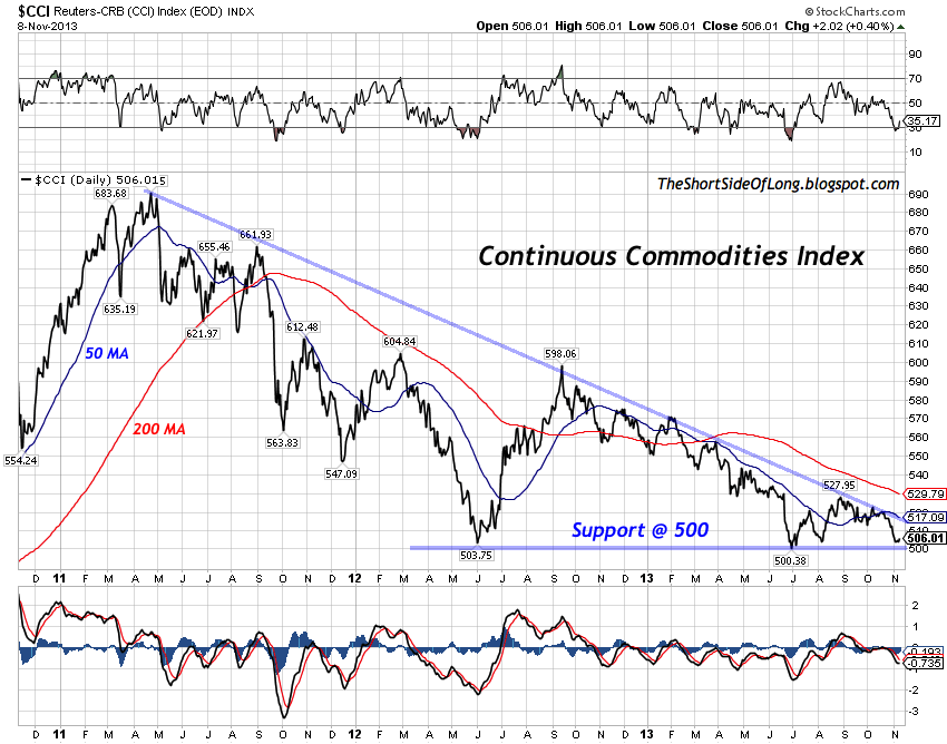
However, it is very rare to see the internal sector performance of other asset classes. For instance, investors can break down the US Dollar Index to see the way individual currencies are behaving. One could also look at the different sectors of the commodity complex, which is what I will do today.
Glancing at the chart above, we can see the Continuous Commodity Index (equal weighted) over the last three years. The index peaked in early May, just shy of 700 points and has since been in a downtrend or a bear market. However, up until now, the bears have failed to post lower lows since June 2012, which tells us that selling pressure has been mild over the last year. As we test the critical support at 500 points on the index, the question is, what can we expect next? Let us observe the various sectors for more clues.
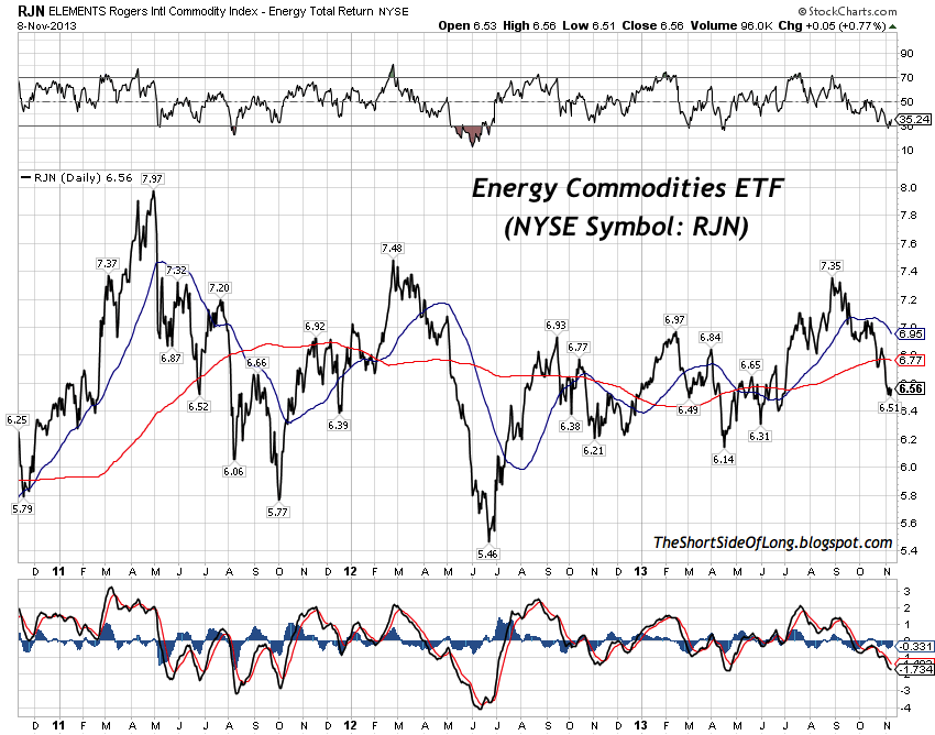
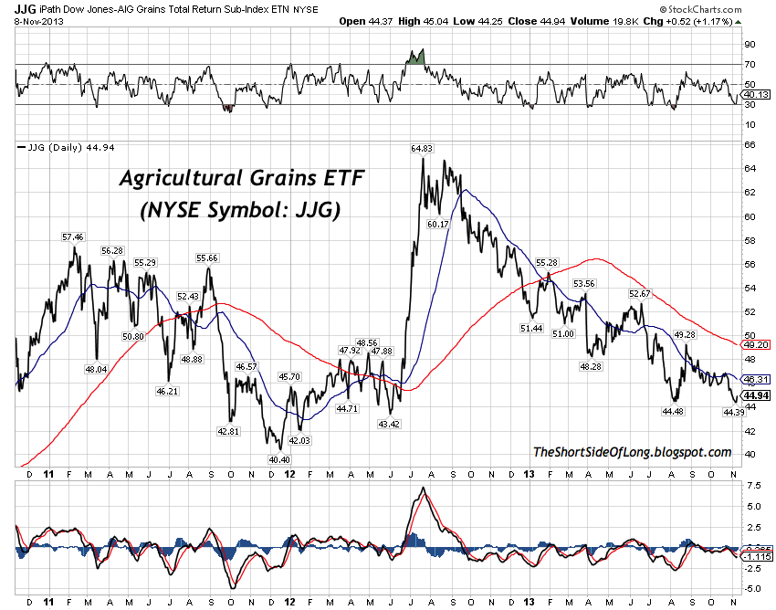
Chart 2 & 3: Grains and Energy have outperformed other commodities
While all sectors have struggled in recent years, some sectors have held up better then others. The two sectors seen above are Grains and Energy. By observing the charts with a quick eye test, we can see that these two sectors have faired much better then the overall index, as they have essentially moved more sideways.
In the Grains sector, commodities such as Corn and Soybeans managed to make all time record highs last year into September, while in the Energy sector relative outperformance by Brent Crude and in recent times Natural Gas has helped the index move sideways, rather then in a downtrend.
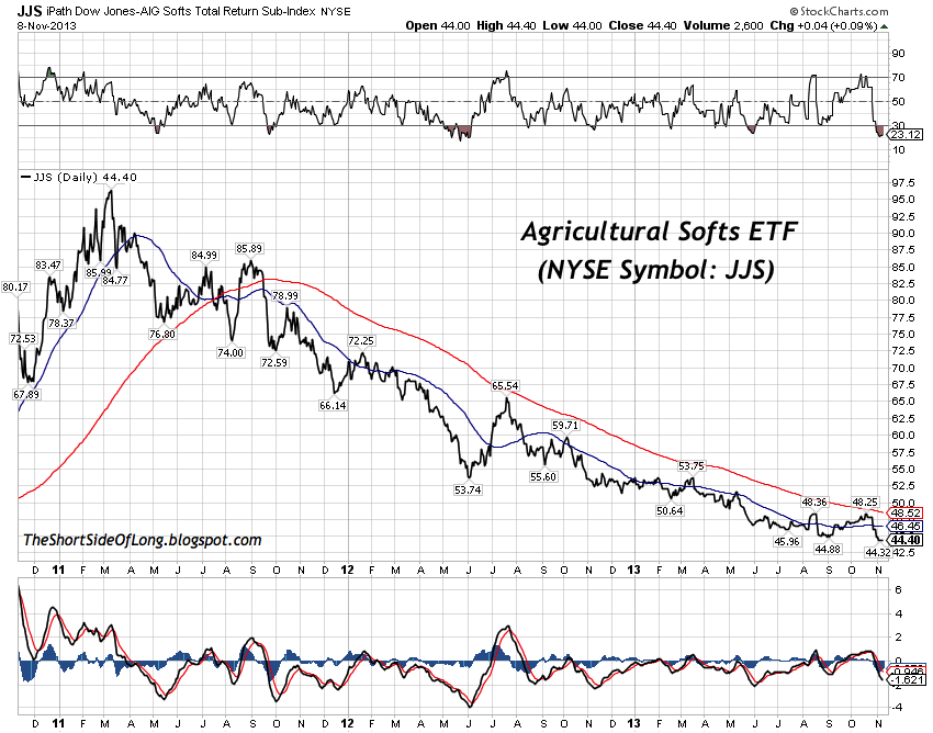
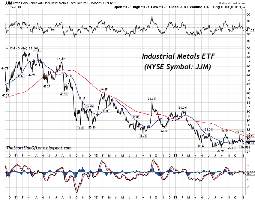
Chart 4 & 5: Soft commodities together with base metals have under-performed
By and large, the worst performing sectors within the commodity complex have been Agricultural Softs and Industrial Metals. The bear market in both sectors has been unpleasant to say the least, and nasty if by some terrible decision, you exposed yourself towards these two sectors near the peak, in early 2011. Both ETFs are down by around 40 to 50 percent over the last two and half years.
In the Soft sector, recent strong performance by Sugar has not been enough to offset the ongoing downtrend in Coffee and renewed weakness in Cotton. Industrial metals have suffered across the board with Copper, Aluminium and Nickel all under-performing dramatically.
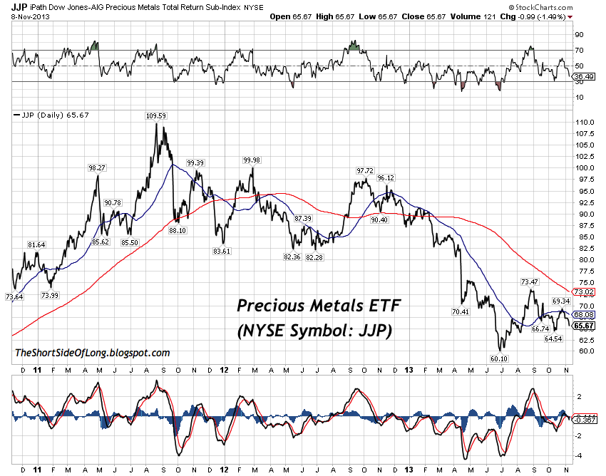
Chart 6: Precious metals bear market has been intense during 2013!
One interesting observation is that, apart from Grains, all other sectors peaked well ahead of the Precious Metals. Grains managed to make a new high in 2012, mainly due to the US drought, while all other sectors such as Energy, Softs and Base metals peaked in early 2011, while PMs continued to rally well into later parts of the year (see the chart above).
Chart 7 & 8: No safe havens, as PMs underperform other commodities in '13!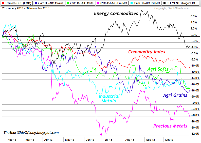
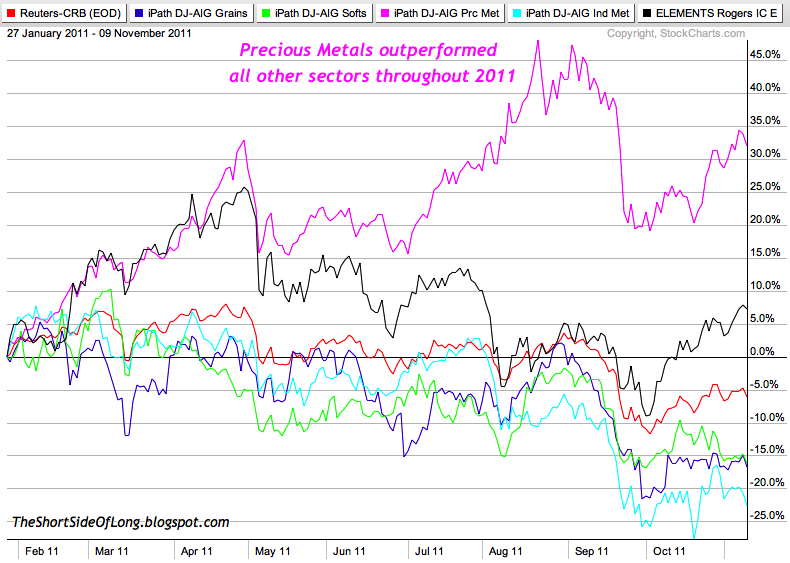
It seems that because Precious Metals outperformed the rest of commodities in 2011, they are currently under performing all other sectors in 2013. The two charts above show nominal percentage performance of all main sectors discussed above over the last 200 trading days (pay attention to the difference in dates between the two charts).
We can see Precious Metals all the way at the bottom of the top chart, while the sector was all the way at the top of the performance in the bottom chart all the way back in 2011. As the old market saying goes: usually whatever goes up the most, comes down the most!
- English (UK)
- English (India)
- English (Canada)
- English (Australia)
- English (South Africa)
- English (Philippines)
- English (Nigeria)
- Deutsch
- Español (España)
- Español (México)
- Français
- Italiano
- Nederlands
- Português (Portugal)
- Polski
- Português (Brasil)
- Русский
- Türkçe
- العربية
- Ελληνικά
- Svenska
- Suomi
- עברית
- 日本語
- 한국어
- 简体中文
- 繁體中文
- Bahasa Indonesia
- Bahasa Melayu
- ไทย
- Tiếng Việt
- हिंदी
Thoughts On Various Commodity Sectors
Published 11/10/2013, 12:38 AM
Updated 07/09/2023, 06:31 AM
Thoughts On Various Commodity Sectors
Latest comments
Loading next article…
Install Our App
Risk Disclosure: Trading in financial instruments and/or cryptocurrencies involves high risks including the risk of losing some, or all, of your investment amount, and may not be suitable for all investors. Prices of cryptocurrencies are extremely volatile and may be affected by external factors such as financial, regulatory or political events. Trading on margin increases the financial risks.
Before deciding to trade in financial instrument or cryptocurrencies you should be fully informed of the risks and costs associated with trading the financial markets, carefully consider your investment objectives, level of experience, and risk appetite, and seek professional advice where needed.
Fusion Media would like to remind you that the data contained in this website is not necessarily real-time nor accurate. The data and prices on the website are not necessarily provided by any market or exchange, but may be provided by market makers, and so prices may not be accurate and may differ from the actual price at any given market, meaning prices are indicative and not appropriate for trading purposes. Fusion Media and any provider of the data contained in this website will not accept liability for any loss or damage as a result of your trading, or your reliance on the information contained within this website.
It is prohibited to use, store, reproduce, display, modify, transmit or distribute the data contained in this website without the explicit prior written permission of Fusion Media and/or the data provider. All intellectual property rights are reserved by the providers and/or the exchange providing the data contained in this website.
Fusion Media may be compensated by the advertisers that appear on the website, based on your interaction with the advertisements or advertisers.
© 2007-2025 - Fusion Media Limited. All Rights Reserved.

