Five years into the biggest money-printing exercise of all time, and commodities are (incredibly) approaching the status of being universally loathed. On Friday, gold provided a great illustration of one reason I always say that investors should have a position in diversified commodity indices. A Goldman Sachs report released a couple of days ago (with gold 20% off the highs) suggested that prices may have further to fall; more important to Friday’s rout, though, was the increase in the European assessment of how much more money Cyprus will have to raise for itself (€6bln, or about 35-40% of annual Cypriot GDP) to complete the bailout, and the speculation that Cypriot gold reserves will have to be sold.
Add to this the fact that Friday’s economic data was weak with ex-Auto Retail Sales -0.4% and the Michigan Confidence figure showing a surprising drop. Clearly, investors believe this to be a death knell for inflation (as opposed to the “death bell” – I’m not sure what that is – that Citigroup says has been sounded for the commodity supercycle).
But all of the data, and the European sovereign crisis, apparently does support rapidly rising home prices and equities at disturbing multiples of 10-year earnings!
Considering that commodities have been around far longer than equities, bonds, or even money itself, it is incredible how little understanding there is about them.
One misunderstanding, and key to understanding the current situation, is not peculiar to commodities. It is simply the common confusion of nominal and real quantities. In a nutshell, the change in any good’s nominal price over time consists of two things: a real price change, and a change in the price that recognizes that the value of the currency unit measuring stick has changed – that is, inflation. We’re familiar with this construction in the form of the Fisher equation, which tells us that nominal yields represent the combination of a real return that is the cost of money plus a premium (or, less frequently, a discount) for the expected change in the price level over the holding period. But that construction applies to all price changes.
So if the price of your ham sandwich rises 3% this year, is there a bull market in ham sandwiches? Well, in all likelihood not – it’s just that the overall price level is rising by roughly that amount. What about if the price of the ham sandwich rises by only 1%, because ham is becoming cheaper? Then we would say that there was a 2% decline in the real price of the ham sandwich, plus 3% inflation.
Now, if prices instead rose 15%, the ham sandwich in this latter scenario would not still be only rising in price by 1%. It would likely rise by 13% or so: the 15% inflation, minus the 2% decline in the real price of a ham sandwich. Even if a ham sandwich glut was forcing a 10% decline in real prices, the nominal price of a ham sandwich would still be rising in that case.
So, when groups trumpet the “end of the commodity cycle,” they seem to be confused. It is possible that they are saying that real commodity prices should decline over time, but I wonder whether their clients would be awed by that prediction since it has been the norm for hundreds of years. Moreover, if they were referring to real prices, then if CPI goes up 10% and commodity prices go up 5%, they will be right – but clients might not see it the same way.
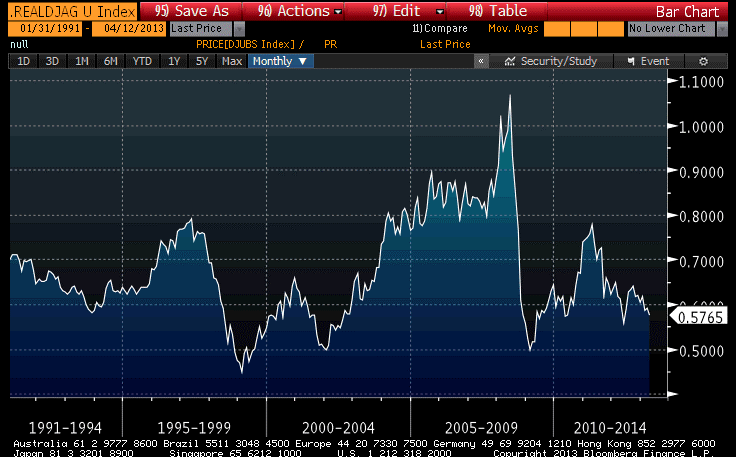
But I don’t think that’s what they are saying. If it is, then those groups are also a bit late to the party – commodity indices, which include additional sources of return, have underperformed inflation by 28% since 2004 and are down about half from the 2008 highs.
Frankly, in the chart below (Source: Bloomberg), which shows the DJ-UBS commodity index divided by the NSA CPI, I don’t see anything which looks like an up-leg of a supercycle, except perhaps the doubling from 2003-2008. Is a 100% gain over five years a “supercycle”?
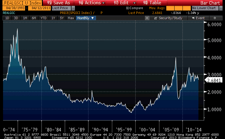
Now, in the SP-GSCI, which has a much greater weight in energy, it looks plausibly like a “supercycle,” as prices tripled in real terms off the lows in 1999 (see Chart, source Bloomberg), and admittedly the chart looks a little feeble at the moment. But that difference is, as I just suggested, mostly due to energy. And if you think the energy supercycle has ended…just short energy, don’t paint all commodities with the ugly brush!
And, by the way, it seems like a pretty wimpy supercycle if the peak in real terms doesn’t even approach the earlier peak.
In nominal terms, all of these charts look different, with the downswings being dampened and the upswings accentuated, because of inflation. But that’s certainly not the right way to look at commodities (or any asset) over time. We don’t care about the nominal return. We care about the real return. And viewed through a real return lens, commodities are much closer to being really cheap than to being really rich!
Obviously, I disagree with all of these groups when it comes to commodities generally. About gold I have no firmly-held opinion about its valuation at the moment, but commodities generally we see as cheap – in fact, we expect triple the real returns from investing in commodities indices over the next ten years compared to equity investing. This is a function of both the very rich absolute valuations of equities and the very cheap absolute valuations of commodities indices.
Moreover, if inflation does in fact accelerate – something which has nothing to do with the weak Michigan or Retail Sales numbers – then commodities will also have terrific nominal returns while equities might well have negative nominal returns.
- English (UK)
- English (India)
- English (Canada)
- English (Australia)
- English (South Africa)
- English (Philippines)
- English (Nigeria)
- Deutsch
- Español (España)
- Español (México)
- Français
- Italiano
- Nederlands
- Português (Portugal)
- Polski
- Português (Brasil)
- Русский
- Türkçe
- العربية
- Ελληνικά
- Svenska
- Suomi
- עברית
- 日本語
- 한국어
- 简体中文
- 繁體中文
- Bahasa Indonesia
- Bahasa Melayu
- ไทย
- Tiếng Việt
- हिंदी
This Commodity Cycle Certainly Hasn’t Been Super
Published 04/15/2013, 12:14 AM
Updated 02/22/2024, 09:00 AM
This Commodity Cycle Certainly Hasn’t Been Super
Latest comments
Loading next article…
Install Our App
Risk Disclosure: Trading in financial instruments and/or cryptocurrencies involves high risks including the risk of losing some, or all, of your investment amount, and may not be suitable for all investors. Prices of cryptocurrencies are extremely volatile and may be affected by external factors such as financial, regulatory or political events. Trading on margin increases the financial risks.
Before deciding to trade in financial instrument or cryptocurrencies you should be fully informed of the risks and costs associated with trading the financial markets, carefully consider your investment objectives, level of experience, and risk appetite, and seek professional advice where needed.
Fusion Media would like to remind you that the data contained in this website is not necessarily real-time nor accurate. The data and prices on the website are not necessarily provided by any market or exchange, but may be provided by market makers, and so prices may not be accurate and may differ from the actual price at any given market, meaning prices are indicative and not appropriate for trading purposes. Fusion Media and any provider of the data contained in this website will not accept liability for any loss or damage as a result of your trading, or your reliance on the information contained within this website.
It is prohibited to use, store, reproduce, display, modify, transmit or distribute the data contained in this website without the explicit prior written permission of Fusion Media and/or the data provider. All intellectual property rights are reserved by the providers and/or the exchange providing the data contained in this website.
Fusion Media may be compensated by the advertisers that appear on the website, based on your interaction with the advertisements or advertisers.
© 2007-2025 - Fusion Media Limited. All Rights Reserved.
