There was a pigs breakfast of mostly positive headlines after the October existing homes sales data was released. My post had a positive spin October 2014 Existing Home Sales Had the Best Month in a Year. The problem for all analysts is that it is impossible to transfer the entire feel of a situation.
Follow up:
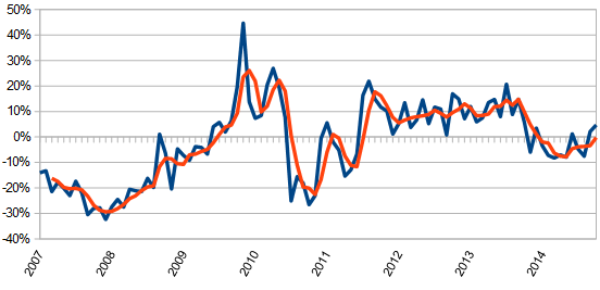
I included the following graph showing the year-over-year gains in existing home sales.
Unadjusted Year-over-Year Change in Existing Home Sales Volumes (blue line) – 3 Month Rolling Average (red line)
Looking back, I have read posts by others - here, here, and here, and all seemed to have similar defects, using an improving rate of year-over-year growth.
The basic issue with the positive spins of October data - after 12 months of depressed home sales, the year-over-year growth is compared to the previous year's depressed growth - and suddenly it is positive (even though it could still be depressed). There is also a factoid concerning Octobers historically - about half the time it spikes compared to the previous month. Finally, of course, one month of data is NOT A TREND.
I am not a lover of seasonally adjusted data - the more you screw with data, the more you obscure the micro-movements which may be indicators of things to come. Here is the seasonally adjusted data which shows a noisy progression of improvement beginning in July 2010:
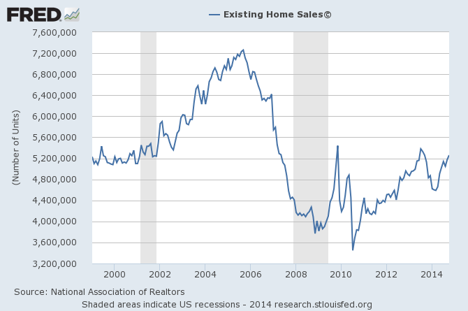
The viewing the unadjusted data (graph below) - one gets a slightly different impression. The similarities between viewing the adjusted and unadjusted data is both show the bottom of home sales in mid-2010 and both show improvement since then. The red line in the graph below is the October data. [Note that author added the red and green lines to the FRED graph].
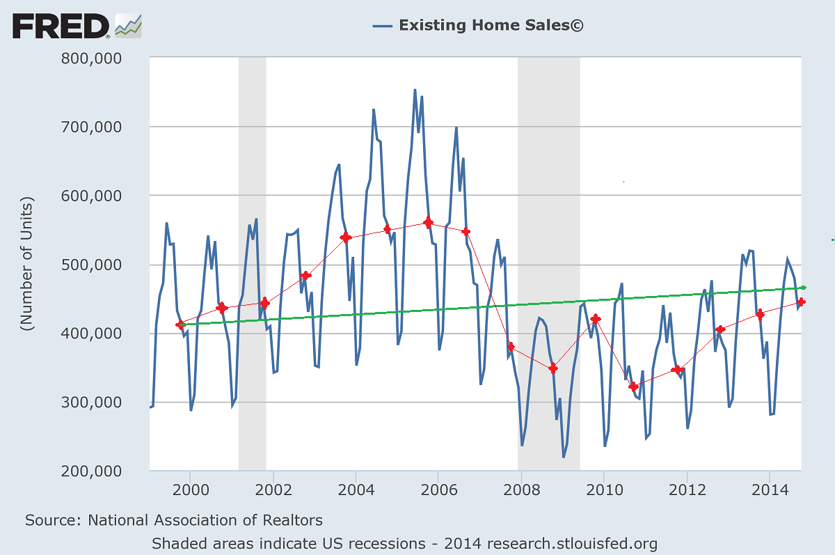
The green line in the graph above is a 1% growth line beginning with 1999 data to account for population growth. I consider the 2000s an abnormal period of home sales with a bubble created from an overheated home sales market of flippers and home purchases by those who could not afford it. Using this sort of logic, it could be argued we are close to a real recovery in home sales.
Whether this analysis is correct would depend on October 2014 home sales not being an anomaly.
Other Economic News this Week:
The Econintersect Economic Index for December 2014 is showing our index on the high side of a tight growth range for almost a year. Although there are no warning flags in the data which is used to compile our forecast, there also is no signs that the rate of economic growth will improve. Additionally there are no warning signs in other leading indices that the economy is stalling - EXCEPT ECRI's Weekly Leading Index which is slightly below the zero growth line.
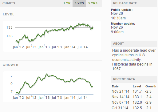
The ECRI WLI growth index value crossed slightly into negative territory which implies the economy will not have grown six months from today.
Current ECRI WLI Growth Index
The market was expecting the weekly initial unemployment claims at 278,000 to 295,000 (consensus 286,000) vs the 313,000 reported. The more important (because of the volatility in the weekly reported claims and seasonality errors in adjusting the data) 4 week moving average moved from 287,750 (reported last week as 287,500) to 294,000. Rolling averages under 300,000 are excellent.
Weekly Initial Unemployment Claims - 4 Week Average - Seasonally Adjusted - 2011 (red line), 2012 (green line), 2013 (blue line), 2014 (orange line)
Bankruptcies this Week: none
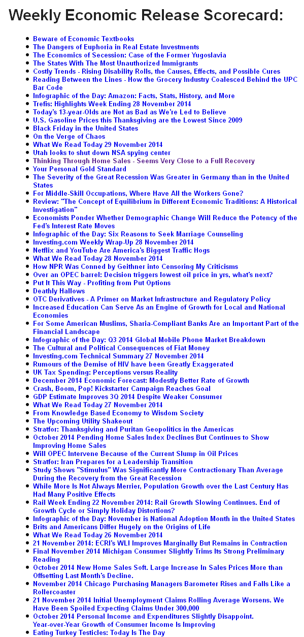
Weekly Economic Release Scorecard:
Click here to view the scorecard table below with active hyperlinks
