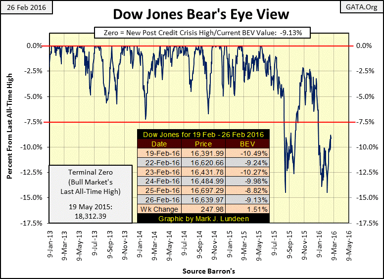
The bulls made some progress this past week. But they have a lot to prove before we can believe the bull market in stocks has resumed. Just look at all the BEV Zeros below (new all-time highs) from January 2013 to May 2015; that’s what an actual bull market looks like on a BEV chart. It’s been 228 trading days (10 months) since the Dow Jones’ advanced to a new all-time high. That’s a long time between new all-time highs in a bull market.
Below we see how the market bottomed last August, and then began to rise in November. Then just as the Dow Jones came within 2.5% of reaching its last all-time high the selling pressure began as the smart money sold into the rising market. Though I believe we are still in the early stages of a massive bear market, I expect we’ll see the Dow Jones break above its -7.5% BEV line in the next few weeks. The real question is whether the selling pressure will once again begin at the BEV -2.5% line – OR – at the -5.0% line, which would be a very bad technical indicator.
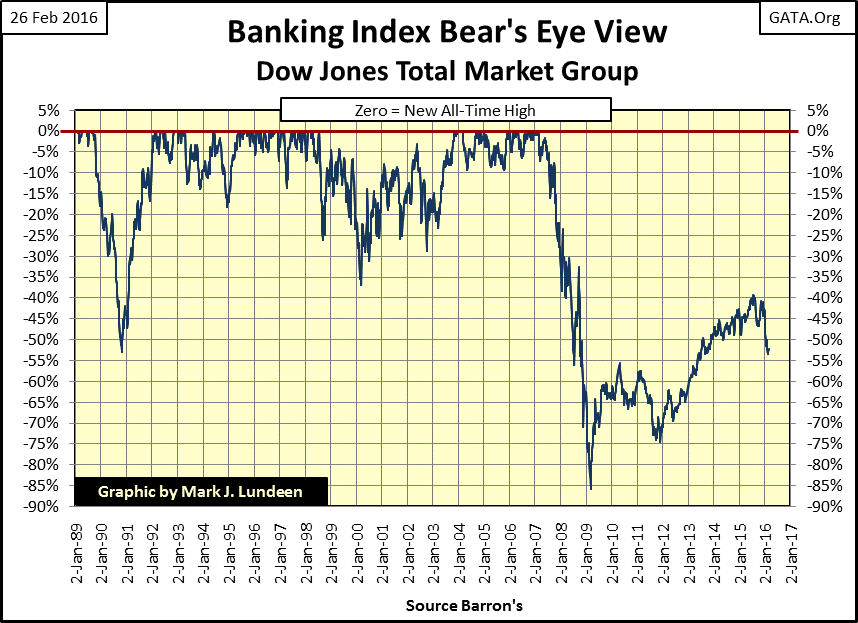
If there’s one market group that will indicate the future direction of the Dow Jones Industrials it would be banking stocks (BEV chart below). Unlike the Dow Jones, the DJTMG Bank Group failed to recover from their credit crisis low to make new all-time highs. But then the banks saw a depression era like collapse of 86% during the credit crisis, while the Dow Jones, with its collapse of only 54% was far from its 89% decline of July 1932.
And keep in mind that during the credit crisis the banks collapsed 86% despite untold trillions of dollars in direct and indirect subsidies and outright “injections of liquidity” from the Federal Reserve, changes in accounting rules and who knows what else. And even after all that they are still trading 54% below their 2007 highs? There is something still terrible wrong with the banks that the past eight years hasn’t fixed yet.
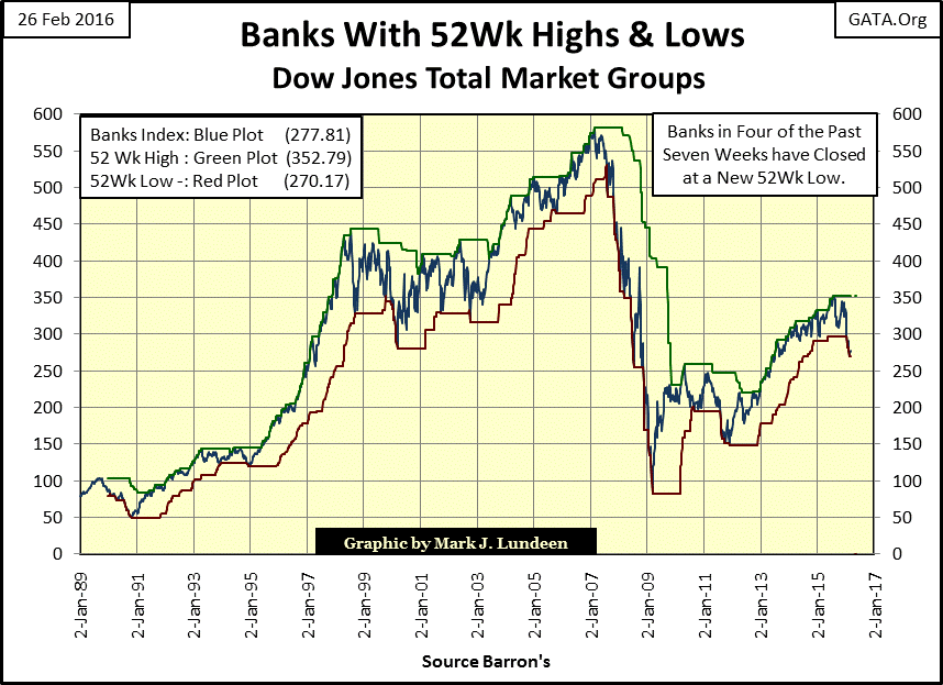
Here is a chart of the DJTMG’s Banking Index using the as published data from Barron’s plotted with its 52Wk Highs and Lows. When these banks began crashing in 2007-08, they took everything else down with them. The problem back then was the same one they have today: the OTC derivative market has bound the global banking system together in a suicide pact.
Deutsche Bank (DE:DBKGn), the current poster child for European banking problems is apparently having problems with its $70 TRILLION dollar derivative book. Because these derivatives function in a totally unregulated market (thanks to Bill Clinton, Alan Greenspan and Robert Rubin), no outsider can really say with certainty what is happening with Deutsche Bank’s derivatives. But should their counterparty failures total into the trillions their failure will bring down many of their counter parties as well. Wall Street’s banks will not escape Deutsche Bank’s downfall unscathed.
Until Mr Bear finally lances this market abscess, problems like this will fester for years with the market plodding on day after day. However an occasional ray of light can be seen peeking outpast the dark clouds.
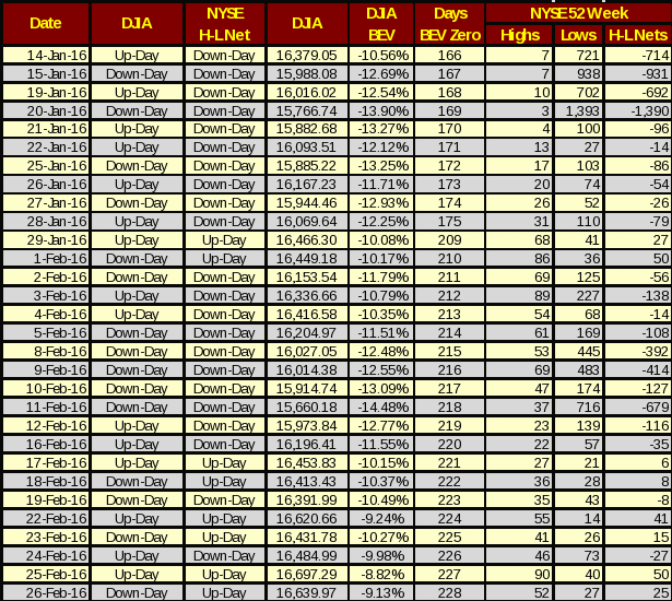
We’re beginning to see days with more NYSE 52Wk Highs than Lows. But the simple fact is that most stocks trading on the NYSE, like the banks in the chart above, are still closer to their 52Wk Lows than they are to their 52Wk Highs. It would take months of cumulative market gains before we could even begin to hope for 52Wk Highs to rise into the high triple digits. However should the Dow Jones’ BEV plot break below its -15% line, which I expect will happen before summer, we’d most likely see well over a thousand new NYSE 52Wk Lows.
The problems the financial markets struggle with today are structural, set in place by economic policies made many decades ago. The next time market valuations stumble there won’t be any more short term fixes to make the pain go away. I blame the disrespect politicians, academics and central bankers have shown to honest money – (gold and silver) since the end of World War Two.
From August 1971 through 2001, trends in US Treasury long bond yields (Red Plot below) and the price of gold (Blue Plot) were closely correlated. Rising bond yields were paired with higher gold prices (and vice versa). This was especially true from August 1971 through January 1980 as consumer price inflation grew from single to double digits. Chronic inflation was eating into the dollar’s purchasing power. The bond market reaction to rising CPI inflation was to demand an inflation premium; so rising bond yields (declining bond prices) went hand in hand with rising gold prices and rising consumer prices.
Gold prices ultimately peaked in January of 1980, but bond yields didn’t peak until October 1981. This peak in bond yields marked the point in time when monetary inflation from the Federal Reserve ceased flowing into consumer prices, and began flowing into financial asset valuations. It was during this first collapse in bond yields (October 1981 to December 1982), that the 1982-2000 bull market in stocks began (in August 1982). Note that declining gold prices followed bond yields down until 2001. It’s important to be aware of these historical relationships. They contradict most “market expert” opinions that rising interest rates support valuations in financial assets, not gold. Actually rising interest rates, bond and dividend yields are hallmarks of bear markets (both stocks and bonds), and bull markets for gold and silver.
The current gold bull market began in 2001, during the 2000-2002 bear market in high-tech stocks. About a year later Doctor Bernanke promised to heave pallets of $100 bills from helicopters should stock and bond prices continue deflating, and this was eleven years before bond yields bottomed in 2012. The 2001 starting point for the bull market in gold was unusual as it coincided with a long running bull market in bonds and two additional bull markets in stocks.
However in 2001 Alan Greenspan was still Chairman of the Federal Reserve. Greenspan did his utmost to reflate the stock market by inflating a new bubble in the American single family housing market. In May of 2005 the Wall Street Journal noted the success Greenspan’s “monetary policy” had had in “injecting liquidity” into lower income housing and the families that live in them.
"Despite the opinions of old sages, many economists led by Federal Reserve Chairman Alan Greenspan see the expansion of credit to lower income families as a sign of progress. Some speak of the 'democratization' of credit. In an April speech, Mr Greenspan said that in colonial times through the late 19th century, only the affluent had access to credit and rates were high. --- Now, Mr. Greenspan says, 'Innovation and deregulation have vastly expanded credit to virtually all credit classes."
-WSJ 17-May-2005
Rising gold and silver prices during the inflationary stage of the sub-prime mortgage bubble is proof that not everyone believed central bankers knew what they were doing. Beginning in 2001 gold and silver prices began to rise as people began purchasing the old monetary metals to shield their wealth from the monetary debacles to come.
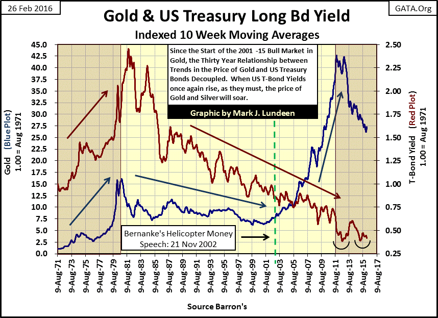
Gold and silver prices have been “correcting” since 2011. Actually it’s more accurate to say the price of gold and silver have been bushwhacked by the same people who in 2011 gave us “Operation Twist” to manipulate long-term bond yields downward.
US T-Bond yields since 2011 have seen a double bottom. Considering that the bull market in bonds has now lasted more than thirty years, (taking T-Bond yields down from 15.04% in 1981 down to below 3.00% since December 2015), while the national debt has increased from less than $1 trillion in 1981 to more than $19 trillion today, it’s not unreasonable to assume that the next significant move in yields and in interest rates will be up.
It’s a hazardous business for market prognosticators to get too specific on the future. This is especially so when central-bank bureaucrats are allowed to fix market prices. But looking at the chart above I feel safe in predicting that either gold, or US Treasury long bond yields (or both) will soon reverse to the upside. These moves will most likely be violent. This will be an early indication that the global central banking cartel is losing what credibility it has left, and a signal for Mr Bear to come back and do what he’s wanted to do since the early 1990s – take out the trash.
Below I’ve plotted US T-Bond Long Bond Yield (Red Plot) along with the Fed Funds Rate (Blue Plot). Seeing the blue Fed Funds plot rise above the red T-Bond Yield shows when tight money policy caused a recession (to check price inflation). The higher the blue plot rises above the red, the tighter money got and the more severe the recession. The lower the blue plot declines below the red, the looser monetary policy got, and the bigger the bubble blown.
I inserted a chart of CinC inflation. The red star marks October 1981 when both bond yields and interest rates peaked. Seeing CinC inflation increase by more than a factor often, and the national debt increase by a factor of nineteen since October 1981 with T-Bond yields declining to levels not seen since the early 1950s is unnatural and bizarre.
Back in October 1981 bonds were seen as a source of income, while today T-Bonds are primarily used as collateral by the global banking system for their derivatives. So even at the current low yields, T-Bonds are still in high demand.
October 1981 also marks a dramatic change in “monetary policy.” Before 1981 the FOMC was not afraid to invert the Fed Funds rate well above bond yields, but very reluctant to invert the curve since then.“Monetary policy” since the end of World War Two has been one of continual inflation. The data below begins in 1954, but by 1958 monetary inflation had resulted in a run on US gold reserves which didn’t end until Nixon “closed the gold window” in August of 1971. From 1954 to 1981, however, monetary inflation had been flowing into consumer prices and wages.
Rising CPI inflation has few real world supporters, but Wall Street and Washington fully supported the FOMC’s inflationary activities as they were the primary beneficiaries of the new dollars being issued. Still, rising interest rates, consumer prices and progressively larger recessions during the period from 1954 to 1981 became problematic even for bankers and politicians.
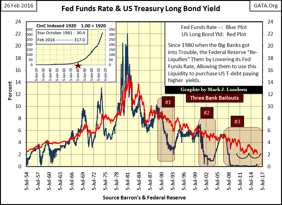
All that changed after October 1981 when monetary inflation stopped flowing into consumer goods prices and began flowing into financial markets. Instead of inflation resulting in rising consumer prices, we now began seeing “bull markets,” and central bankers like Alan Greenspan attained “rock star status.” Greenspan was even knighted by the Queen of England for the destructive bubbles he inflated in financial markets.
With this shift in the flow of inflation from consumer prices to financial assets, “monetary policy” saw a remarkable change. Unlike the FOMC’s response to rising consumer prices before 1981 (sharply inverting the yield curve by raising the Fed Funds Rate far above bond yields), after 1981 the FOMC never again conducted a proper inversion in the yield curve.
Take a moment to compare the yield inversions before and after 1981 in the chart above. After 1981 the inversions were slight and very short in duration, and each successive inversion popped a bubble requiring increasingly large bail outs for the big banks on Wall Street banks.
#1: Leverage Buyout / Junk Bond Bubble
#2: High-Tech Bubble
#3: Mortgage Bubble
If you go back up to my BEV chart for the DJTMG’s Bank Index you’ll see that inversion #1 above resulted in a 53% collapse in the banking stocks. Inversion #2 36%, and inversion #3 an 86% collapse in the DJTMG’s Banking Index.
The maximum yield inversion during bubble #3 (mortgage bubble) was a pathetic fifty-six basis points. Before 1981 the Federal Reserve regularly inverted the yield curve by many percentage points (table below) without apocalyptic consequences. However by raising the Fed Funds rate a mere 0.56% above the T-Bond yields in 2006, the FOMC brought about a global banking collapse and the second largest Dow Jones bear market since 1885. Since December 2008 the Fed Funds rate has flat-lined at near zero percent, unlike any other period since the creation of the Federal Reserve.
In recent months the FOMC has raised the Fed Funds rate by twenty-five basis points (0.25%), despite the protests of their colleagues in the IMF and the BIS, who feared the consequences of this puny increase.This states how fragile the banking system and economy are today, and that any supposed strength underlying the stock and bond markets is largely fictional.
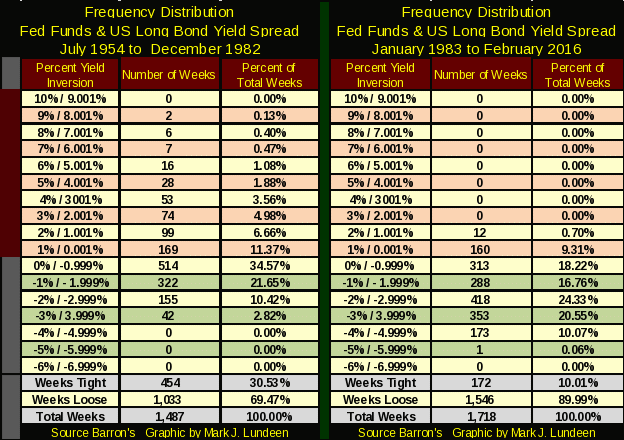
The above chart is a good graphic to identify the periods when the FOMC has set the Fed Funds Rate above or below T-Bond yields, but the frequency distribution table below shows us the exact number of weeks, and just how far above and below the bond yield the FOMC has fixed the Fed Funds Rate. Keep in mind that the left side of the table covering 1954 to 1982 was an inflationary period of monetary history, when monetary inflation was flowing into consumer prices. The right side of the table (1983-2016) covers the period of monetary history when inflation was flowing into financial assets. Placing these two tables side by side is a clear graphic of just how drastically Federal Reserve “monetary policy” has changed since 1983.
Look at the totals at the bottom of the table; it’s shocking how the FOMC has instituted tight money policy (raised the Fed Funds Rate above T-Bond Yields) for just 10% of the 1,718 weeks since 1982. From 1954 through 1982 tight money policy was instituted for 30.5% of the weeks.
When inflation was flowing into consumer prices, the left table shows how steep the FOMC was willing to invert the yield curve. Inversions of 3% to over 8% were not uncommon. However, after 1982 (right side) the FOMC never again inverted the yield curve by more than 2.001%.
What Greenspan, Bernanke and now Yellen have been happy to do since 1983 is to provide “economic growth” (monetary heroin) to the economy and markets by artificially suppressing the Fed Funds Rate far below T-Bond yields. Since 1982 the extremes in “Loose Money” have been scandalous.
The inflationary dollars “printed” by the banking system, at “attractive market rates” are now creating problems in the junk bond market. The US national debt has now increased to more than nineteen trillion dollars. This is a vast sum of money that can never be paid back. To bulls on the stock market these facts are of little concern. If you are concerned you should be buying gold and silver.
For decades the Federal Reserve has been inflating the money supply with few apparent side effects to the broader economy. But all that changed in August 2008, when US Electric Power Consumption’s 52Wk Moving Average (Red Plot below) reached its last all-time high just as the credit crisis approached.
I use Electric Power’s 52Wk moving average to smooth out the seasonal factors for heating and cooling in the raw weekly data (Blue Plot). This is useful to smooth out the wide intra-year fluctuations in power usage since the 1960s (the age of air conditioning).Still these seasonal factors are useful. There is a direct correlation between the heat of any given summer and the public’s demand for EP for air conditioning. Looking at the EP data since 2007 below, a case for “global warming” cannot be made, nor can the Federal Government’s claims for economic growth.
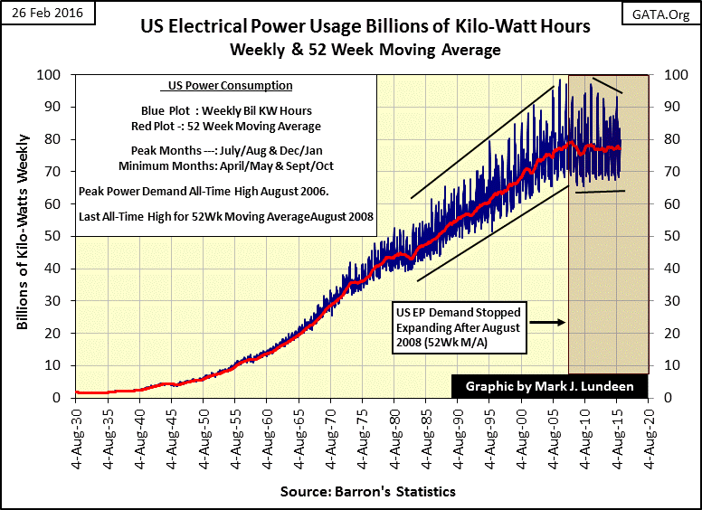
Next up is the Bear’s Eye View (BEV) chart of Electric Power’s 52Wk moving average displaying each new all-time high in EP as a 0%. The Great Depression saw a 277 week gap between new all-time highs in demand for EP. Our current recession has now seen a gap of 394 weeks and still failed to come within 1% of a new all-time high since August 2008.
The most peculiar aspect of the current decline is just how different it is from all the other declines in EP since 1929. The other declines dropped sharply, bottomed, and then recovered to a new all-time high creating a V pattern in the plot. The current decline in EP is totally different. It’s not recovering to make any new highs, but it’s not breaking down to new lows either. For years EP has been fluctuating between its BEV -2% and -4% lines.
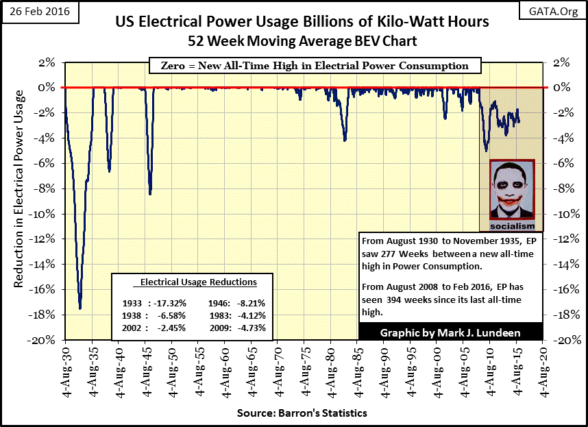
I’ll credit the unseen hand of the FOMC and the Federal Government for EP’s current strange behavior. Since August 2008 there have been massive measures to ward off deflation which have successfully prevented the economy (as seen in EP’s BEV plot) from declining to new lows, but have been unsuccessful at actually stimulating the economy to new highs in demand for in Electric Power.
My expectations are that when Mr Bear eventually returns to claw asset prices down “to market”, we’ll not only see gold and silver rise to prices simply not believable today, but he’ll also drive Electric Power’s BEV plot down to levels not seen since the 1930s.
