Here is an update in response to a standing request from David England, a retired professor now actively educating investors through his Trader's Eye website. In his presentations, he likes to disprove the standard message of Wall Street, "Don't worry! The market will always come back." I furnished David with some charts, and I now share them with regular visitors to my Advisor Perspectives pages.
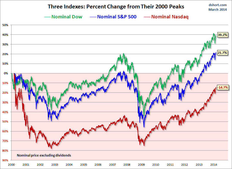
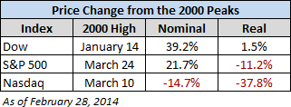
Specifically, David had asked for real (inflation-adjusted) charts of the S&P 500, Dow 30, and Nasdaq Composite. So I created two overlays — one with the nominal price, excluding dividends, and the other with the price adjusted for inflation based on the Consumer Price Index for Urban Consumers (which I usually just refer to as the CPI). The charts below have been updated through today's close.


The charts require little explanation. So far the 21st Century has not been especially kind to equity investors. Yes, markets usually do bounce back, but often in time frames that defy optimistic expectations.
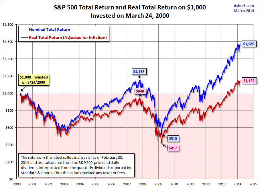
The charts above are based on price only. But what about dividends? Would the inclusion of dividends make a significant difference? I'll close this post with a reprint of my latest chart update of the S&P 500 total return on a $1,000 investment at the 2000 high.

Total return, including reinvested dividends, certainly looks better, but the real (inflation-adjusted) purchasing power of that $1,000 is currently, 14 years later, is only 152 dollars above break-even.
