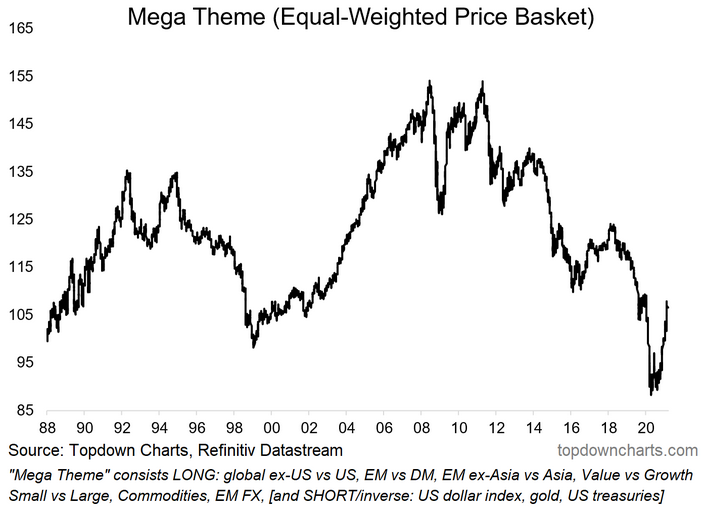
The first chart I featured in the "10 Charts to Watch in 2021" earlier this year was a somewhat unusual, and perhaps even confusing one...
Basically, I decided to combine all my big ideas into one “mega theme” given some of the echoes across the ideas in terms of price action, setup, and macro drivers.
The result is this peculiar chart—which I will explain in more detail in this post, specifically: 1. Why I decided to do this; 2. Why it's worth paying attention to; 3. What specifically goes into it; and 4. What to watch for going forward...

Why did I do this?
To be really precise, I was writing up the intro to the November monthly market cycle guidebook report last year and I sort of just slipped the term "mega theme" in there as a bit of a throwaway line. But then it got me thinking, and a few weeks later I featured it as a topic in the weekly macro themes report (actually was in the final edition of last year).
But aside from the serendipitous development of ideas across the workflows, there is some real method to this: each of the 10 ideas were developed on their own merits in isolation, but each of the ideas share common threads in terms of actual price action, setup (e.g. valuation), and macro sensitivities. There are echoes across the ideas.
So really this is just a useful way of tracking them as a group and capturing that.
Why it's worth paying attention to
The individual ideas (which I outline below) are all fairly critical areas of the market for asset allocators to be paying attention to—particularly as we get later in the cycle and the necessity to get more nuanced with allocations really comes into focus. So it's a quick easy way of staying on top of these ideas.
It's also probably a good way to check in on whether my calls are any good. Basically it's like an equal weighted portfolio of some of my best ideas (although there are a few pretty interesting ideas I haven't included in this).
But the other thing is, as I'll reiterate toward the end of this post in terms of the outlook, the path of this group of assets/markets is intimately linked with the macro picture: as a sweeping generalization, the mega theme basket will benefit from improving growth/inflation. To the extent that the market keeps up with the macro, it will serve as confirmation or a sort of progress check on the global recovery.
What specifically goes into it?
Here's a quick brief on each of the individual ideas (for more detail behind these just email me and I will forward through the relevant reports).
1. Global ex-US vs US: compelling relative value, quirks around sectoral composition, long-term cycles, and the developing technical picture favor rest of the world vs US equities.
2. EM vs DM: relative valuations, absolute valuations, monetary tailwinds, and the logical progression of longer term cycles favor EM over DM.
3. EM ex-Asia vs Asia: within emerging markets the relative value picture across equities and FX favors EM ex-Asia, as does the relative sentiment and cycles backdrop.
4. Value vs Growth: value has become cheaper than usual vs growth and anticipated mean reversion, cyclical sensitivity, and the logical conclusion of the pandemic means value should be due a period of outperformance.
5. Small vs Large: again, relative value, long-term mean/trend-reversion, cyclical sensitivity, and the evolving tactical setup tilt the odds in favor of small vs large; still see upside here despite big run already.
6. Bullish Commodities: started out as a cyclical/tactical view (valuations, technicals, macro, positioning/sentiment), but further exploration of longer term cycles, massive stimulus, a dearth of capex (accentuated by the pandemic) and interesting thematics (decarbonization, space-commerce race) makes a new supercycle seem plausible.
7. Bullish EMFX: cheap valuations, linkages with commodities, and promising medium-term technicals say my 25-currency equal weighted EMFX index likely heads higher further out (again, there is deeper value in EMFX ex-Asia... think commods).
8. Bearish USD: yeah I know it's consensus, but I was there before the crowd and am happy to stay there; expect valuation overshoot to cheap, progression of longer term cycles, fiscal outlook, removal of yield support, to help the case.
9. Bearish Gold: bear gold less bold now as breakdown looks imminent; gold faces headwinds from rising real yields, improving risk sentiment, expensive valuations, and likely flush out of still heavy positioning by the last true-believer holdouts.
10. Bearish Treasuries: expensive valuations, clear macro headwinds as the growth/inflation outlook likely gets better at an accelerating pace, shorter term macro/market divergences point to higher yields yet.
...notice anything?
I already talked about the macro linkages that echo across the ideas and I think that probably stood out fairly clearly. But the other common thread is valuation.
At initiation of each of the ideas listed above, valuation was a major consideration and for many of these ideas the valuation case either is or was based on an extreme reading.
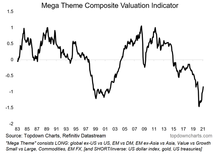
So naturally it made sense to stitch together an equal weighted composite valuation indicator by bringing in the valuation metrics for each of the ideas. What you get is the chart below, and I think it really is quite a remarkable picture...

The combined valuation indicator reached its lowest reading on record in April last year, it subsequently made a furious rebound which has left it marginally higher than the previous low point around the turn of the millennium. My process is grounded in valuation (and rounded with macro and tactical), so I still think this is an incredibly compelling chart, and not one to take lightly as we move forward with what promises to be an interesting decade.
What to watch for going forward
Well, above all else, the first thing to watch for... for me at least, is to keep reviewing each of the individual ideas in isolation to see if they still make sense (e.g. stay the course vs move to neutral vs flip bearish/short). Because this ultra top-down theme was basically built bottom-up (bottom up of top down ideas... can I really say that?).
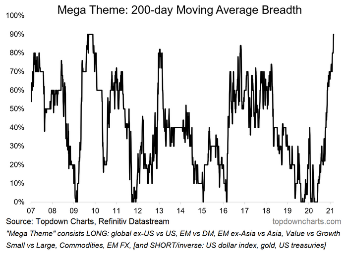
But in terms of tracking the mega theme, I am naturally monitoring price action of the headline basket, the breadth of performance (see chart below), valuations, and of course the evolution of the global macro and thematic picture.

I think it's also quite important to actually pay attention to each of the price action of each of the components just for any signs of impending strength across the rest (or weakness!). For instance, surging commodities have clearly rippled across and likely will do so further.
So basically keep an eye on the components, the basket, and the macro picture.
Summary and takeaways
The asset allocation "mega theme" is a good way of tracking and monitoring the performance of my 10 big global macro/asset allocation ideas for 2021 and beyond. The ideas share common threads around valuation extremes which help the longer term case, while the macro linkages that echo across the ideas help the near-term case. In that sense it will also be a good basket to track in terms of gauging how the recovery is progressing (and whether the market is keeping up with the macro).
It is also a good way to highlight how important taking a more nuanced approach to asset allocation will be as the cycle matures. Further to that, it also represents an about face on some of the big themes and trends that worked very well in previous years (i.e. the big secular downtrend for this basket across the last decade)—should we see further follow through to the upside this will be a rude surprise to investors who have extrapolated past performance into eternity.
This next decade in many ways promises to be nothing like the past 10 years—so be careful how you anchor your expectations and mental models.
