They say that if you do not learn history you are doomed to repeat it. This tenet carries some merit in the world of technical analysis. As prices retest areas of prior battles between buyers and seller, support and resistance, information is divulged to the observer.
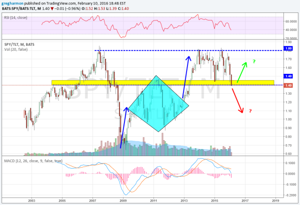
The chart of the ratio of stocks to bonds is at one of those places. The chart below shows the monthly price action in this ratio since 2002 using the liquid ETFs N:SPY and N:TLT. The SPY was carrying the day from 2003 through the peak in 2007. From there it turned over to the bonds ETF TLT to a bottom in 2009. The bounce then met a diamond shaped consolidation from 2009 to 20013, before moving higher out of the Diamond. The run higher tapped out at the prior high ratio of about 1.80.

Since then it has tested both the top and bottom of a range from 1.40-1.45 to 1.80. Looking left on the chart reveals that the ratio has some history between 1.40 and 1.45. This is where it sits mid way through February. At a crossroads. Bonds have been driving higher as stock prices fall. This would put the momentum to the downside.
Will the ratio break through and continue lower to the middle of the Diamond, support in the consolidation? Or will the 1.40-1.45 area act as support again and we see the ratio bounce. This would seem to indicate a reversal in bond yields higher and prices lower, along with stock prices reversing higher. This is a key ratio to watch over the next two weeks to find out.
Disclaimer: The information in this blog post represents my own opinions and does not contain a recommendation for any particular security or investment. I or my affiliates may hold positions or other interests in securities mentioned in the Blog. Please see my Disclaimer page for my full disclaimer.
