Long before the Fed got cute and started to follow the PCE price deflator there was the CRB Index. This was your guide for all things inflation related. It did not get kicked to the curb when the Fed found a better measure. It was adopted by Reuters/Jeffries and carries on today. In fairness, this index measures commodities prices, both hard and soft commodities, so it is not all encompassing like the PCE price deflator. But it does give a good general direction of inflation expectations.
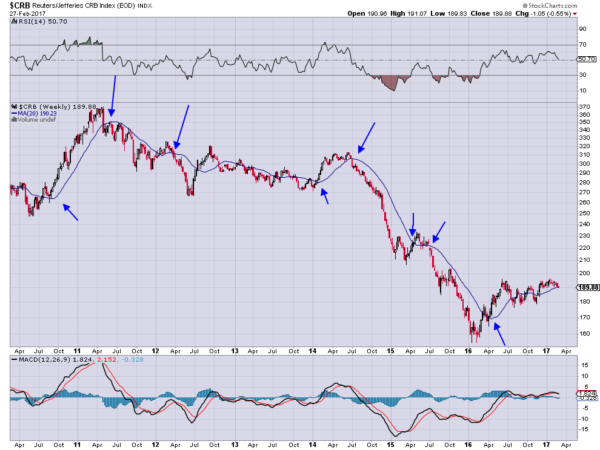
The chart below shows the CRB Index since 2011. Notable is the downward drift through to 2014 and then the plunge to a low in early 2016. The Index bounced then and inflation expectations started to pick up. This of course got the Fed all hot and bothered and they started talking about rate increases. There is a funny thing about talking about raising rates. This impacts expectations of inflation going forward. And what was a strong bounce in the CRB Index has now leveled off and it may be turning lower.

The direction of inflation has been pretty easy to see with hindsight on this chart. Every time the CRB Index has crossed is 100 day SMA (shown as a 20 week SMA on this chart) there has been a change of direction in inflation. Some short and others long, but the major crosses have run. One may be happening now, with a cross down. Of course, the CRB Index might just continue to hold and vacillate around the SMA line as it has done since July. But separation would be an indication that inflation expectations are in check. Watching momentum will give confirmation. A continued move of the RSI below the mid line and the MACD below zero would support a deeper move, not just consolidation. Maybe the Fed has already done its job.
DISCLAIMER: The information in this blog post represents my own opinions and does not contain a recommendation for any particular security or investment. I or my affiliates may hold positions or other interests in securities mentioned in the Blog, please see my Disclaimer page for my full disclaimer.
