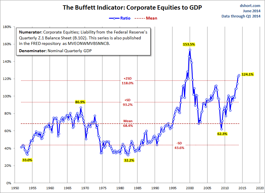
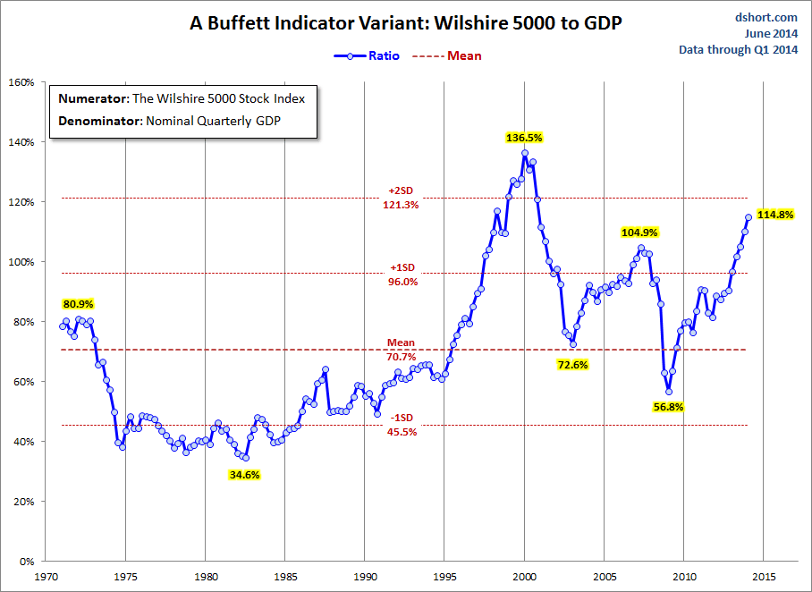
Market Cap to GDP is a relatively long-term valuation indicator that has become popular in recent years, thanks to Warren Buffett. Back in 2001 he remarked in a Fortune Magazine interview that "it is probably the best single measure of where valuations stand at any given moment."
In response to reader requests, I began publishing periodic updates on this metric earlier this year. My most recent update triggered some emails that mostly fall into two categories. The first asks why the big difference between the two "Buffett Indicator" snapshots.
Here are the two versions side-by-side. The one on the left shows the latest valuation at two standard deviations (SD) above the mean. The other one is noticeably lower. Why does one look so much more expensive than the other?
One uses Fed data back to the middle of the last century for the numerator, the other uses the Wilshire 5000, the data for which only goes back to 1971. The Wilshire is the more familiar numerator, but the Fed data gives us a longer timeframe. And those early decades, when the ratio was substantially lower, have definitely impacted the mean and SDs.
To illustrate my point, here is an overlay of the two versions over the same timeframe. The one with the Fed numerator has a tad more upside volatility, but they're singing pretty much in harmony.
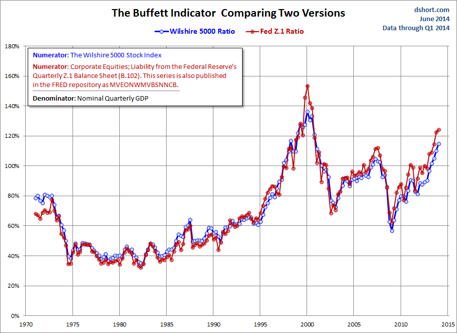
Incidentally, the Fed's estimate for Nonfinancial Corporate Business; Corporate Equities; Liability is the broader of the two numerators. The Wilshire 5000 currently consists of fewer than 4000 companies.
Wouldn't GNP Give a More Accurate Picture?
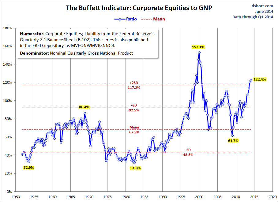
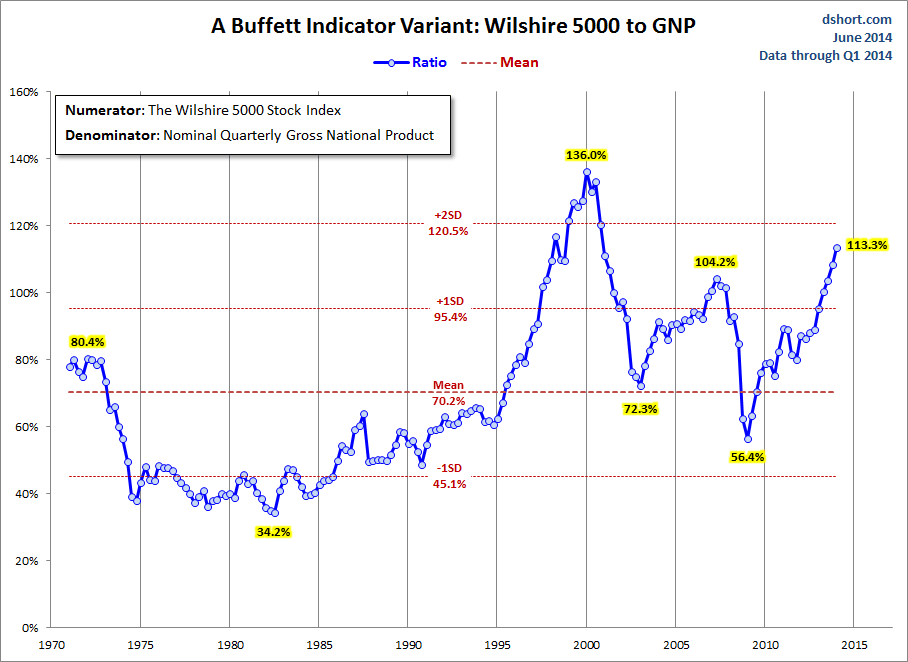
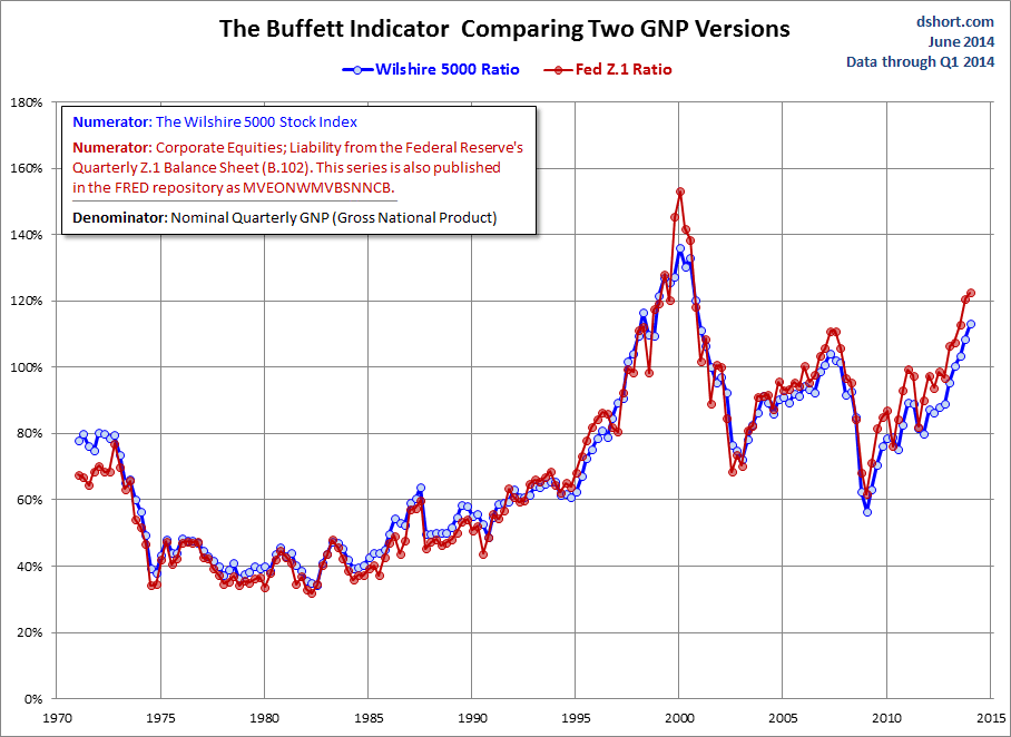
That is another question I've been asked mutiple times. Here is the same calculation with Gross National Product as the denominator; the two versions differ very little from their Gross Domestic Product counterparts.
Here is an overlay of the two GNP versions -- again, very similar.
A final question I've been repeatedly asked is why I don't include the "Buffett Indicator" in the overlay of the four valuation indicators I update monthly. I've not included it for various reasons: The timeframe is so much shorter, the overlapping timeframe tells the same story, and the four-version overlay is about as visually "busy" as I'm comfortable graphing.
I will, however, continue to post periodic "Buffett Indicator" updates.

