Today’s column is short.
I simply want to show you a powerful chart.
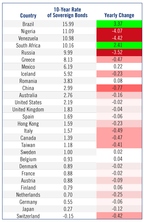
I think this table perfectly exemplifies one of the biggest trends of the last few years. More important, though, I’m convinced it will explode into a huge, market-moving story in 2016.

This table is simple. It shows the benchmark 10-year rate of sovereign bonds from 30 key countries across the planet. It also shows how much rates have moved - and in what direction - over the last year.
I want you to note two key themes...
First, America is an economic delineator. The countries with yields higher than our 10-Year benchmark are on the ropes. Brazil’s GDP shrunk by 4.5% last quarter. China, with rates not all that higher than ours, is dealing with incredible volatility and uncertainty. Even Australia, with its resource-dependent economy, is in a tight spot.
Meanwhile, the countries below America on the list are flat-out stagnant... and are dealing with painful deflation in some cases.
What’s most interesting, though, is the majority of yields fell over the last 12 months. It’s a sign that rate-based stimulus is growing.
I could expound on all the economic rules that were broken this year... or how rising rates in America put us in bad company... but we’ll save that commentary for later.
For now, I simply want to kick off a week of predictions with one of my own: The table above - and everything it represents - will be the biggest investing story of 2016.
