It has been heartening this week to see that bonds are, at long last, started to weaken again. Looking at the intraday ZB chart, you can see the breakdown, particularly in the form of lower highs.
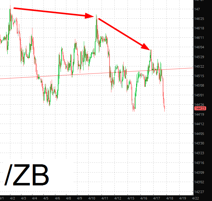
My “big short” for 2018 is, as mentioned many times, bonds. The general premise is “bonds weaken, interest rates rise, real estate falls down” (Palo Alto notwithstanding, of course). The trendline is getting fractured, but I am looking for a full-blown breakdown.
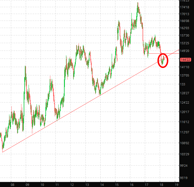
What’s particularly interesting to me is how strongly correlated certain markets are, merely because they are affected by interest rates even though they may be in totally different spheres. Take these two line charts, for instance:
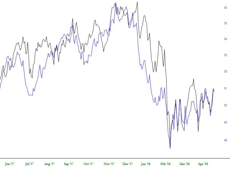
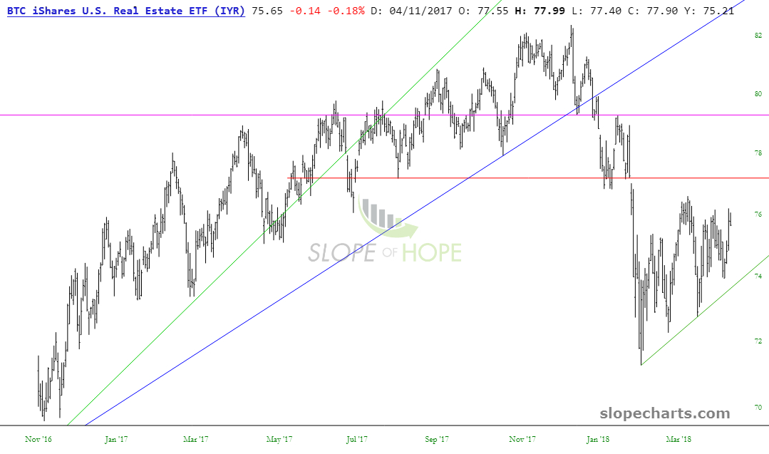
One of them is Real estate (as measured by the IYR ETF):
And the other is the Dow Utilities, as measured by the XLU ETF:
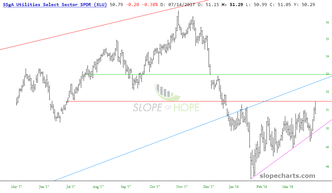
A lot of folks are convinced that bonds and stocks are inversely correlated (e.g. when money is pouring into stocks, the cash gets bored with humdrum bonds and moves over into equities), but by no means is this always the case. I am not letting my belief that equities are going to weaken dampen my enthusiasm for my bearishness on the bond market.
