Street Calls of the Week
What makes the latest installment of the risk rally so interesting is the fact that US Treasurys – “safety” – have not become less attractive to investors even as risk has become only more alluring. In fact, as told by the 10-year yield, Treasurys have gone nowhere but sideways in recent months.
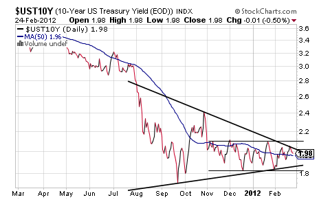
In looking at the daily chart above, however, it appears that the 10-year yield is about to go somewhere and probably pretty fast based on the large Symmetrical Triangle it has been trading in over the last seven months with the consolidation of that pattern nearing an apex that will take the 10-year back toward 3.00% or down near a seemingly impossible 1.00%.
Frankly, this pattern should break to the upside with the Symmetrical Triangle acting as an excellent reversal at bottoms with the need for a bottom showing in the one-year chart to a degree but really showing rather well in a more than 20-year long chart below.
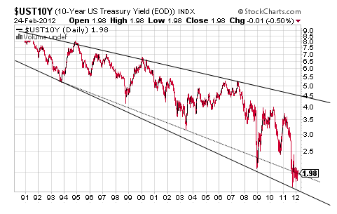
Interesting, though, is the fact that the Symmetrical Triangle presents less as a bottoming opportunity in that long-term view and more like a bearish appendage pattern of some sort. Such a possibility is worth noting not just because it suggests an implosion in risk of some sort but because it suggests that the 10-year yield’s Descending Broadening Formation is about to be breached badly to the downside.
Technically, this sort of breaching of such a long-term technical aspect seems somewhat unlikely, but it happened in 2009 and again last year to the original bottom trendline and so it could happen once again with the actual bottom trendline at 1.50%, and thus a downside breaching could be as low as 1.00% to be in-line with last year’s breach of the original trendline.
Put otherwise, the 10-year yield’s Descending Trend Channel should support its Symmetrical Triangle taking the 10-year yield back up to 3.00%, but it does not preclude the possibility of a downside breach to 1.00% on, again, what appears to be more of a bearish appendage in the longer-term context.
What makes such a potential drop by the 10-year yield toward 1.00% most interesting is the fact that it appears to be supported by another long-term chart and that is of the VIX and my latest charting obsession.
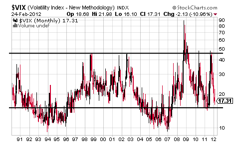
Over the last five years in particular, the VIX has found strong support right around 16 before spiking higher toward 50 or significantly higher in the case of 2008.
Considering that the VIX has been nosing around down near 16 in recent weeks suggests it will not be long before it spikes higher as an indication of rising volatility on a round of risk off and something that will probably be accompanied by the price of Treasurys moving higher as yield pushes lower yet, toward 1.00%, with the two trading inverse.
In fact, the VIX futures for March and April are above 20 and something that suggests investors believe the risk of risk-off is rising even as the risk assets trade up on vapors.
It is that sort of dichotomy that is showing up in the charts of failed and stretched bearish patterns in the equity charts over the last two months, but the bones in that graveyard of failed bearish patterns could rattle yet in the form of maybe not a flash crash but some sort of very fast 5-10% decline that could come when it is little expected by most people.
Put otherwise, the internals of the risk markets may not be as healthy as the markets appear on the outside and something that could come calling in a very fast round of risk off, or even the fast flight to liquidity detailed at the end of last year, with most things in the financial markets, and life, taking longer and going further than seems possible initially.
It is this outcome that would show up in the 10-year dropping toward 1.00%, the VIX spiking toward 50 and the S&P dropping well below its 200 DMA and something that seems to be mutually-supported by these three charts.
What the fundamental “something” driving such a potential move turns out to be is to be seen, but it is showing in charts everywhere and rather clearly in those of the 10-year and the VIX.

In looking at the daily chart above, however, it appears that the 10-year yield is about to go somewhere and probably pretty fast based on the large Symmetrical Triangle it has been trading in over the last seven months with the consolidation of that pattern nearing an apex that will take the 10-year back toward 3.00% or down near a seemingly impossible 1.00%.
Frankly, this pattern should break to the upside with the Symmetrical Triangle acting as an excellent reversal at bottoms with the need for a bottom showing in the one-year chart to a degree but really showing rather well in a more than 20-year long chart below.

Interesting, though, is the fact that the Symmetrical Triangle presents less as a bottoming opportunity in that long-term view and more like a bearish appendage pattern of some sort. Such a possibility is worth noting not just because it suggests an implosion in risk of some sort but because it suggests that the 10-year yield’s Descending Broadening Formation is about to be breached badly to the downside.
Technically, this sort of breaching of such a long-term technical aspect seems somewhat unlikely, but it happened in 2009 and again last year to the original bottom trendline and so it could happen once again with the actual bottom trendline at 1.50%, and thus a downside breaching could be as low as 1.00% to be in-line with last year’s breach of the original trendline.
Put otherwise, the 10-year yield’s Descending Trend Channel should support its Symmetrical Triangle taking the 10-year yield back up to 3.00%, but it does not preclude the possibility of a downside breach to 1.00% on, again, what appears to be more of a bearish appendage in the longer-term context.
What makes such a potential drop by the 10-year yield toward 1.00% most interesting is the fact that it appears to be supported by another long-term chart and that is of the VIX and my latest charting obsession.

Over the last five years in particular, the VIX has found strong support right around 16 before spiking higher toward 50 or significantly higher in the case of 2008.
Considering that the VIX has been nosing around down near 16 in recent weeks suggests it will not be long before it spikes higher as an indication of rising volatility on a round of risk off and something that will probably be accompanied by the price of Treasurys moving higher as yield pushes lower yet, toward 1.00%, with the two trading inverse.
In fact, the VIX futures for March and April are above 20 and something that suggests investors believe the risk of risk-off is rising even as the risk assets trade up on vapors.
It is that sort of dichotomy that is showing up in the charts of failed and stretched bearish patterns in the equity charts over the last two months, but the bones in that graveyard of failed bearish patterns could rattle yet in the form of maybe not a flash crash but some sort of very fast 5-10% decline that could come when it is little expected by most people.
Put otherwise, the internals of the risk markets may not be as healthy as the markets appear on the outside and something that could come calling in a very fast round of risk off, or even the fast flight to liquidity detailed at the end of last year, with most things in the financial markets, and life, taking longer and going further than seems possible initially.
It is this outcome that would show up in the 10-year dropping toward 1.00%, the VIX spiking toward 50 and the S&P dropping well below its 200 DMA and something that seems to be mutually-supported by these three charts.
What the fundamental “something” driving such a potential move turns out to be is to be seen, but it is showing in charts everywhere and rather clearly in those of the 10-year and the VIX.
