In this past weekend’s missive, I discussed the market once again retesting support at the 200-dma.
“As stated, the market did defend its 200-dma and is very close to reversing its short-term ‘sell signal.’”
“That’s the good news.
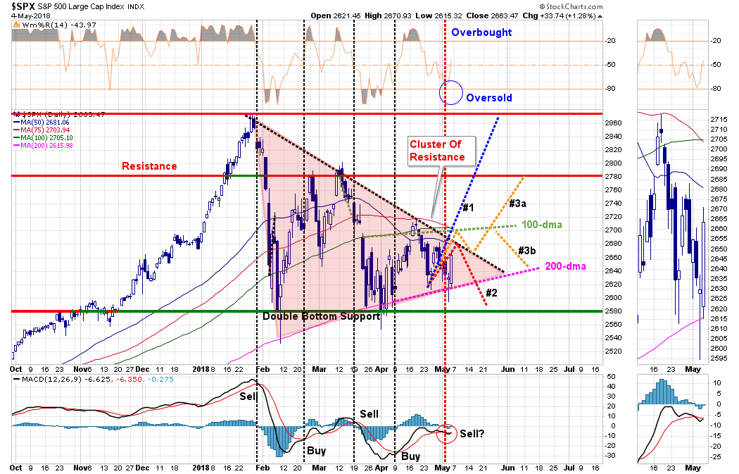
The not so good news is that while the market did muster a rally on Friday, it still remains well-entrenched within the ongoing consolidation/correction process.”
As you can see in the “reddish triangle,” prices have been continually compressed into an ever smaller trading range. This “compression” is akin to coiling a spring. The more tightly the spring is wound, the more energy it has when it is released.
More importantly, these “compressions” can not go on indefinitely and will resolve themselves. It is a binary outcome. Currently, we have now reached the point where we will likely see a “conclusion” within the next several days to a couple of weeks at the most. So, exactly what does that mean?
When these compressions normally occur in a rising market trend, they historically resolve themselves to the upside. However, as discussed in a moment, there are many factors at work currently which makes “betting” on a positive outcome substantially riskier.
The chart below shows the total expected range, based on the initial decline, of a breakout of the consolidation range. As I discussed this past weekend, I am using a “weekly chart” to smooth out daily volatility which means the next update on the chart will be in this coming weekend’s newsletter.
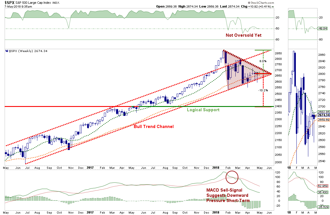
If the market can break back above the current downtrend from the previous highs, a push to the top of the longer-term overhead bullish trend line is quite logical. That line has served as the peak of the current advance since the conclusion of the correction in early 2016.
A break downward, however, has substantially different connotations. Such a break will likely see the broader market step back to the 2400 level. Such a decline will definitely change the current “tone” of the market toward a more negative bias. If a breakdown does occur, the risk of being more aggressively invested in equities rises markedly.
I continue to “hope” for a more bullish conclusion to this corrective process. We remain invested in equities currently, although we are holding more cash than normal, and a more positive development would allow us to move equity exposure back towards full allocations.
As stated above, while we “hope” for a more bullish outcome, we will “wait” for it to occur before committing more capital towards “risk.”
Remember, “risk” is how much you lose when you are “wrong.” Waiting for the market to “tell us” where it is going next reduces that risk substantially.
We’ve Seen These Before
The rally on Friday and Monday, while certainly encouraging, has been little more than a short-covering, oversold, bounce currently. As noted above, the intermediate-term signals have been little changed as of yet and we have seen these rallies before.
During a corrective process, it is not uncommon to see sharp, reflexive rallies. Also, after two particularly rough months of trading, it would not be surprising to see a month of more positive price action. This is why we continue to give pathways #3a and #3b the most weight currently as noted in the first chart above.
On a longer-term basis, we remain focused on the potential triggering of our longer-term sell-signal. As shown below, these signals are rare and have previously coincided with more serious declines than what we have seen to date. Again, as stated above, the long-term weekly moving average (green line) current intersects at 2400.
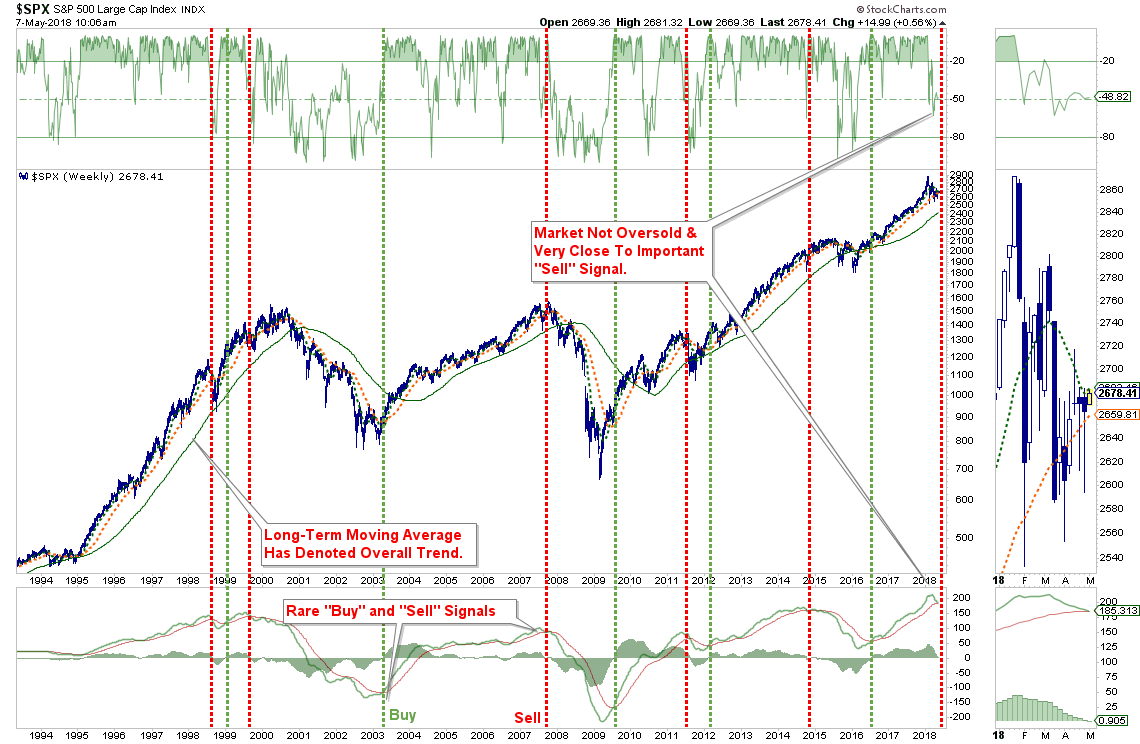
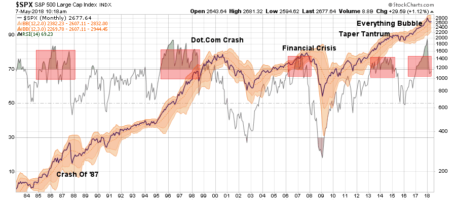
More importantly, when long-term indicators turn lower, they tend to precede longer-term correction processes. We previously addressed the massive overbought condition represented by the monthly relative strength index. As shown below, it is not the rise in the RSI that becomes problematic for the market, but the decline. While the extreme extension of the RSI index has begun to decline, it still has a much more to fall before returning back to levels more normally associated with bull market advances. Also, notice that RSI has previously peaked and began to decline several months prior to the onset of a more important corrective period or outright bear market.
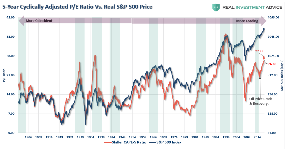
Valuations also have begun to decline which tends to lead more important corrective market actions. This is particularly something to watch as we have likely reached peak earnings for this current cycle. (Year-over-year comparisons will begin to become much more problematic as we head into 2019.)
The chart below is a cyclically-adjusted price to earnings ratio based on a 5-year average of reported earnings. It is a bit more sensitive to market turns than use a 10-year average. (Read this)
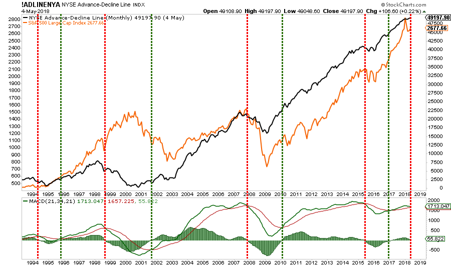
The monthly advance-decline line has also started to flatten out and is close to registering a monthly “sell” signal. Again, as with all monthly signals, changes occur on a significantly slower basis and are much more important to pay attention to. Importantly, these signals are only updated AFTER the close of each monthly period so a very sharp rally between now and the end of the month could keep the signal from triggering. It is just something we are paying very close attention to currently.
Lastly, despite the recent corrective process, investors still remain primarily allocated to equities as shown by the Rydex allocation measures below. With the market below its bullish trendline from the 2016 lows, Rydex Bear and Cash allocations remain at low levels while bullish allocations have not fallen much from their recent highs.
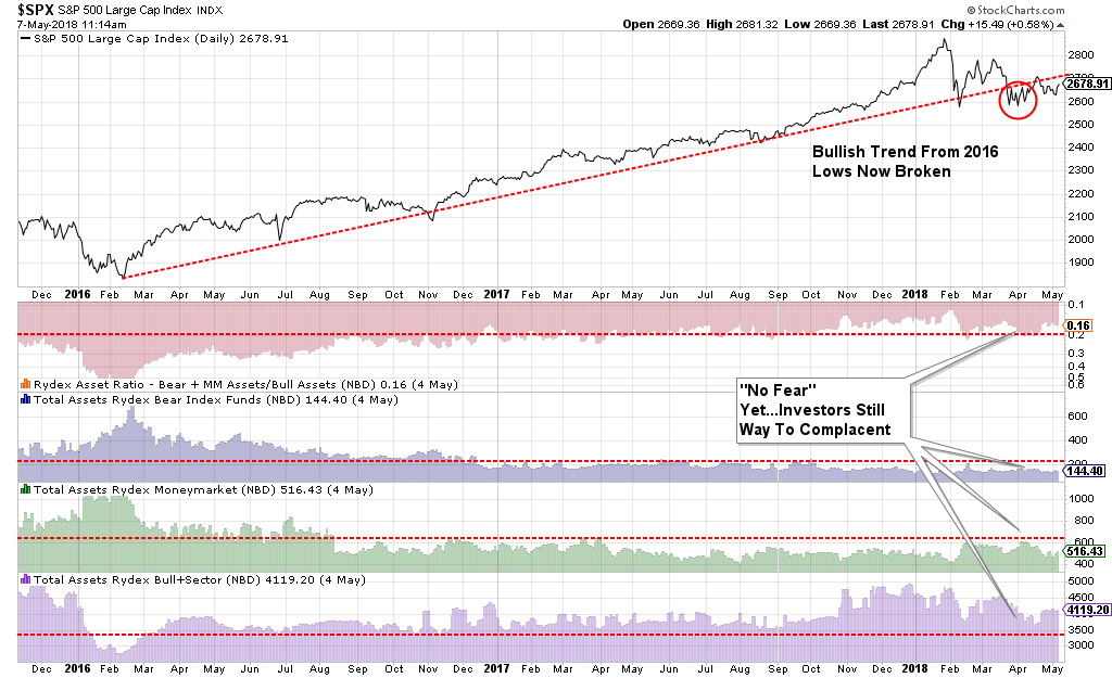
If the market does break down out of the current consolidation process, the decline could well be fueled by a sudden shift out of long-asset exposure. In other words, investors haven’t “panicked” yet.
While “everyone loves a good bullish thesis,” the reality is that several changes are occurring simultaneously that have chipped away at the markets previous pillars of support:
- The Fed is raising interest rates and reducing their balance sheet.
- The yield curve continues to flatten and risks inverting.
- Credit growth continues to slow suggesting weaker consumption and leads recessions
- The ECB has started tapering its QE program.
- Global growth is showing signs of stalling.
- Domestic growth has weakened.
- While EPS growth has been strong, year-over-year comparisons will become challenging.
- Rising energy prices are a tax on consumption
- Rising interest rates are beginning to challenge the valuation story.
While there have been several significant corrective actions since the 2009 low, this is the first correction process where liquidity is being reduced by the Central Banks.
The current correction process is coming to an end, and soon. The only question is simply which way it breaks?
My suspicion is that even if the market breaks out to the upside, the advance may be somewhat limited as investors remain way too “complacent” currently.
