A new year has started, but the performance view for the major asset classes doesn’t look all that different from the final days of the old year, at least not yet. Let’s consider how the numbers stack up with a set of ETF proxies using a 250-trading-day window. By that standard, US equities are still in the lead, although the performance edge has weakened a bit. Meanwhile, there’s still plenty of red ink at the opposite end of the return spectrum.
Stocks in the United States are up more than 27% through yesterday, January 13, based on the Vanguard Total Stock Market ETF (VTI). At the far end of the losing side of the ledger: a broad measure of commodities, as tracked by the iPath DJ-UBS Commodity ETN (DJP).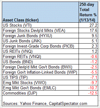
For another perspective, let’s graph the return histories for each of the major asset classes for the past 250 trading days. The next chart shows the performance records through January 13, 2014, with all the ETFs rebased to 100 as of January 15, 2013: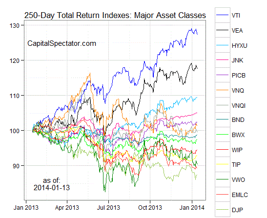
Now let’s review an ETF-based version of a passive, market-value-weighted mix of all the major asset classes--the Global Market Index Fund, or GMI.F, which is comprised of the ETFs in the table above. Here's how GMI.F stacks up for the past 250 trading days through January 13, 2014. This investable strategy is higher by 11% over that span, or roughly midway between the returns for US stocks (VTI) and US bonds (BND) for the same period.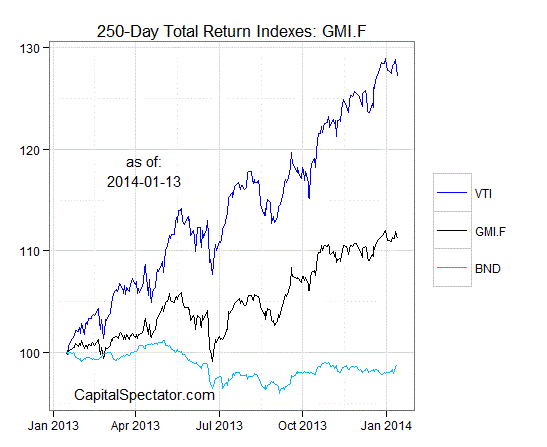
Comparing the overall dispersion of returns for the major asset classes via ETFs suggests that the rebalancing opportunity is relatively middling for GMI.F vs. recent history. Analyzing the components of GMI.F with the rolling median absolute deviation of one-year returns for all the funds--the GMI.F Rebalancing Opportunity Index, as it's labeled on these pages--suggests that there’s average potential for adding value by reweighting the portfolio in comparison with the past several weeks. 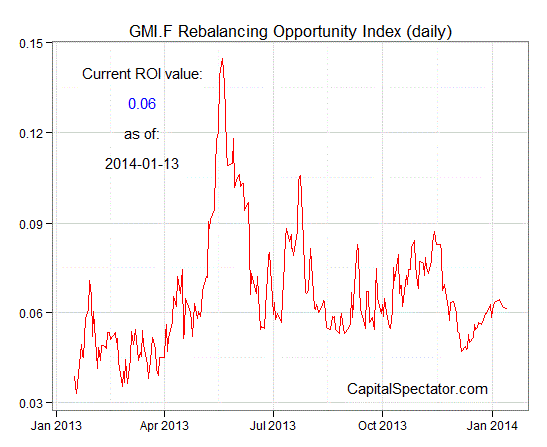
Finally, let’s compare the rolling 1-year returns (defined here as 250-trading-day performance) for the ETFs in GMI.F via boxplots. (Keep in mind that the historical records for these ETFs vary due to different launch dates). The gray boxes in the chart below reflect the middle range of historical returns for each ETF—the 25th to 75th return percentiles. The red dots indicate the current 1-year return (as of Jan. 13) vs. the 1-year return from 30 trading days earlier (blue dots, which may be hiding behind the red dots in some cases). Note that US stocks (VTI) remain in the lead in absolute and relative terms vs. the other asset classes.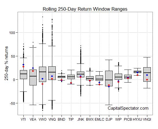
- English (UK)
- English (India)
- English (Canada)
- English (Australia)
- English (South Africa)
- English (Philippines)
- English (Nigeria)
- Deutsch
- Español (España)
- Español (México)
- Français
- Italiano
- Nederlands
- Português (Portugal)
- Polski
- Português (Brasil)
- Русский
- Türkçe
- العربية
- Ελληνικά
- Svenska
- Suomi
- עברית
- 日本語
- 한국어
- 简体中文
- 繁體中文
- Bahasa Indonesia
- Bahasa Melayu
- ไทย
- Tiếng Việt
- हिंदी
Stocks In The US Are Up More Than 27%
Latest comments
Loading next article…
Install Our App
Risk Disclosure: Trading in financial instruments and/or cryptocurrencies involves high risks including the risk of losing some, or all, of your investment amount, and may not be suitable for all investors. Prices of cryptocurrencies are extremely volatile and may be affected by external factors such as financial, regulatory or political events. Trading on margin increases the financial risks.
Before deciding to trade in financial instrument or cryptocurrencies you should be fully informed of the risks and costs associated with trading the financial markets, carefully consider your investment objectives, level of experience, and risk appetite, and seek professional advice where needed.
Fusion Media would like to remind you that the data contained in this website is not necessarily real-time nor accurate. The data and prices on the website are not necessarily provided by any market or exchange, but may be provided by market makers, and so prices may not be accurate and may differ from the actual price at any given market, meaning prices are indicative and not appropriate for trading purposes. Fusion Media and any provider of the data contained in this website will not accept liability for any loss or damage as a result of your trading, or your reliance on the information contained within this website.
It is prohibited to use, store, reproduce, display, modify, transmit or distribute the data contained in this website without the explicit prior written permission of Fusion Media and/or the data provider. All intellectual property rights are reserved by the providers and/or the exchange providing the data contained in this website.
Fusion Media may be compensated by the advertisers that appear on the website, based on your interaction with the advertisements or advertisers.
© 2007-2025 - Fusion Media Limited. All Rights Reserved.
