Ukraine war hype, China demand drop, GOFO mysteries… these are the short-term noise inputs on the Gold sector.
US Treasury bond yield spreads, gold vs. commodities (i.e. the ‘real’ price of gold), gold vs. the stock market… these are some of the fundamental considerations that actually matter and they have taken a hit since January.
It is easy to say ‘I am bullish in the big picture’ (measured in years) but it is not so easy to actively manage in the smaller pictures (measured in days, weeks and months) with all of the above noise inputs and more bombarding the poor individual player.
We use shorter-term charts to manage the shorter time frames. Daily charts have most recently indicated a bearish set up as bear flags formed across the precious metals complex (with the exception of silver, which never got going to begin with) last week. Weekly charts continue to indicate that an extended and oh so grinding bottom may be forming, but that includes the potential for ups and downs, also known as volatility.
Happy Birthday, Bull
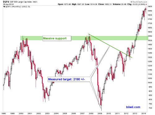
There is also a lot of noise lately in the stock market. The US stock bull celebrated its 5th birthday last month. The last 2 cycles (the manic phase of the secular bull ended 2000 and the cyclical bull ended 2007) were each approximately 5 years long. Today let’s retreat to the calm of the long term monthly charts and get a snapshot of the big picture.
The S&P 500 has a measured target of around 2190 that we have had open as a possibility since the big breakout occurred in early 2013. A measured target is just that, a measurement; simple math. It is not a directive and therefore 2190 is not hype, it is just a possibility.
While we are seeing some shorter term signs that the S&P 500 may not make it to that target (at least pending a test of the big breakout) the chart does not lie. A breakout occurred off of a giant pattern that had its low 5 years ago. A 5 year cycle in the SPX could simply entail a decline to the breakout support. That would probably occur within the context of a mild cyclical bear market. Indeed, we will only manage such a potential decline for now rather than force other interpretations on the chart at this point.
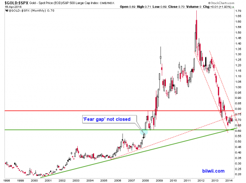
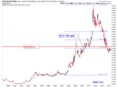
Gold vs. the SPX appears to be boxed in above support and below resistance. Notably, Gold-SPX has not closed the 2008 ‘fear gap’ as it has the 2010 Euro ‘fear gap’…
Yet even in European market terms gold has some resistance to deal with.
Gold vs. stock market ratios are among several fundamental considerations (most of which are beyond the scope of this article) that must come in line for an investment case to form in the gold mining sector.
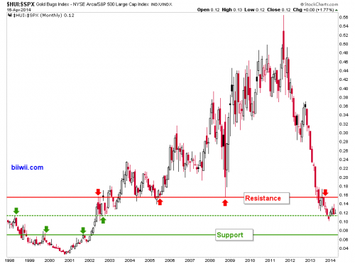
ARCA Gold BUGS vs. SPX is making a potential bottom at a valid support level. That bottom would not be confirmed however, until significant resistance noted on the chart is exceeded.
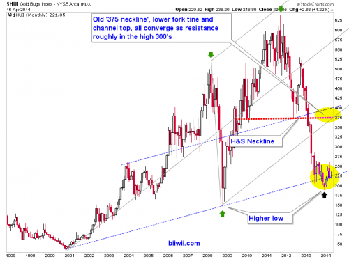
Nominal HUI seems really busy but in reality it is very simple. There is a potential bottoming pattern trying to make a higher low to 2008. This is what we have called a “grind” and it is doing its job on people only looking at shorter term views. Those looking at pictures like the above will be very interested to see if this bottoming process holds up or fails.
Again, we note that despite what the conspiracy detectives uncover to rationalize gold’s smack downs, the fundamental backdrop (including everything from a weak ‘real’ price of gold to a strong US economy) has not been good. It will take routine check ups on these fundamentals and the technicals over much shorter time frames to ensure being positioned properly for the time when opportunity arises.
We are all human and part of being human is thinking like a human; thinking rational thoughts, having rational hopes and aspirations. But the markets eat that stuff for breakfast, puke it up and have it again for lunch. People simply have to learn how to be less like people and more like components of the market and always be in alignment with what the market decides.
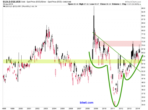
Anyway, as often happens, I digress. On to our final chart, the Gold-Silver ratio (GSR).
This chart may bode ill for the precious metals sector in the short term, but a breakout in the GSR would most likely go hand in hand with major problems for global stock markets because GSR itself traditionally goes hand in hand with draining liquidity. That has made what has gone on with US stocks over the last couple of years somewhat of an anomaly.
Precious metals got destroyed, commodities go whacked and global markets varied. US stocks received the benefit of current inflation operations because Goldilocks applied deflationary pressure – which the GSR may well be indicating – to temporarily at least, offset these conditions. This pressure took the form of China’s economic deceleration, ongoing deflationary issues in Europe and other drags on the global economy, in which the US participates.
In 2010 GSR declined impulsively with the Fed’s QE2 hyper liquidity operation. Since 2011 it has ground higher, chewing up precious metals (and to a lesser degree, commodity) investors first and now, with a potential breakout in view, it may have stock market investors in its sights.
Now, will GSR break out? I don’t have that answer. The answers I do have are that if it does break out to new recovery highs, stocks will be very vulnerable and that somewhere within the fallout, the gold sector should be among the first to recover.
Another possibility is that the hyper liquidity of 2010 (GSR down spike) simply evened out the hyper liquidity drainage of 2008 (GSR up spike) and now it will muddle along. So we might not necessarily expect dynamic events across markets in 2014. Those make great headlines, but we may simply be in line for more slugging it out between stock bulls and bears, and gold bugs vs. gold bears.

