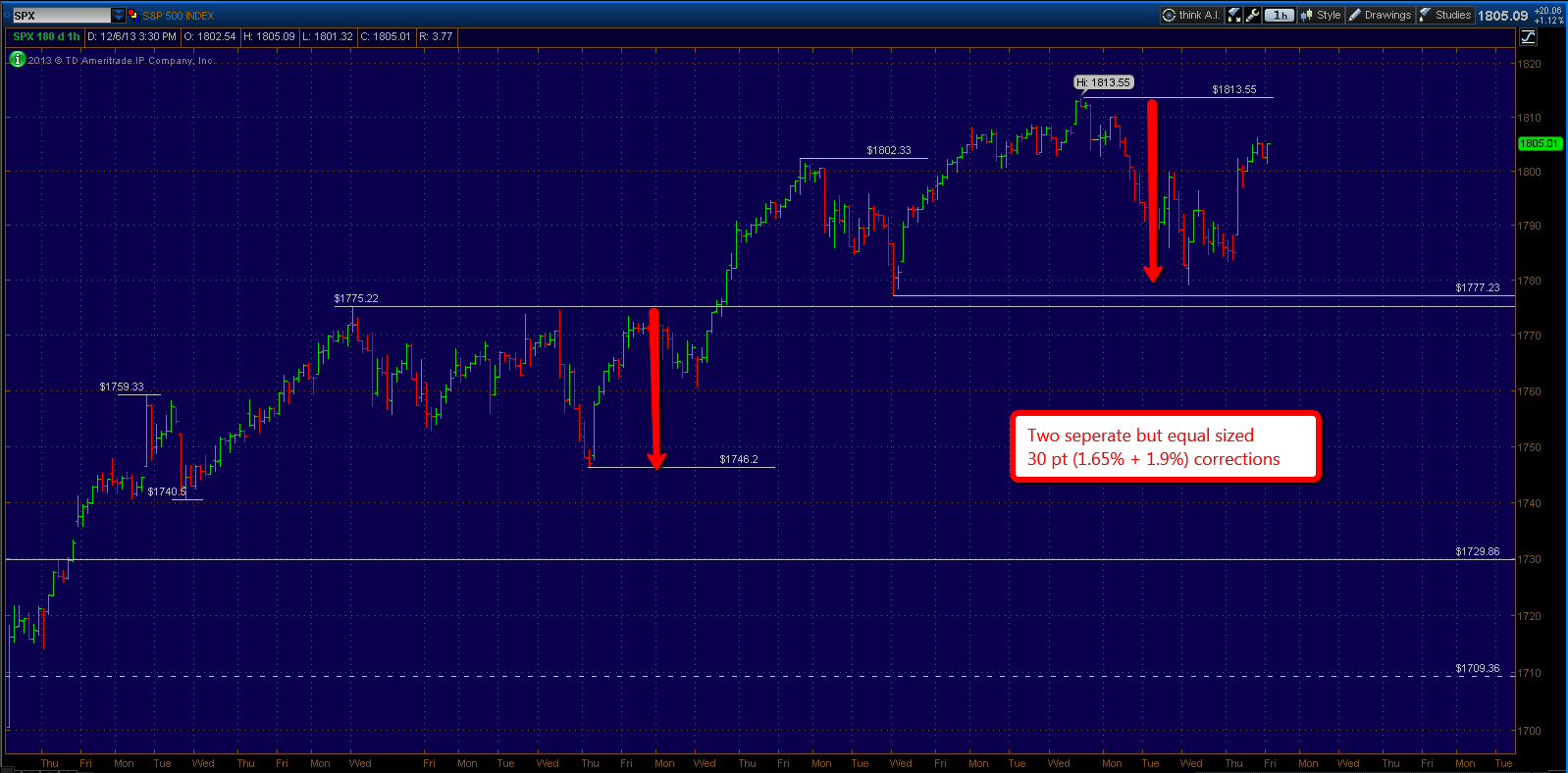
The markets finished the week strong off a solid NFP employment report, however still could not close positive for the week and in turn ends the 9 week winning streak for the S&P 500. The major average experienced a short term correction leading into the report, adding up to an approximate drop of 30 points from highs. This drop was in line with the previous short term correction off the highs at 1775, which equated to roughly 30 points as well.
Although the drop didn't quite reach strong support which is defined on the chart above between 1775 and 1777, Friday's clear rejection of prices below signals that the low at 1780 that formed this week likely ended the correction. So far I see no selling pressure that breaks the rhythm of this current up trend. The expectation now becomes an upside target around 1850 in the S+P 500.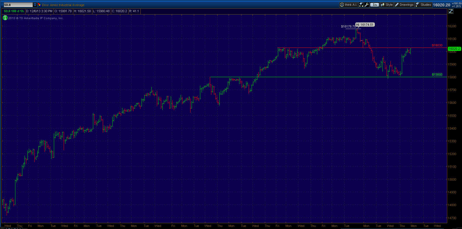
Even though the S&P 500 did not quite make it to support, the Dow did in fact underperform and probe lower into its strong support equivalent as defined on the chart above. The Dow chart looks a little more concerning as it in fact saw its biggest decline since the October low and is underperforming since. I would need to at least see a push back above 16,030 (Red Horizontal line) soon and it is worth monitoring in the mean time. A failure would likely take the Dow back to the 15,500 vicinity in the near term.
If you have followed the web site you know my feelings on the overall trend being overextended at this point. So any and all signs of weakness really needed to be treated with respect.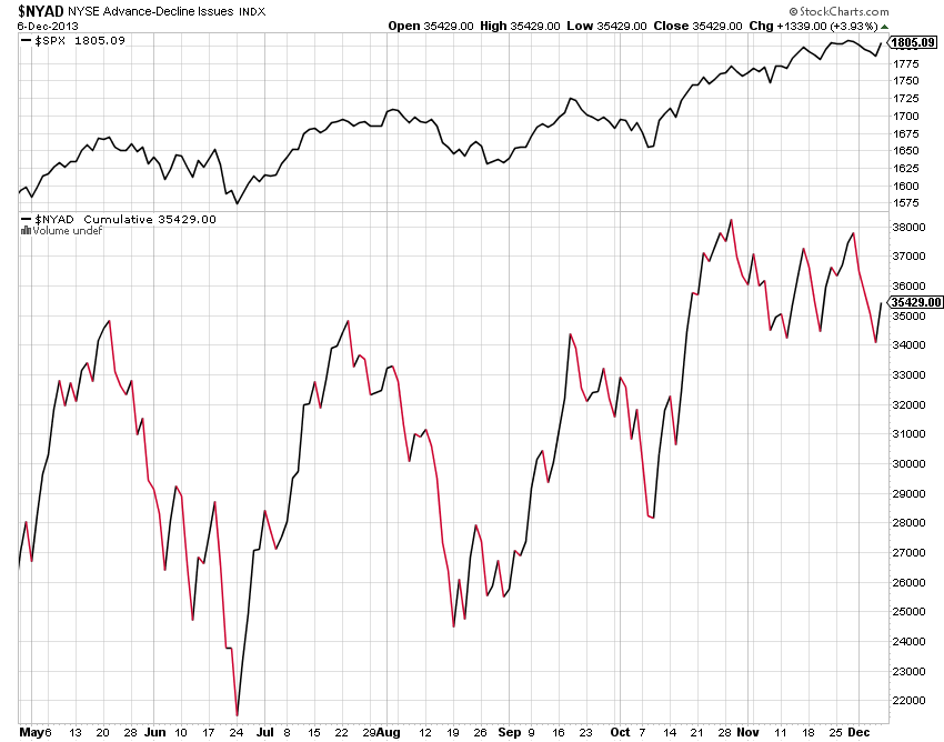
Another note of caution comes from the cumulative advance - decline line which from the chart above clearly shows bearish divergences as fewer and fewer stocks participate in the rallies. This in of itself is not a bull market killer and certainly not a market timing tool however.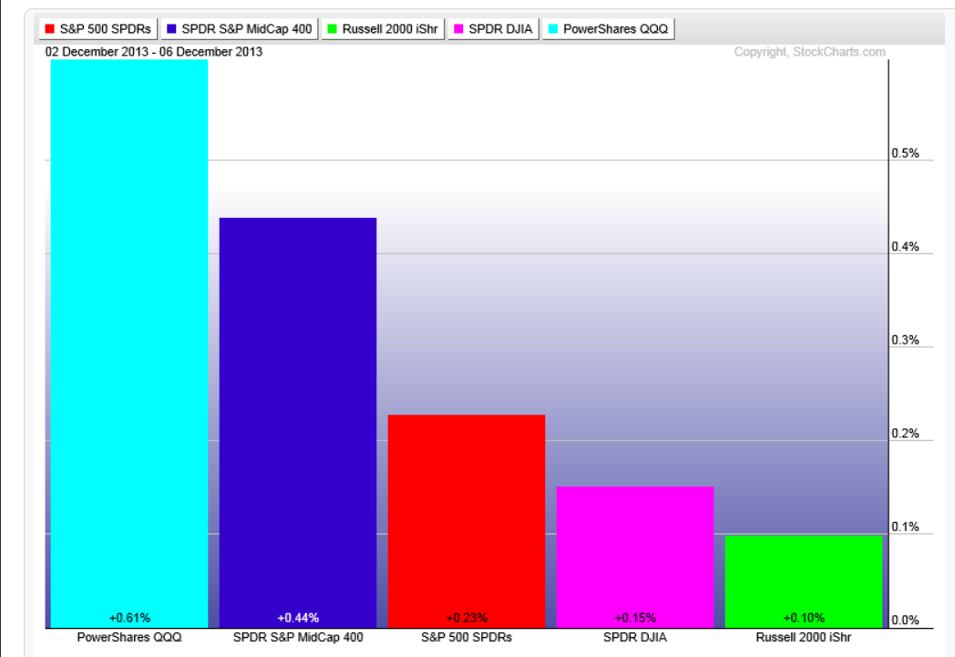
A performance chart for the week on the major averages show the Nasdaq 100 as the top performer and the Small caps Russell 2000 as the underperformer, possible risk off?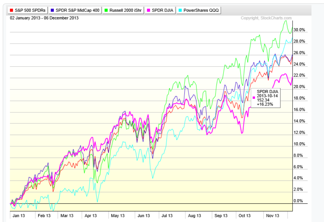
The major averages year to date chart above show the small caps and Nasdaq 100 as the leaders with 28% and 30% gains year to date. With the blue chip Dow index coming in around 22% gain for the year.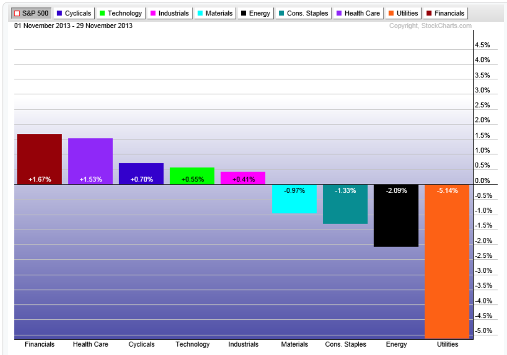
Taking a look at the sector performance relative to the S+P 500 for the month of November shows the strength coming from the Financials, Health Care, Discretionary Consumer and Technology. With Energy, Consumer Staples and Utilities underperforming.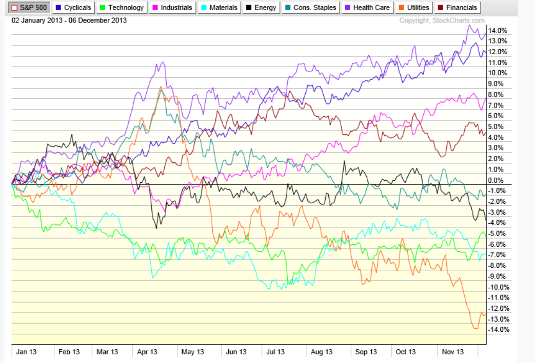
Sector performance year to date relative to the S+P 500 shows the strongest performance coming from the Consumer Discretionary, Health Care (mainly Biotech), Industrials and Financials. The relative weakness is seen in Utilities, Materials, Energy and Technology.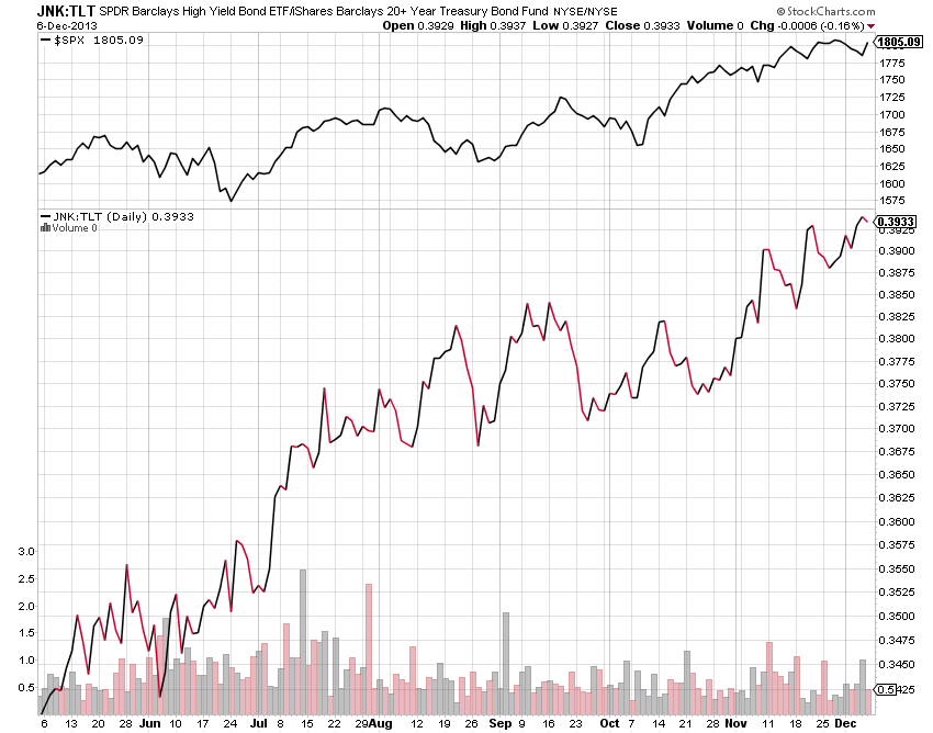
Taking a look at the other major asset class, that being the Bond and Credit markets. One simplified way to gauge the health of the credit markets is looking at the difference between the High Yield and Long Term treasuries. This chart above does just that as it shows new highs being made meaning investors still willing to accept risk.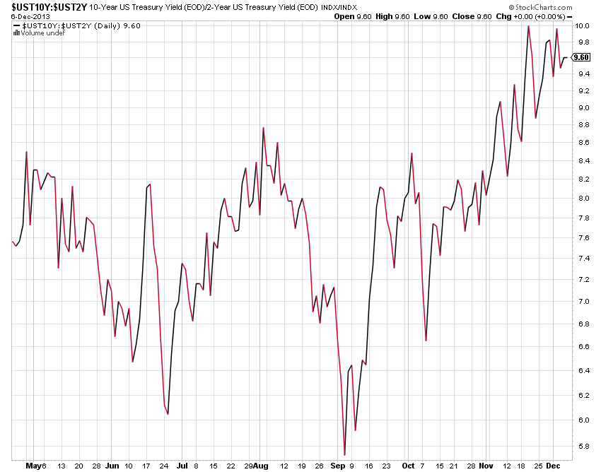
Another indicator shows the spread between the 10 year and 2 year bond yields. Like the previous chart, it too is at highs showing relative health in the bond market in a simplified format.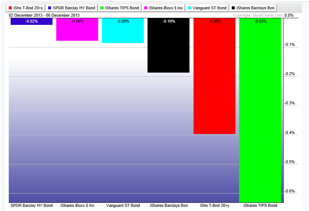
In terms of performance, this week most if not all bond types were in the red. With the TIPS (Treasury Inflation Protected Securities) and long term treasuries being the worst performers and the High Yield and Investment Grade Corporate Bonds being the "least bad".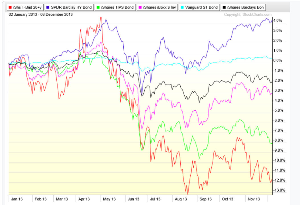
Performance year to date looks relatively the same. With long term treasuries and TIPS down 12% and 8% respectively. The short duration and High Yield bonds showing the only positive returns for the year.
So in conclusion, this current up trend is still intact but showing some minor cracks that deserve closer monitoring going forward. It is still my opinion that a good 20-30% correction is close at hand but will need clearer internal signs of weakness to even begin to guess when and where it may begin.
- English (UK)
- English (India)
- English (Canada)
- English (Australia)
- English (South Africa)
- English (Philippines)
- English (Nigeria)
- Deutsch
- Español (España)
- Español (México)
- Français
- Italiano
- Nederlands
- Português (Portugal)
- Polski
- Português (Brasil)
- Русский
- Türkçe
- العربية
- Ελληνικά
- Svenska
- Suomi
- עברית
- 日本語
- 한국어
- 简体中文
- 繁體中文
- Bahasa Indonesia
- Bahasa Melayu
- ไทย
- Tiếng Việt
- हिंदी
Stock Market Summary: S&P 500 Breaks 9-Week Streak
Published 12/07/2013, 02:45 PM
Updated 07/09/2023, 06:31 AM
Stock Market Summary: S&P 500 Breaks 9-Week Streak
Latest comments
Loading next article…
Install Our App
Risk Disclosure: Trading in financial instruments and/or cryptocurrencies involves high risks including the risk of losing some, or all, of your investment amount, and may not be suitable for all investors. Prices of cryptocurrencies are extremely volatile and may be affected by external factors such as financial, regulatory or political events. Trading on margin increases the financial risks.
Before deciding to trade in financial instrument or cryptocurrencies you should be fully informed of the risks and costs associated with trading the financial markets, carefully consider your investment objectives, level of experience, and risk appetite, and seek professional advice where needed.
Fusion Media would like to remind you that the data contained in this website is not necessarily real-time nor accurate. The data and prices on the website are not necessarily provided by any market or exchange, but may be provided by market makers, and so prices may not be accurate and may differ from the actual price at any given market, meaning prices are indicative and not appropriate for trading purposes. Fusion Media and any provider of the data contained in this website will not accept liability for any loss or damage as a result of your trading, or your reliance on the information contained within this website.
It is prohibited to use, store, reproduce, display, modify, transmit or distribute the data contained in this website without the explicit prior written permission of Fusion Media and/or the data provider. All intellectual property rights are reserved by the providers and/or the exchange providing the data contained in this website.
Fusion Media may be compensated by the advertisers that appear on the website, based on your interaction with the advertisements or advertisers.
© 2007-2025 - Fusion Media Limited. All Rights Reserved.
