Technically Speaking: June 24-28
Summary
- International data is still soft.
- US economic data was positive.
- Small-caps finally printed some strong rallies on Thursday and Friday.
International Economic Releases of Note
China/Japan/Asia/Australia
Japan
- LEI at 95.9 (trending lower)
- CEI at 102 (trending sideways)
- Retail sales increased 1.2% Y/Y (trending sideways)
- Industrial production decreased 1.7% Y/Y (decreased in 5 of the last 6 months)
- Unemployment at 2.55
China
- Industrial profits during the first five months down 2.3% Y/Y
South Korea
- Consumer sentiment 97.5 (modestly lower)
- Industrial production declined .2% Y/Y (Y/Y numbers have been around 0% for the last 7 months)
- Retail sales increased 3.4% Y/Y
Asia conclusion: the data from Japan continues to point towards soft economic performance. The leading indicator has been in a downtrend for the last 8-10 months; the CEIs are have pointed towards modest growth. The news from China - which showed a decline in industrial profits - adds further credence to the modest Japanese weakness thesis as do the weak IP numbers from South Korea.
Europe/UK/Canada
EU
- Germany (business sentiment) IFO 97.5 (trending lower)
- German consumer climate index 10.1 (potentially bottoming out)
- Economic sentiment indicator decreased 1.9 (trending lower)
- Inflation at 1.2% Y/Y
Canada
- GDP increased .3% in April
UK
- 1Q19 GDP up .5% Q/Q and 1.8% Y/Y
- Business investment down 1.5% Y/Y
EU/UK/Canada conclusion: the EU continues to hover just above contraction. The sentiment is down and the lack of price pressures indicates a fair amount of slack in the system. Canada is in fair shape, although a large drop in transportation manufacturing occurred in the latest month. The UK data simply reminded us that Brexit pulled data forward.
Emerging economies
Mexico
- Retail sales up 1.6% (trend sideways)
- Unemployment at 3.5% (sideways)
US Economic Released of Note
On Thursday, the BEA released the third estimate of first quarter GDP:
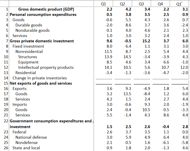
The table shows the Q/Q changes. Personal consumption expenditures were weak, increasing a modest 0.9%. The drop in durable goods purchases (-2.4%) was the main reason. Spending on services - which is normally steady - was also soft. The headline business number was solid but it belies a concerning trend in equipment investment, which declined 1%. Residential investment contracted for the fifth consecutive quarter. Notice the large difference between exports (increasing 5.4%) and imports (which declined 1.9%). This difference is abnormal and had a disproportionate impact on the final number, contributing 30% of the headline 3.1% increase. In the previous 15 quarters, this number subtracted from growth (-0.29%). Finally, notice the large increase in state and local government spending, which supplanted the 5.8% decline in non-defense spending caused by the government shutdown.
The following data shows that the headline GDP number wasn't as strong as implied:

Gross domestic income only increased by 1.7%. While final sales of domestic product was a very healthy 3.5%, sales to various domestic purchases increased between 2.1% and 2.7%. The average of GDP and GDI was a 2.7%.
The Conference Board's Consumer Confidence Indicator declined:
The Conference Board Consumer Confidence Index® declined in June, following an increase in May. The Index now stands at 121.5 (1985=100), down from 131.3 in May. The Present Situation Index – based on consumers’ assessment of current business and labor market conditions – decreased from 170.7 to 162.6. The Expectations Index – based on consumers’ short-term outlook for income, business and labor market conditions – decreased from 105.0 last month to 94.1 this month.
Here's a chart of the data from Briefing.com:
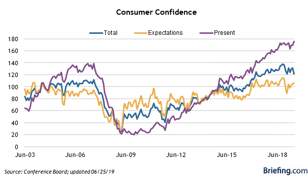
The overall index (in blue) has been moving sideways for most of this year. Notice that it's not unnatural for the expectations index to move sideways while the present conditions indicator rises.
The BEA released the latest monthly personal income and spending numbers:
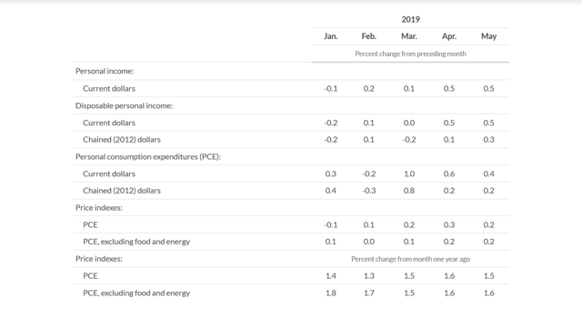
The above numbers show the month to month increases. Personal income increased strongly in April and May; personal consumption expenditures have advanced solidly over the last three months. Turning to a more detailed look at spending, here is a chart of the Y/Y percentage changes for PCEs:
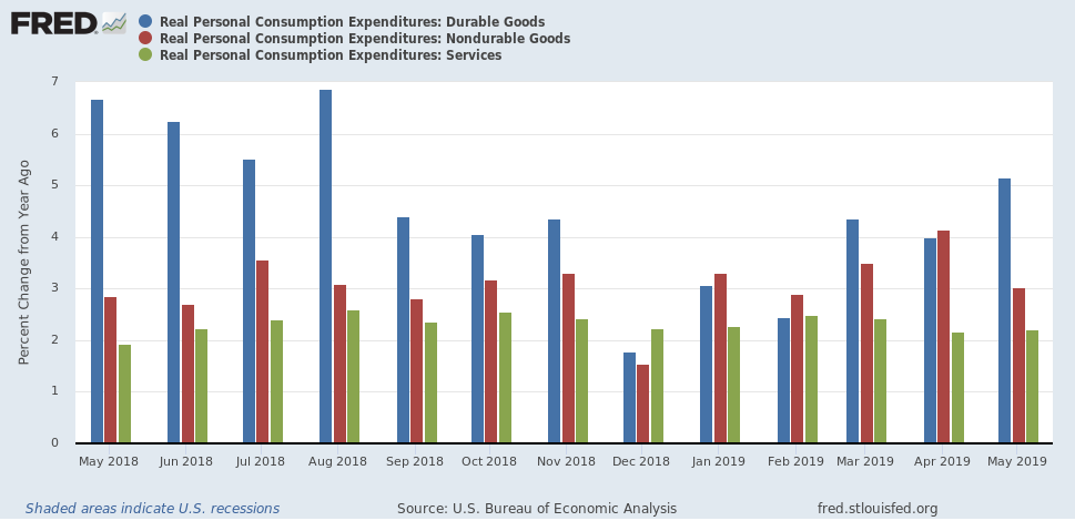
Durable goods expenditures (in blue) have rallied strongly over the last three months as have non-durable goods expenditures (in red). The above data indicates that consumers have started to increase spending after the lull during the first quarter (see GDP data above).
The Census released the latest new home sales numbers, which declined by 7.8%. The following charts put the data into a longer-term perspective:
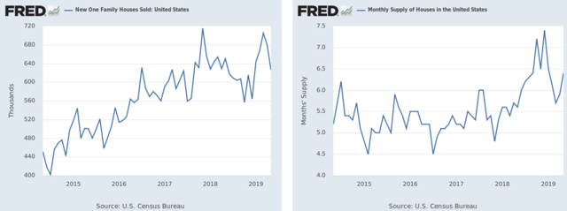
The left chart shows new home sales over the last 5 years. Because they recently came close to hitting a post-recession high, I'm less inclined to worry about the drop and instead chalk the last two months of activity up to a natural deceleration. The right chart shows the total inventory, which has ticked-up a bit.
Finally, the Census released the latest durable goods numbers, which declined 1.3% and have fallen in three of the last four months. Here are the charts of the relevant data:
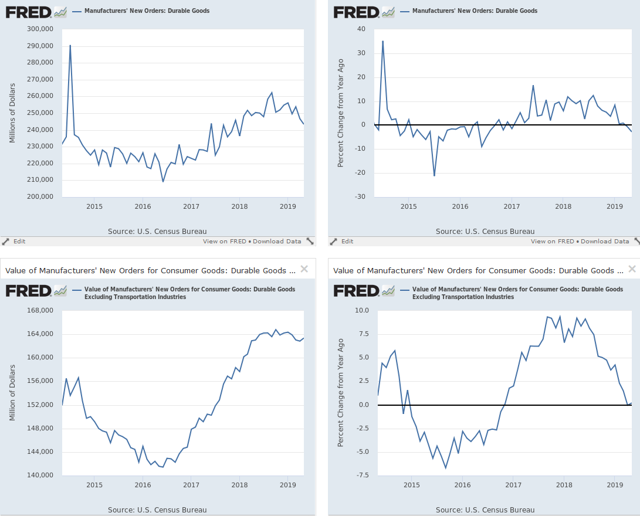
The top charts show the total numbers; the bottom chart shows the ex-transport data. The left charts show the total amount while the right chart contains Y/Y data, which is concerning: total orders are now negative while the ex-transport data is just barely positive. This data indicates that manufacturing is a bit weaker than previously thought.
US Conclusion: overall, the US economy remains in fair shape. Consumer spending and sentiment are still at positive levels. However, the weakness in manufacturing orders is concerning, indicating that the decline in the ISM manufacturing index is translating into weaker activity.
US Market Wrap For the Week of June 24-28
Let's take a look at a few performance tables, starting with this week's table:
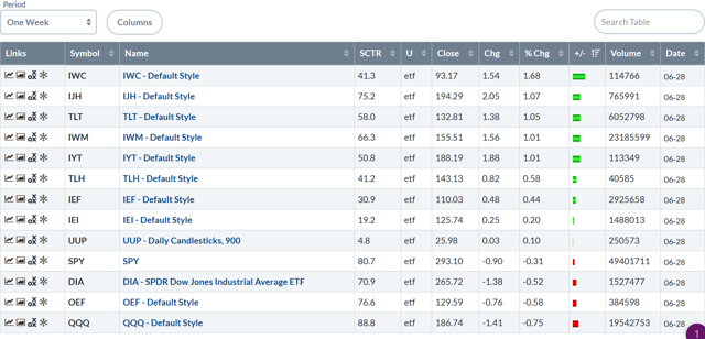
The good news is that micro-caps and mid-caps are at the top of the list; small-caps were number four. Large-caps were off modestly.
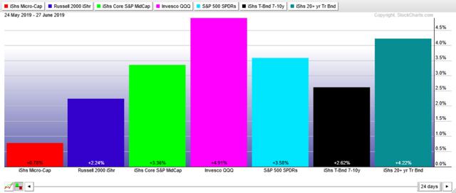
Next, let's look at the 1-month performance chart:
The above chart is organized with small-caps on the left, large-caps in the middle, and the Treasury market on the right.
The 1-month table shows this rally's main problem: small-cap under-performance. Although all equity indexes were higher, large-caps (mid-chart) were the big winners - as were the Treasury market ETFs.
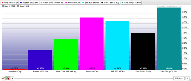
The 3-month chart shows a more exacerbated, large-cap and Treasury market performance.
One of my main complaints with the Spring's rally is small-cap under-performance. That might be changing. Let's start with this week's QQQ chart:
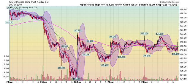
The QQQ dropped on Tuesday and then spent the rest of the week moving sideways. Prices are trading right around the 200-minute EMA.
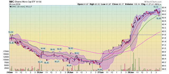
In contrast, micro-caps had a strong rally on Thursday and Friday, as did ...
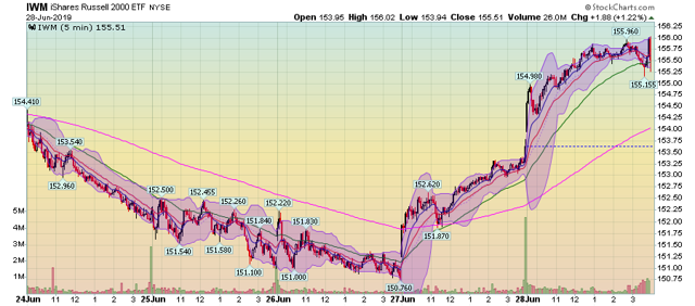
... the IWM, and ...
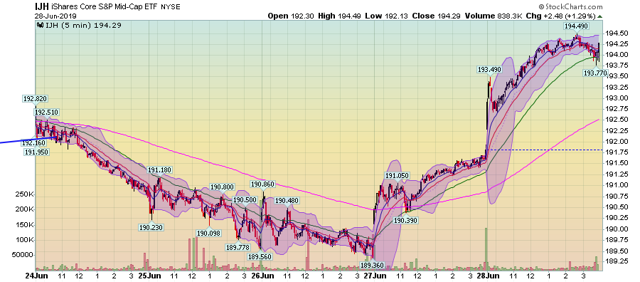
... the IJH.
This strength plays out in the daily charts:

The IWCs printed two very strong bars on Thursday and Friday, as did ...
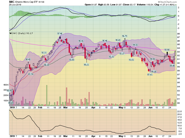
... IWM.
The small-caps finally printing some solid bars. However, these indexes have to follow through in a holiday-shortened week or it will all be for nothing.

