As the stock market started to pull out of the bottom made during the financial crisis one measure of risk taking, the ratio of US Treasuries (TLT) to Junk Bond (JNK) moved into a channel and started heading lower. The chart below shows the broad channel between the two bright red lines. This is a risk on measure, showing assets flowing from US Treasuries into high yield bonds. This continued throughout 2009 and into 2010. You can also see from the chart that the ratio is highly correlated to the S&P 500 (SPY) (blue area). It topped at the peak in 2010 and pulled back. It then surged higher again into 2011 and only to pullback into late 2011 and 2012. The latest move higher off of the double bottom began in May 2012 and continues today. The ratio becomes interesting in the short run as it is at a critical retracement of the move lower, at 61.8% of that range. To a technical trader breaking this Golden Ratio level can mean a continued move to the top of the channel with increasing confidence. Not a guarantee, but as if a speed bump or barrier has been removed. The other indicators that a technician might follow measuring momentum support a continued move up in the ratio and the ratio itself shows that it has room to move higher over this level without resistance from prior history without another test for a while. The green triangles show a Harmonic Bat (now we are deep into the technicals) formation that targets a move much higher to give an estimate of just how far it could go.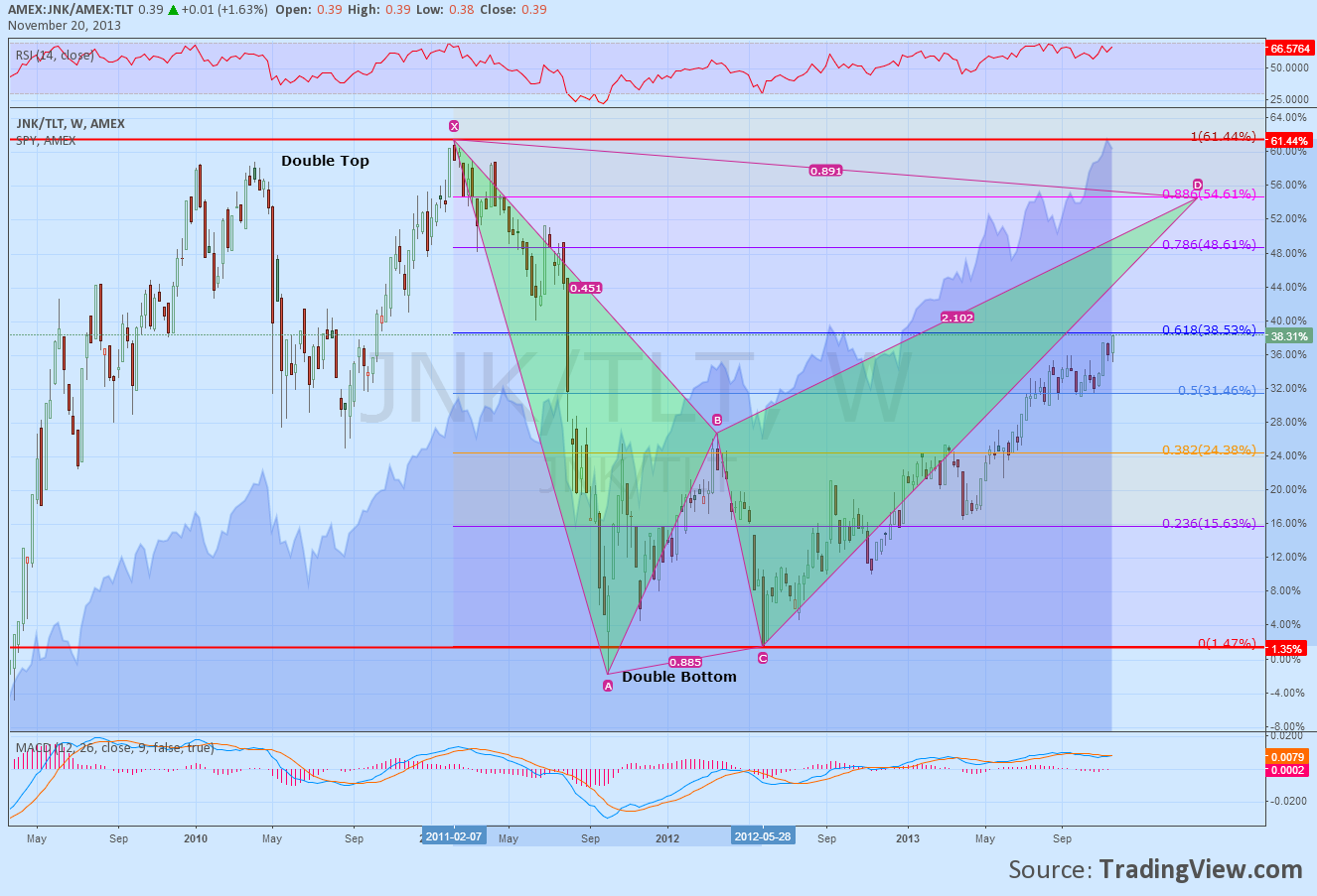
A continued flow from US Treasuries into high yield bonds does not guarantee a move higher in stock prices. But it adds to the broad context of measures that support more upward price action in equities.
Disclosure: The information in this blog post represents my own opinions and does not contain a recommendation for any particular security or investment. I or my affiliates may hold positions or other interests in securities mentioned in the Blog, please see my Disclaimer page for my full disclaimer.
Original post
- English (UK)
- English (India)
- English (Canada)
- English (Australia)
- English (South Africa)
- English (Philippines)
- English (Nigeria)
- Deutsch
- Español (España)
- Español (México)
- Français
- Italiano
- Nederlands
- Português (Portugal)
- Polski
- Português (Brasil)
- Русский
- Türkçe
- العربية
- Ελληνικά
- Svenska
- Suomi
- עברית
- 日本語
- 한국어
- 简体中文
- 繁體中文
- Bahasa Indonesia
- Bahasa Melayu
- ไทย
- Tiếng Việt
- हिंदी
Selling Quality For Junk A Good Thing For Stocks
Published 11/21/2013, 08:44 AM
Selling Quality For Junk A Good Thing For Stocks
Latest comments
Loading next article…
Install Our App
Risk Disclosure: Trading in financial instruments and/or cryptocurrencies involves high risks including the risk of losing some, or all, of your investment amount, and may not be suitable for all investors. Prices of cryptocurrencies are extremely volatile and may be affected by external factors such as financial, regulatory or political events. Trading on margin increases the financial risks.
Before deciding to trade in financial instrument or cryptocurrencies you should be fully informed of the risks and costs associated with trading the financial markets, carefully consider your investment objectives, level of experience, and risk appetite, and seek professional advice where needed.
Fusion Media would like to remind you that the data contained in this website is not necessarily real-time nor accurate. The data and prices on the website are not necessarily provided by any market or exchange, but may be provided by market makers, and so prices may not be accurate and may differ from the actual price at any given market, meaning prices are indicative and not appropriate for trading purposes. Fusion Media and any provider of the data contained in this website will not accept liability for any loss or damage as a result of your trading, or your reliance on the information contained within this website.
It is prohibited to use, store, reproduce, display, modify, transmit or distribute the data contained in this website without the explicit prior written permission of Fusion Media and/or the data provider. All intellectual property rights are reserved by the providers and/or the exchange providing the data contained in this website.
Fusion Media may be compensated by the advertisers that appear on the website, based on your interaction with the advertisements or advertisers.
© 2007-2025 - Fusion Media Limited. All Rights Reserved.