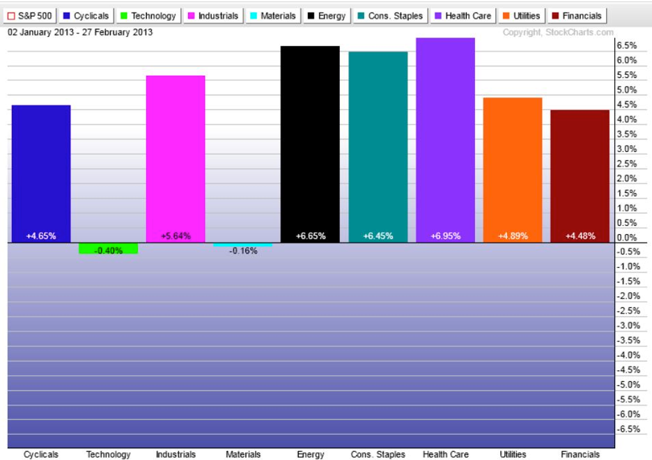
On this the last day of the month you’ll likely see the calls for month-end window dressing and a bunch of other excuses for why the market rises or falls to finish out February. It’s often best to take all of this with a grain of salt. However one thing we can look at as we head into March is the sector performance for the first two months of 2013.
Stockcharts has a great sector tool to look at performance of the nine S&P sectors on a customizable time frame. So far we have two sectors in the red -- tech and materials -- with a clear outperformance in energy, healthcare, and staples. While equities have had decent performance so far this year, it appears the advance has come on the back of some of the lower-beta areas of the market.
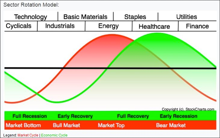
Where does this put us in the grand scheme of things? It doesn’t look good. As you can see from the cycle chart below, which shows what sectors typically outperform in various stages of the market and economy, energy, staples, and healthcare sit at the crest (top) of the cycle. When we expand our view and look at the sector performance from the Nov ’12 bottom through yesterday, we can see that financials, industrial, and energy are the top performers, with technology being the laggard.
This isn’t a good sign for equity bulls it’s not necessary the final bullet to stop them in their tracks. I’m still looking to see if we can test the high of 1530, although it appears equities are gasping for air as traders attempt to regain their footing.
Disclaimer: Do not construe anything written in this post or this blog in its entirety as a recommendation, research, or an offer to buy or sell any securities. Everything in this post is meant for educational and entertainment purposes only. I or my affiliates may hold positions in securities mentioned in the blog. Please see my Disclosure page for full disclaimer. Connect with Andrew on Google+.
- English (UK)
- English (India)
- English (Canada)
- English (Australia)
- English (South Africa)
- English (Philippines)
- English (Nigeria)
- Deutsch
- Español (España)
- Español (México)
- Français
- Italiano
- Nederlands
- Português (Portugal)
- Polski
- Português (Brasil)
- Русский
- Türkçe
- العربية
- Ελληνικά
- Svenska
- Suomi
- עברית
- 日本語
- 한국어
- 简体中文
- 繁體中文
- Bahasa Indonesia
- Bahasa Melayu
- ไทย
- Tiếng Việt
- हिंदी
Sector Performance Should Worry Equity Bulls
Published 02/28/2013, 12:30 PM
Updated 07/09/2023, 06:31 AM
Sector Performance Should Worry Equity Bulls
Latest comments
Loading next article…
Install Our App
Risk Disclosure: Trading in financial instruments and/or cryptocurrencies involves high risks including the risk of losing some, or all, of your investment amount, and may not be suitable for all investors. Prices of cryptocurrencies are extremely volatile and may be affected by external factors such as financial, regulatory or political events. Trading on margin increases the financial risks.
Before deciding to trade in financial instrument or cryptocurrencies you should be fully informed of the risks and costs associated with trading the financial markets, carefully consider your investment objectives, level of experience, and risk appetite, and seek professional advice where needed.
Fusion Media would like to remind you that the data contained in this website is not necessarily real-time nor accurate. The data and prices on the website are not necessarily provided by any market or exchange, but may be provided by market makers, and so prices may not be accurate and may differ from the actual price at any given market, meaning prices are indicative and not appropriate for trading purposes. Fusion Media and any provider of the data contained in this website will not accept liability for any loss or damage as a result of your trading, or your reliance on the information contained within this website.
It is prohibited to use, store, reproduce, display, modify, transmit or distribute the data contained in this website without the explicit prior written permission of Fusion Media and/or the data provider. All intellectual property rights are reserved by the providers and/or the exchange providing the data contained in this website.
Fusion Media may be compensated by the advertisers that appear on the website, based on your interaction with the advertisements or advertisers.
© 2007-2025 - Fusion Media Limited. All Rights Reserved.
