Summary
The weekly performance numbers are bullish while the monthly numbers are bearish.
Defensive sectors are making headway.
I look at the daily charts for XLU, XLP, and XLV.
Let's begin where we always do: performance for the past week and month:

This week's performance was decidedly bullish. The industrial sector - which had taken it in the teeth due to its exposure to tariffs and sanctions - led the pack, rallying a little more than 2%. Technology and consumer discretionary followed. Utilities - which had enjoyed several weeks of leadership - fell to the bottom of the pack. But they were only off 1.15%.

Monthly performance remains decidedly bearish. Utilities and staples are the top performing sectors. The 8.18% gain by the utility sector is especially noteworthy. Financials - which increased a bit over 1% this week - are the worst performer. Remember that they're exposed to a tightening yield curve, which will eventually lower profit margins. Industrials have the second worst performance thanks to the trade war issues.
Next, here's the relative performance of the various sectors when compared to the SPY over the last 10 weeks:
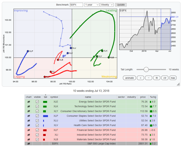
Technology and consumer discretionary are (once again) leading the SPYs. The energy sector is about to move into a weakening position, which will probably occur next week should oil prices continue to weaken. Pay particular attention to the XLUs and XLVs, which are right on the cusp of leading the SPYs. And the consumer staples ETF is gaining strength. This means that the three primary conservative ETFs are all "improving." Bearish sentiment is building.
Let's look at the conservative sector's performance relative to each other over the last one- and three-month time frames:
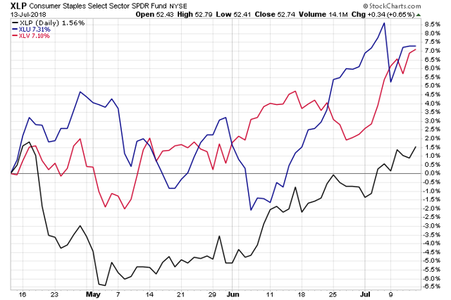
In the last three months, all are positive, with utilities just outperforming the healthcare sector. Staples recently turned positive.
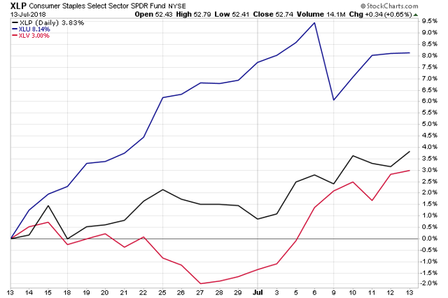
Over the last month, utilities are the hands-down winner, rising slightly more than 8%. Staples rose nearly 4% while health care) was up exactly 3%.
Finally, let's look at the daily charts of these defensive sectors, starting with consumer staples:
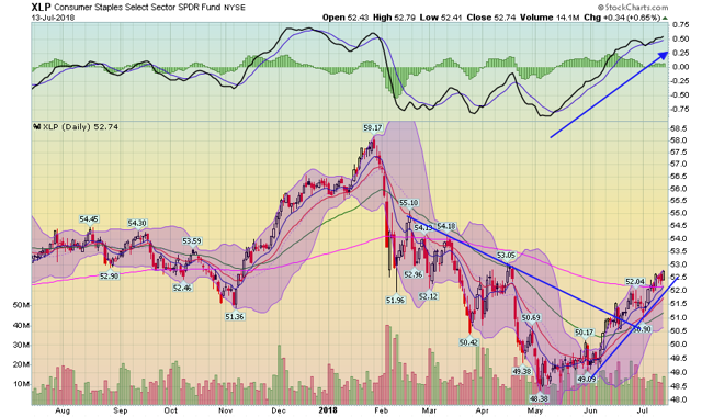
Starting in late January, prices started moving lower, moving from the upper 50s to the lower 40s. But starting in early May, the sector began a rally that is ongoing. Prices broke through resistance in mid-June and moved through the 200-day EMA at the beginning of July.
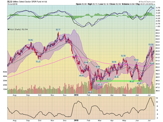
The utility ETF's overall chart is a bit weak. It sold off sharply even before the spring sell-off thanks to a spike in interest rates. The XLU rallied through the 200-day EMA in late April but fell back until the latest rally that started at the beginning of June. Two events are responsible for the XLUs' recent rise. First, interest rates have steadied. Second, the XLUs' yield has attracted yield-hungry investors.
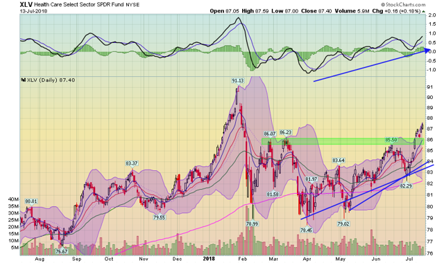
The health care ETF has a good chart. Prices have been in an uptrend for about 3.5 months. They have advanced beyond the 200-day EMA, and the shorter EMAs are now about that line as well. Momentum is rising and prices have moved through the mid-80s level, which is the last area of technical resistance before the lower 90s.
Disclosure: I/we have no positions in any stocks mentioned, and no plans to initiate any positions within the next 72 hours.
I wrote this article myself, and it expresses my own opinions. I am not receiving compensation for it (other than from Seeking Alpha). I have no business relationship with any company whose stock is mentioned in this article.
