ETF Sector Review for January 28 - February 1
Summary
- All sectors were up for the week, even if only marginally.
- The defensive structure we saw in the fourth quarter is giving way to a more bullish structure.
- I take a deeper look at the energy sector.
Let's begin where we always do: performance tables, starting with the weekly numbers:
The week's big winner was the energy sector (NYSE:XLE), which rebounded in sympathy with oil's recent rise. Real estate (NYSE:VNQ) also benefited, thanks to a more dovish Fed. Industrials (NYSE:XLI) - which have had a harder recent go of it, thanks to the global trade situation - were number four. Two defensive industries - consumer staples (NYSE:XLP) and utilities (NYSE:XLU) - were number three and five on the list. Interestingly, technology (NYSE:XLK) was barely higher, rising slightly more than 1%.
Here's the one-month table:
The first thing to notice is that all sectors are higher; the difference is the amount. Three defensive sectors - healthcare (NYSE:XLV), staples, and utilities - are at the bottom. Once again energy is the top-performing industry, followed by industrials and real estate.
Here's the three-month table:
This is where we start to see red: technology was the worst performer with a slightly more than 3% decline. Energy was also lower, dropping 3.3%. Real estate was the primary beneficiary, thanks to declining long-term interest rates. This also benefited the utility sector, which was up nearly 3%.
Here is the relative strength chart - which is very interesting: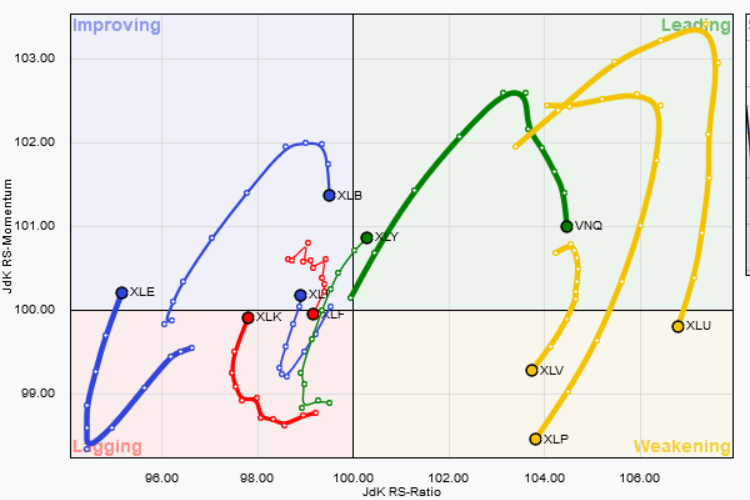
For most of 4Q18, defensive sectors were leading the SPYs. That is no longer the case, with healthcare, staples, and utilities moving into the "weakening" sector. Real estate is right in the "leading" sector, and consumer discretionary (NYSE:XLY) just entered this part of the graph. Energy - which has been moving up in several time frames - just moved into the "improving" area, while technology is right on the cusp of making that jump.
Let's take a closer look at the energy sector, starting with its key commodity, oil: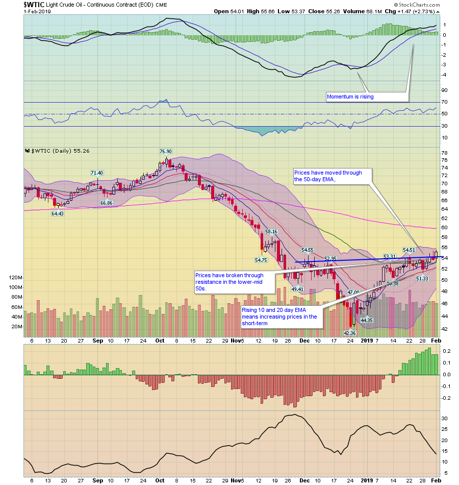
Oil's chart is bullish. Prices have moved through the 10-, 20-, and 50-day EMAs along with resistance in the lower-mid 50s. All the EMAs are moving higher, as is momentum. The next area of resistance is the upper-50s. Another way to read the chart's price action since the end of December is as a rally until mid-January when prices consolidated in the lower 50s. They have since broken out to the upside.
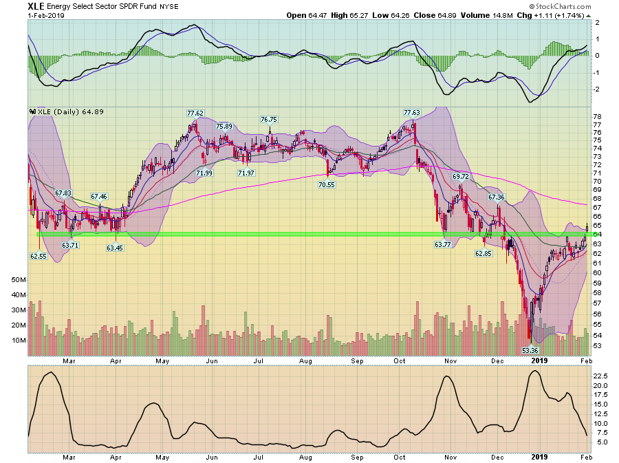
Next, let's look at the XLE chart:
XLE is strongly influenced by oil for obvious reasons. Prices have moved through the 50-day average while gapping higher on Friday. The shorter EMAs are rising, as is momentum.
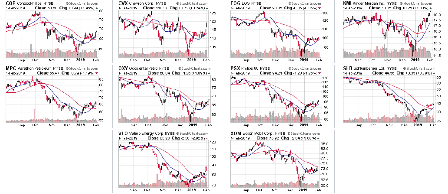
Next, let's look at XLE's 10 largest members, starting with their respective two-week charts: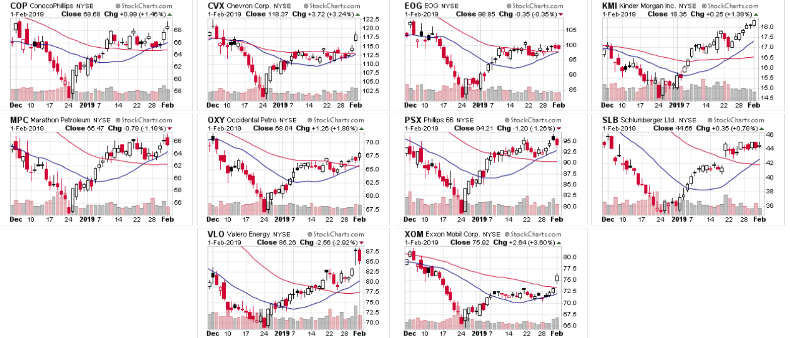
Unsurprisingly, all come close to mirroring oil's price chart, with a sharp decline at the end of December followed by a small rally and consolidation in January.
A majority of these charts are technically attractive. They've clearly bottomed and then advanced through their respective 20- and in some cases 50-day EMA. Several gapped higher on Friday with the broader sector performance. And most are in the lower half of their respective charts, meaning they have a lot of upside room to run.
Finally, let's look at them from two fundamental perspectives:
Four are yielding over 4%.
While three have forward PEs slightly above 10.
Bottom line - the energy sector looks to be gaining steam right now.
Disclosure: I/we have no positions in any stocks mentioned, and no plans to initiate any positions within the next 72 hours. I wrote this article myself, and it expresses my own opinions. I am not receiving compensation for it (other than from Seeking Alpha). I have no business relationship with any company whose stock is mentioned in this article.


