The search for the holy grail in diversification never ends and, unfortunately, rarely if ever turns up productive discoveries not already widely known. Nonetheless, tracking various facets of diversification is still useful and sometimes essential. That includes monitoring return distributions, which are always in flux.
For those who don’t indulge, the benefits are obvious. If your perspective in this realm is minimal, profiling how the return distributions of your holdings compare can be revealing, in some cases by highlighting previously overlooked weaknesses in a portfolio-design strategy.
For wealth managers and investors who periodically run the numbers, most of the attention is focused on the individual investments/asset classes. But don’t neglect the overall portfolio. After all, these are the distributions that matter most to investment results and provide key information on the pros and cons of a particular portfolio design.
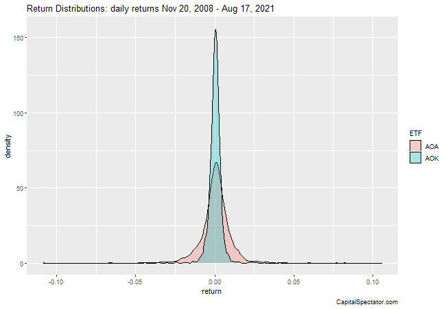
As a toy example, consider two asset allocation strategies via a pair of BlackRock ETFs: iShares Core Aggressive Allocation ETF (NYSE:AOA) and iShares Core Conservative Allocation ETF (NYSE:AOK). As you’d expect, the daily return distributions for the more aggressive AOA exhibit fatter tails vs. AOK—a visual representation of the higher-return-equates-with-higher-risk concept.

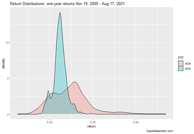
Daily return distributions are useful, but longer-period results often provide more meaningful insight, particularly as a check on portfolio design success (and failure). Consider how the AOA and AOK’s distribution changes when we shift to one-year returns.

The second chart is strikingly different from the first. AOA’s performances are now skewed considerably to the right in a more forceful degree, reflecting a higher incidence of positive performance.
To quantify features of distributions we can generate statistics for skewness and kurtosis.
For example, AOA’s skewness reading for one-year returns is 0.9 vs. 0.3 for AOK. For a distribution that was perfectly symmetric—the negative data is the mirror image of the positive values—the skewness reading would be zero. By contrast, the positive readings for AOA and AOK’s one-year returns are positive, indicating a positive skew, although AOA’s skew is substantially higher vs. AOK’s.
For kurtosis, which quantifies the tail shape of the distribution, AOA’s one-year returns translate to 2.0 vs. 1.5 for AOK. The higher kurtosis reading for AOA indicates a higher incidence of outlier readings.
The real value of running these type analytics applies to customized portfolios. Running the numbers on AOA and AOK yields no surprises, primarily because BlackRock (NYSE:BLK) engineered the funds with a target level of risk and return in mind.
By contrast, it’s not always clear how customized portfolios fare. You may think you’re designing a portfolio with a certain level of risk and return, but do the return distributions confirm (or reject) your plans? On that note, how does a relevant benchmark stack up? Is the customized portfolio adding value vis-à-vis the benchmark’s return distribution?
Note, too, that portfolios evolve, sometimes in surprising and unexpected ways. Periodically running distribution analytics (and tracking the changes) can sometimes yield valuable perspective for risk management and return expectations that’s not otherwise obvious.
As Yogi Berra reportedly once said, you can learn a lot by looking. But there’s a catch: You have to be looking.
