Pictures Are Worth A Thousand Words
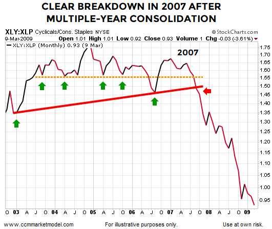
When investors are confident about future economic outcomes, they tend to prefer growth-oriented XLY (consumer discretionary) over defensive-oriented XLP (consumer staples). The 2002-2009 chart below shows the XLY:XLP ratio consolidated for several years before breaking down in October 2007.

This Picture Looks Quite A Bit Different
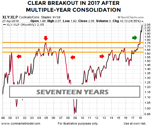
In the present day scenario, the XLY:XLP also consolidated for a number of years. The ratio was unable to exceed the orange lines between 2000 and late 2017. Instead of breaking down in a bearish manner (see October 2007 above), the ratio broke out in a bullish manner in late 2017 by exceeding the levels that had acted as resistance for roughly 17 years.

The charts above tell us quite a bit about the market's tolerance for risk in late 2007 relative to the market's tolerance for risk in 2018. Even in the face of recent broader market weakness/consolidation, the ratio is up 6.55% for the month as of April 27.
Does Broader Asset Class Behavior Paint A More Concerning Picture?
Is the XLY:XLP ratio the only ratio that paints a "be open to better than expected long-term outcomes" picture? To help answer that question, this week's video covers over 20 ETFs, allowing us to understand the market's message via broad asset class behavior.
