
Friday morning I posted my latest Big Four update featuring Real Personal Income Less Transfer Payments. Now let's take a closer look at a different calculation of incomes: "Real" Disposable Income Per Capita. The November data shows a strong reversal of the contractionary pattern in recent months.
Adjusted for inflation, per-capita disposable incomes have been struggling for the past two years and are currently at about the level first achieved in November of 2007. Most of 2011 saw a slow decline in incomes, a trend that began reversing in November of last year. Modest income growth continued for eight consecutive months. However, the trend reversed in August, and incomes slumped for three months. But the November data has shown a surprisingly strong reversal to the upside. Let's hope this trend change has some staying power.
The first chart shows both the nominal per capita disposable income and the real (inflation-adjusted) equivalent since 2000.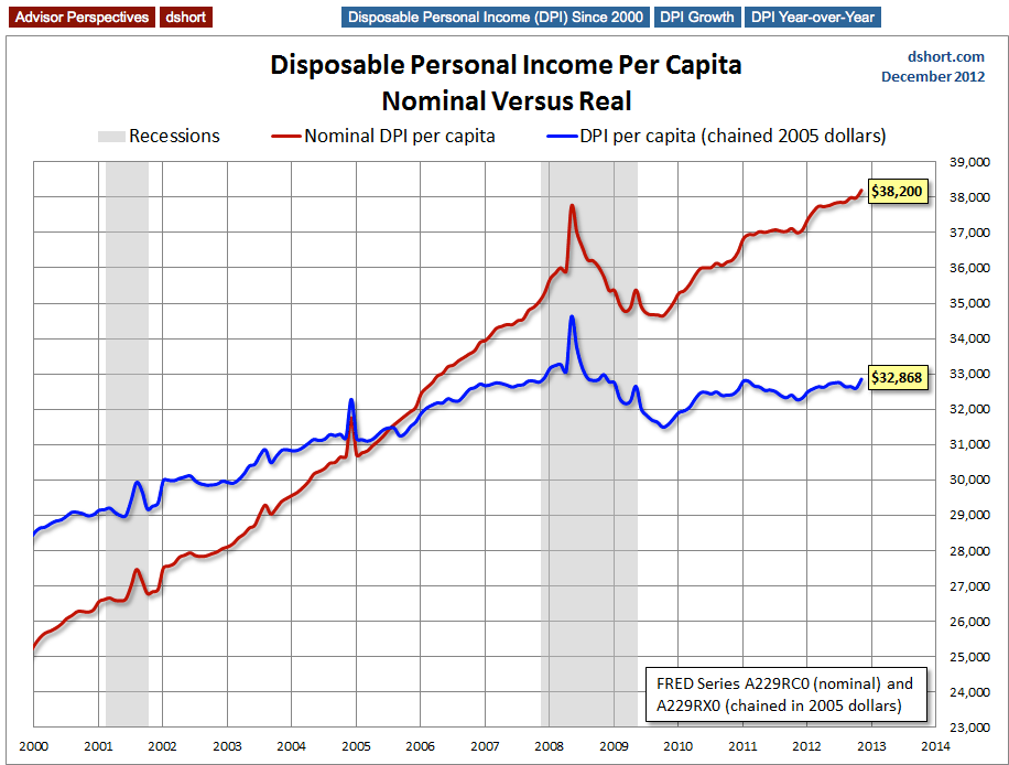
The BEA uses the average dollar value in 2005 for inflation adjustment. But the 2005 peg is arbitrary and unintuitive. For a more natural comparison, let's compare the nominal and real growth in per capita disposable income since 2000. Do you recall what you we're doing on New Year's Eve at the turn of the millennium? Nominal disposable income is up 50.8% since then. But the real purchasing power of those dollars is up only 15.2%.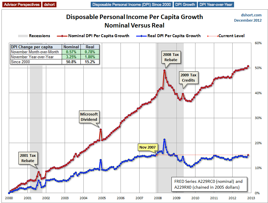
Here is a closer look at the real series since 2007.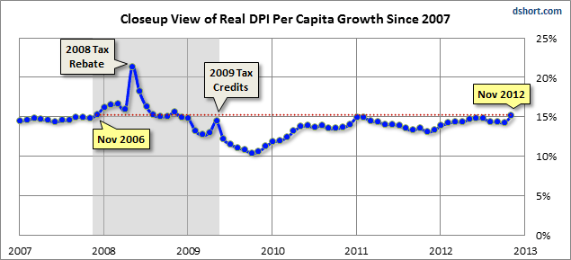
Year-Over-Year DPI Per Capita
Let's take one more look at real DPI per capita, this time focusing on the year-over-year percent change since the beginning of this monthly series in 1959. I've highlighted the value for the months when recessions start to help us evaluate the recession risk for the current level.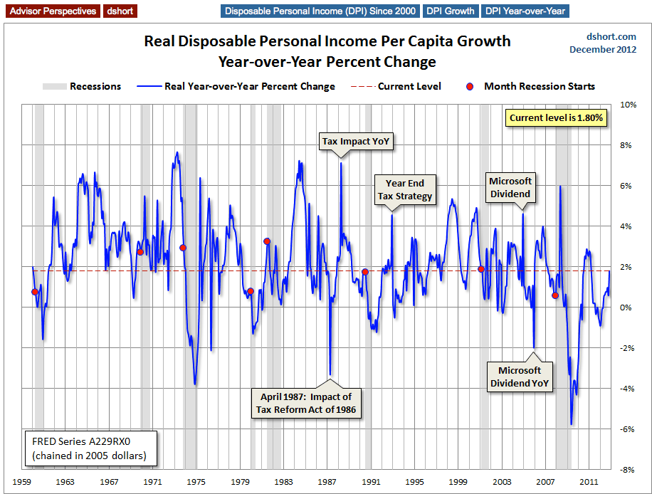
Of the eight recessions since 1959, four started with a YoY number higher than the current 1.80%.
Suffice to say that we need this indicator to continue to show some solid improvement in the months ahead. An economy without real disposable income growth is heading for trouble.
The Consumption vs. Savings Conflict
The U.S. is a consumer-driven economy, as is evident from the 70-plus percent share of GDP held by Personal Consumption Expenditures.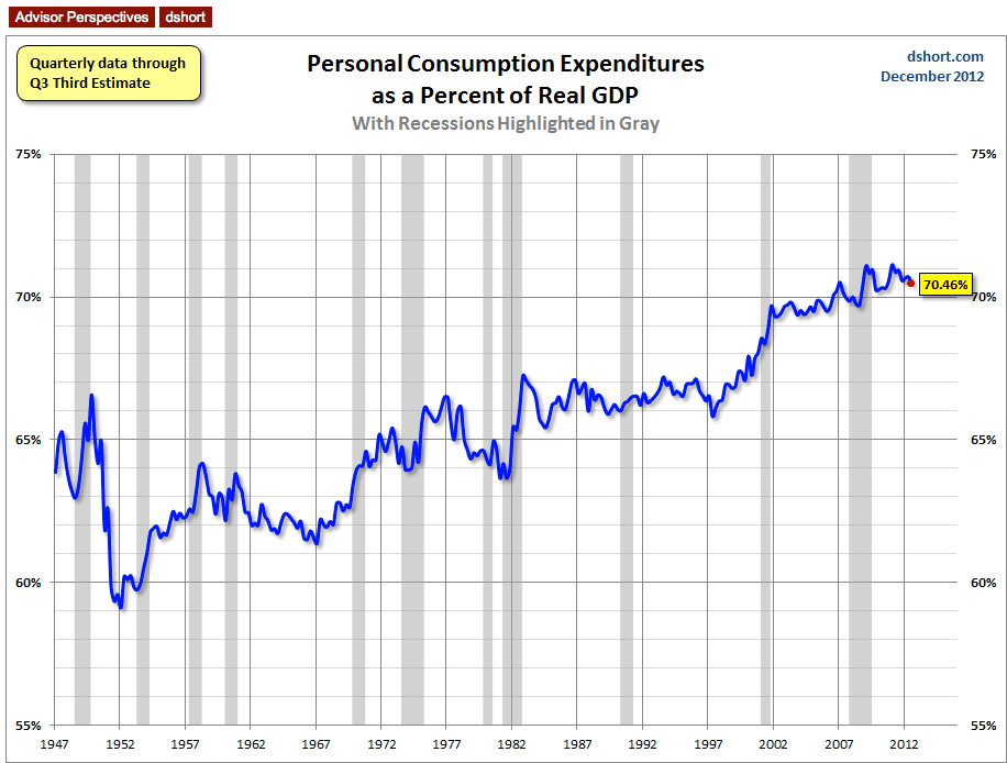
But the money to support consumption has to come from somewhere, and a growth in real disposable income would be the best source. An alternative is to spend more by reducing savings.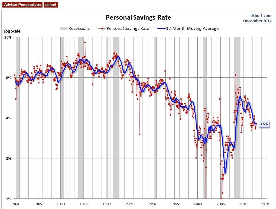
As the chart above illustrates, the U.S. savings rate had generally declined since the early 1980s, a trend no doubt supported by the psychology of the secular bull market from 1982 to 2000. After stabilizing for a couple of years following the Tech Crash, a new surge in asset-growth confidence from residential real estate was probably a factor in that trough in 2005. But in 2008 the Financial Crisis reversed the trend ... for a while. The red dots are the actually monthly data points. They illustrate that the saving rate has been slipping back to the 2002-2004 range. The blue line is a 12-month moving average, which helps us understand the underlying trend of this rather volatile indicator.
Can this low savings rate be maintained? Perhaps. However the odds of reductions in retirement entitlements in the years ahead may eventually discourage the trend toward saving less.
Note: My BEA data source is the National Income and Product Accounts (NIPA) Tables. Table 2.6 (Personal Income and Its Disposition, Monthly) is available here. A couple of hours after the BEA announcement, the St. Louis Federal Reserve posts the data in FRED (Federal Reserve Economic Data) with separate tables for the nominal and real per capita data: DPI Nominal and DPI in chained 2005 dollars.
A Footnote On Annual Revisions The DPI series is subject to monthly revisions and more substantial annual revisions each July. So we must take the latest data with a grain of salt. See, for example, the impact of the July 2012 annual revisions on our understanding of trends for this indicator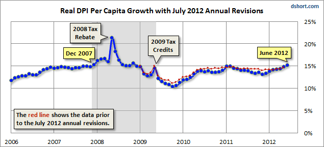
As we readily see, the July revisions lowered the data for the majority of the months since January 2009, changing what previously appeared as a relatively flat line since mid-2010 into a couple of more conspicuous undulations, especially from early 2011 to the present.
- English (UK)
- English (India)
- English (Canada)
- English (Australia)
- English (South Africa)
- English (Philippines)
- English (Nigeria)
- Deutsch
- Español (España)
- Español (México)
- Français
- Italiano
- Nederlands
- Português (Portugal)
- Polski
- Português (Brasil)
- Русский
- Türkçe
- العربية
- Ελληνικά
- Svenska
- Suomi
- עברית
- 日本語
- 한국어
- 简体中文
- 繁體中文
- Bahasa Indonesia
- Bahasa Melayu
- ไทย
- Tiếng Việt
- हिंदी
Real Income: A Strong Rebound
Published 12/21/2012, 02:55 PM
Updated 07/09/2023, 06:31 AM
Real Income: A Strong Rebound
Latest comments
Loading next article…
Install Our App
Risk Disclosure: Trading in financial instruments and/or cryptocurrencies involves high risks including the risk of losing some, or all, of your investment amount, and may not be suitable for all investors. Prices of cryptocurrencies are extremely volatile and may be affected by external factors such as financial, regulatory or political events. Trading on margin increases the financial risks.
Before deciding to trade in financial instrument or cryptocurrencies you should be fully informed of the risks and costs associated with trading the financial markets, carefully consider your investment objectives, level of experience, and risk appetite, and seek professional advice where needed.
Fusion Media would like to remind you that the data contained in this website is not necessarily real-time nor accurate. The data and prices on the website are not necessarily provided by any market or exchange, but may be provided by market makers, and so prices may not be accurate and may differ from the actual price at any given market, meaning prices are indicative and not appropriate for trading purposes. Fusion Media and any provider of the data contained in this website will not accept liability for any loss or damage as a result of your trading, or your reliance on the information contained within this website.
It is prohibited to use, store, reproduce, display, modify, transmit or distribute the data contained in this website without the explicit prior written permission of Fusion Media and/or the data provider. All intellectual property rights are reserved by the providers and/or the exchange providing the data contained in this website.
Fusion Media may be compensated by the advertisers that appear on the website, based on your interaction with the advertisements or advertisers.
© 2007-2025 - Fusion Media Limited. All Rights Reserved.