If you’re tired of living in a chronic state of “information overload,” we feel you! It seems the investment news and commentary never cease.
Not to worry – we’re here to help…
Following the notion that “a picture is worth a thousand words,” each Friday we select a handful of charts to put important economic and investment news into perspective for you.
So say goodbye to long-winded commentary, and hello to easy-to-understand pictures.
Resistance is Futile
Ever hear the Wall Street adage, “Don’t fight the Fed”?
Well, here’s proof why we’d be well served to heed that advice.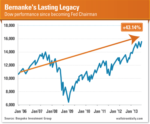
During Fed Chairman Bernanke’s tenure, we’ve witnessed unprecedented monetary easing. And true to form, it prompted the stock market to regain all its losses – and then go on to hit new all-time highs.
All told, the Dow is up almost 45% since Bernanke took office in February 2006. At least he’s got that working for his legacy, which is nice.
The Roof, the Roof, the Roof is on Fire
The housing recovery is blazing hot, based on the latest S&P/Case-Shiller Home Price Index figures. Home prices increased 12.4% from July 2012 to July 2013.
Of course, real estate is a regional investment. So the price increases haven’t been even across all 20 major markets measured.
That means bargains still exist. We just need to know where to look. (Hint: Steer clear of Dallas and Denver; try your luck in Vegas, instead.)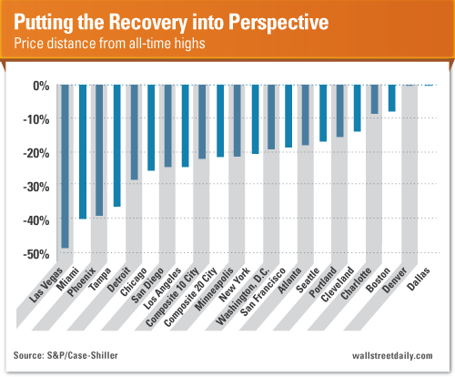
For Richer or Poorer… But, Mostly Poorer
The Census Bureau released new income and poverty data. The key takeaway? Take a look: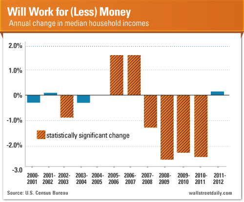
Over the last 12 years, median incomes increased only two times on a year-over-year basis. (And we saw statistically insignificant increases during two other years.)
All told, median incomes are off 6.6% since 2000. So if you feel poorer now than you did when the dot-com bubble collapsed, well… it’s because you are!
In relation to the rest of the world, however, we’re still richly blessed. (In terms of GDP per capita, the United States ranks as the sixth highest in the world.)
Forget about the financial fitness of the average American, though. Let’s talk about our physical fitness…
Gluttony, Anyone?
We all know that obesity in America is a serious issue. But, this chart should help put it into perspective. It’s more serious than you think.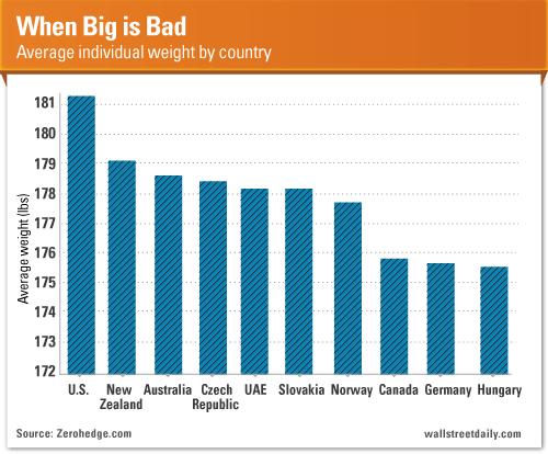
The average American is the heaviest of all.
The cause? Again, this shouldn’t come as a surprise. We eat too much!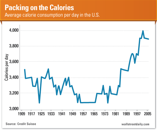
Since 1981, U.S. calorie consumption surged 21.8%, to 3,900 calories per day.
The USDA’s Agriculture Fact Book says that the increase in eating out is partly to blame for the uptick. (The food-away-from-home sector accounts for more than 30% of total food energy consumption now. That’s up from only 18% in the late 1970s.)
Nice try. But in our gut (pun intended), we know better. It’s overconsumption. Plain and simple.
Now, if I were a betting man, I wouldn’t bet on Americans cutting back any time soon. Instead, I’d bet on companies selling drugs to deal with Type 2 diabetes, like Eli Lilly and Company (LLY) and Novo Nordisk (NVO).
Original post
- English (UK)
- English (India)
- English (Canada)
- English (Australia)
- English (South Africa)
- English (Philippines)
- English (Nigeria)
- Deutsch
- Español (España)
- Español (México)
- Français
- Italiano
- Nederlands
- Português (Portugal)
- Polski
- Português (Brasil)
- Русский
- Türkçe
- العربية
- Ελληνικά
- Svenska
- Suomi
- עברית
- 日本語
- 한국어
- 简体中文
- 繁體中文
- Bahasa Indonesia
- Bahasa Melayu
- ไทย
- Tiếng Việt
- हिंदी
Real Estate, Bernanke And the Best Drug Stocks To Own
Published 09/27/2013, 11:40 AM
Updated 05/14/2017, 06:45 AM
Real Estate, Bernanke And the Best Drug Stocks To Own
Latest comments
Loading next article…
Install Our App
Risk Disclosure: Trading in financial instruments and/or cryptocurrencies involves high risks including the risk of losing some, or all, of your investment amount, and may not be suitable for all investors. Prices of cryptocurrencies are extremely volatile and may be affected by external factors such as financial, regulatory or political events. Trading on margin increases the financial risks.
Before deciding to trade in financial instrument or cryptocurrencies you should be fully informed of the risks and costs associated with trading the financial markets, carefully consider your investment objectives, level of experience, and risk appetite, and seek professional advice where needed.
Fusion Media would like to remind you that the data contained in this website is not necessarily real-time nor accurate. The data and prices on the website are not necessarily provided by any market or exchange, but may be provided by market makers, and so prices may not be accurate and may differ from the actual price at any given market, meaning prices are indicative and not appropriate for trading purposes. Fusion Media and any provider of the data contained in this website will not accept liability for any loss or damage as a result of your trading, or your reliance on the information contained within this website.
It is prohibited to use, store, reproduce, display, modify, transmit or distribute the data contained in this website without the explicit prior written permission of Fusion Media and/or the data provider. All intellectual property rights are reserved by the providers and/or the exchange providing the data contained in this website.
Fusion Media may be compensated by the advertisers that appear on the website, based on your interaction with the advertisements or advertisers.
© 2007-2025 - Fusion Media Limited. All Rights Reserved.
