I want to talk about commodities today.
To be sure, I have talked a lot about commodities over the last year. Below I reprise one of the charts I have run in the past (source: Bloomberg), which shows that commodities are incredibly cheap compared to the GDP-adjusted quantity of money. It was a great deal, near all-time lows this last summer…until it started creating new lows.
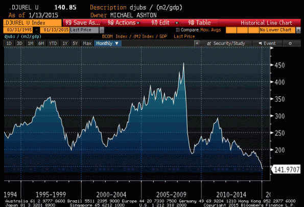
Such an analysis makes sense. The relative prices of two items are at least somewhat related to their relative scarcities. We will trade a lot of sand for one diamond, because there’s a lot of sand and very few diamonds. But if diamonds suddenly rained down from the sky for some reason, the price of diamonds relative to sand would plummet. We would see this as a decline in the dollar price of diamonds relative to the dollar price of sand, which would presumably be stable, but the dollar in such a case plays only the role of a “unit of account” to compare these two assets. The price of diamonds falls, in dollars, because there are lots more diamonds and no change in the amount of dollars. But if the positions were reversed, and there were lots more dollars, then the price of dollars should fall relative to the price of diamonds. We call that inflation. And that’s the reasoning behind this chart: over a long period of time, nominal commodities prices should grow with as the number of dollars increases.
Obviously, this has sent a poor signal for a while, and I have been looking for some other reasonable way to compute the expected return on commodities.[1] Some time ago, I ran across an article by Erb and Harvey called The Golden Dilemma (I first mentioned it in this article). In it was a terrific chart (their Exhibit 5) which showed that the current real price of gold – simply, gold divided by the CPI price index – is a terrific predictor of the subsequent 10-year real return to gold. That chart is approximately reproduced, albeit updated, below. The data in my case spans 1975-present.
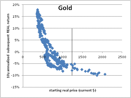
The vertical line indicates the current price of gold (I’ve normalized the whole series so that the x-axis is in 2015 dollars). And the chart indicates that over the next ten years, you can expect something like a -6% annualized real return to a long-only position in gold. Now, that might happen as a result of heavy inflation that gold doesn’t keep up with, so that the nominal return to gold might still beat other asset classes. But it would seem to indicate that it isn’t a great time to buy gold for the long-term.
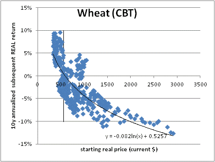
This chart was so magnificent and made so much sense – essentially, this is a way to think about the “P/E ratio” for a commodity” that I wondered if it generalized to other commodities. The answer is that it does quite well, although in the case of many commodities we don’t have enough history to fill out a clean curve. No commodities work as well as does gold; I attribute this to the role that gold has historically played in investors’ minds as an inflation hedge. But for example, look at wheat (I am using data 1970-present).
There is lots of data on agricultural commodities, because we’ve been trading them lots longer. By contrast, Comex Copper only goes back to 1988 or so:
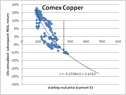
Copper arguably is still somewhat expensive, although over the next ten years we will probably see the lower-right portion of this chart fill in (since we have traded higher prices, but only within the last ten years so we can’t plot the subsequent return).
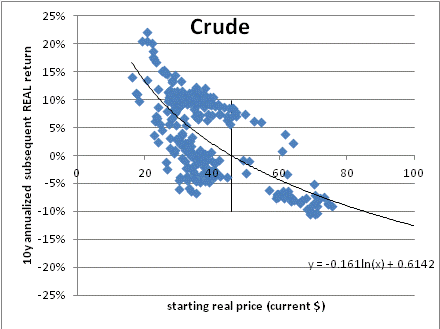
Now the one I know you’re waiting for: crude oil. It’s much sloppier (this is 1983-present, by the way), but encouraging in that it suggests from these prices crude oil ought to at least keep up with inflation over the next decade. But do you know anyone who is playing oil for the next decade?
For the sake of space, here is a table of 27 tradable commodities and the best-fit projection for their next 10 years of real returns. Note that most of these fit a logarithmic curve pretty reasonably; Gold is rather the exception in that the historical record is more convex (better expectation from these levels than a pure fit would indicate; see above).
I thought it was worth looking at in aggregate, so the chart below shows the average projected returns (calculated using only the data available at each point) versus the actual subsequent real returns of the S&P GSCI Excess Return index which measures only the return of the front futures contract.
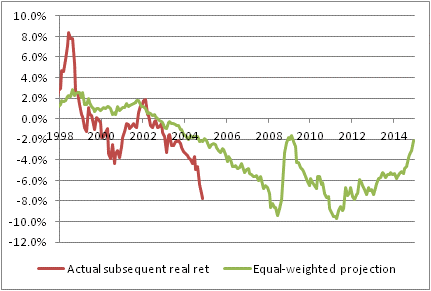
The fit is probably better in reality, because the actual returns are the actual returns of the commodities which were in the index at the time, which kept changing. At the beginning of our series, for example, I am projecting returns for 20 commodities but the 10-year return compares an index that has 20 commodities in 1998 to one that has 26 in 2008. Also, I simply equal-weighted the index while the S&P GSCI is production-weighted. And so on. But the salient point is that investing in spot commodities has been basically not pretty for a while, with negative expected real returns for the spot commodities (again, note that investing in commodity indices adds a collateral return plus an estimate 3-4% rebalancing return over time to these spot returns).
Commodities are, no surprise, cheaper than they have been in a long while. But what is somewhat surprising is that, compared to the first chart in this article, commodities don’t look nearly as cheap. What does that mean?
The first chart in this article compares commodities to the quantity of money; the subsequent charts compare commodities to the price level. In short, the quantity of money is much higher than has historically been consistent with this price level. This makes commodities divided by M2 look much better than commodities divided by the price level. But it merely circles back to what we already knew – that monetary velocity is very low. If money velocity were to return to historical norms, then both of these sets of charts would show a similar story with respect to valuation. The price level would be higher, making the real price of commodities even lower unless they adjusted upwards as well. (This is, in fact, what I expect will eventually happen).
So which method would I tend to favor, to consider relative value in commodities? Probably the one I have detailed here. There is one less step involved. If it turns out that velocity reverts higher, then it is likely that commodities real returns will be better than projected by this method; but this approach ignores that question.
Even so, a projected real return now of -2% to spot commodities, plus a collateral return equal to about 1.9% (the 10-year note rate) and a rebalancing return of 3-4% produces an expected real return of 2.9%-3.9% over the next decade. This is low, and lower than I have been using as my assumption for a while, but it is far higher than the expected real returns available in equities of around 1.2% annualized, and it has upside risk if money velocity does in fact mean-revert.
I will add one final point. This column is never meant to be a “timing” column. I am a value guy, which means I am always seen to be wrong at the time (and often reviled, which goes with the territory of being a contrarian). This says absolutely nothing about what the returns to commodities will be over the next month and very little about returns over the next year. But this analysis is useful for comparing other asset classes on similar long-term horizons, and for using useful projections of expected real returns in asset allocation exercises.
[1] In what follows, I will focus on the expected return to individual spot commodities. But remember that an important part of the expected return to commodity indices is in rebalancing and collateral return. Physical commodities should have a zero (or less) real return over time, but commodity indices still have a significantly positive return.

