Current Position of the Market
- SPX: Long-term trend – Final long-term phase on the way? How much longer, is the question.
- Intermediate Trend – The continued strength has muddied the water and we may have to wait until August/September before the intermediate trend becomes more clear.
- Short-term trend – Done on a daily basis with the help of hourly charts. It is an important adjunct to the analysis of daily and weekly charts which discusses the course of longer market trends.
Market Overview
The Fed’s de facto announcement that it would cut-rate sat its July 25th meeting got in the way of minor cycles having an immediate effect on prices. But it is only expected to delay an anticipated correction by a few days because the primary -- albeit still minor but more important -- cycle likely to impact the stock market is still ahead of us. How much of a correction it will bring about remains to be seen since the steady increase of the SPX with minimum retracement has resulted in almost nil price congestion. But if the Point & Figure chart does not produce a count, we can look for the 2950 level to be a potential target.
More important will be what we do after that correction. The cycle is expected to make its low a few days before the date of the announced rate cut; so what do we do next? Rally, and sell on the news after creating a larger top for a larger correction, or keep the bull market going? I have repeatedly stated that larger cycles were due to bottom in August-September, so my expectation is for a larger correction. We’ll have to wait until the FOMC meeting takes place, and observe what the market does afterward.
In the meantime, the market action of the past few days has created mild negative divergence at the daily and hourly time frame in the SPX. Nothing convincing! And IWM is still lagging. But the strength in DJIA last week was impressive! So it’s a mixed bag, at best, for now. We should get a truer technical picture after 7/25.
Technical Analysis (Charts appearing below are courtesy of QCharts.)
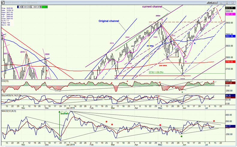
SPX daily chart
I only posted the top portion of the daily SPX chart so that we can see more clearly the trend lines that have been drawn. All dashed trend lines are parallels to the original and current channel lines. It has been my experience that they best represent trend line support and resistance for price action. I think that if you examine this closely, you will find that this is fairly obvious. Currently, the price action is being squeezed into a narrow channel of blue dashed parallels and is pulling away from the channel top on each successive new high. The purple parallels are now providing resistance at a slightly lower level. This detailed analysis maybe boring to some, but it reveals what the market is really doing and provides advance warning of a trend change. In spite of the bullish effect on the market resulting from the expectation of a rate cut on the 25th, traces of deceleration are still evident as minor cycles should finally be able to exact a minor retracement from the index over the next few days.
But is that all that it will be? A more ominous warning is coming from one of the most basic technical tools, the advance/decline indicator which is located at the bottom of the chart, and which I have enlarged so that we can see more clearly what it is doing. After the December low, this indicator had an unusual show of strength, surging to a level not seen since early 2016 which was the beginning of an extended uptrend in the index. Fast forward to today, and the A/D index appears to have run out of steam. If you look at the pattern it has made since the initial surge, every time that it has declined steadily to this level while SPX made higher and higher highs, a pattern which created strong negative divergence to the price, it was soon followed by a penetration below the zero line at the time that the price index reversed course. There is no reason to expect that this time will be different. So let’s keep a close eye on the A/D indicator since a move below the zero line looks imminent.
While the near-term looks reasonably easy to forecast, the intermediate term is still murky, but it should become much clearer over the next few weeks.
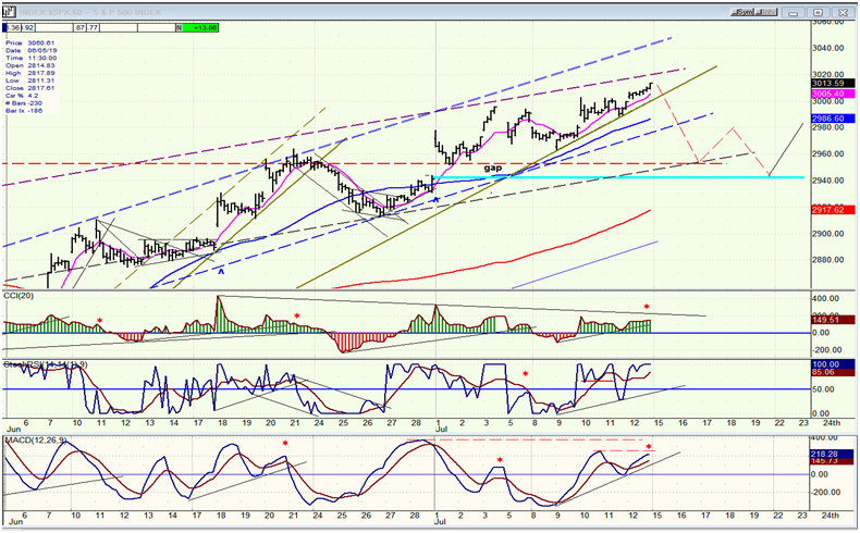
SPX hourly chart
The blue and purple dashed-line channels to which I refer in the daily chart analysis are clearly visible on the 60m chart. The purple one has taken over as the trend regulator, and with prices approaching the top channel line as well as the 3020-25 projection, we could put an end to the move which started at 2912 and have a price retracement into the cycle low expected on about 7/22. The red dashed zigzag is a suggestion for the price pattern before we rally into the 25th..The ideal date for a low may come a little early, and the subsequent reversal should be readily apparent.
Selling on the news would be the most logical thing to expect, especially with larger cycles expected to bottom in August-September.
Assuming that the cycles do perform as anticipated, the short-term way forward is relatively clear. It’s what comes afterward that is not, but the market action into that time period should give us a clue. I am completely open to a continuation of the long-term uptrend but equally wary that we may still be in major wave IV.
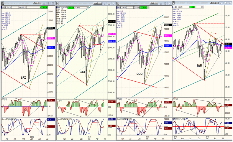
QQQ, SPX, DJIA, IWM (weekly)
As a result of its performance last week, I have moved DJIA into second place. This may not have much significance, and the jockeying for position between the first three indexes is not nearly as important as the fact that IWM remains stuck in the last place while retaining double divergence. If this continues while the other three go on making new highs, I will start to wonder if the relative weakness of IWM is not a long term affair. In other words, if it will continue to lag until the end of the bull market which could still be two or three years away. Just a thought for now!
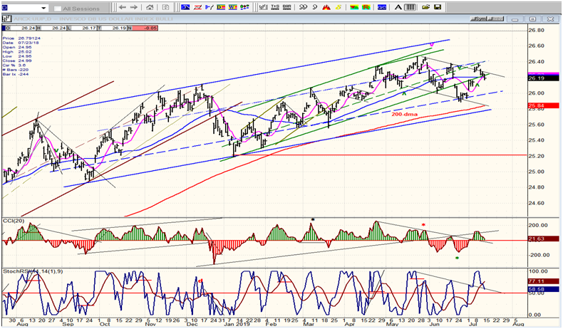
UUP (dollar ETF) daily
After dropping to the bottom of a declining short-term channel, UUP rallied for a couple of weeks, found resistance at the intersection of two-channel parallels, and pulled back down. This puts it back at the bottom of the green channel. If it cannot hold this level, it could continue to decline to the bottom of the blue channel.
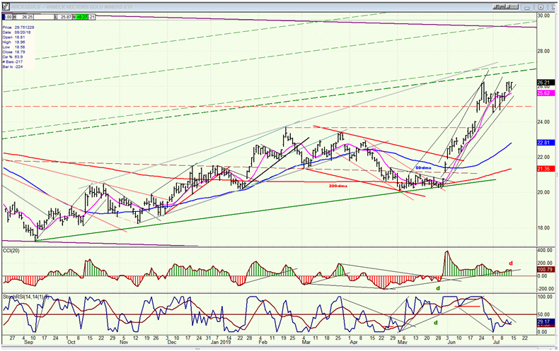
GDX (Gold Miners ETF) daily
GDX broke out of a two-year base and, after about two weeks of a shallow consolidation, closed Friday at the top of its break-out range. It is not clear if a little more consolidation is needed before it climbs to a new high. It may depend on what UUP does over the near term. The anticipated rate cut at the end of the month should be bullish for gold, and it’s probably only a matter of whether GDX extends its break-out move now, or waits a few more days to do so. Either way, the next rally should take it one and a half to two points higher.
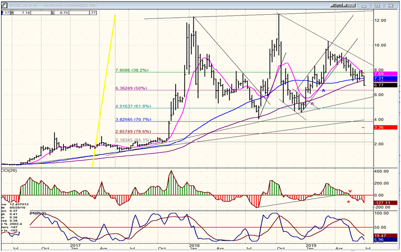
ACB (Aurora Cannabis) weekly
The weekly chart of ACB gives us a better perspective on what the stock is doing. After rising 1200% in a matter of weeks, ACB retraced about 70% of its move, rallied again to its former high, retraced, rallied and has settled down in a less erratic phase of an intermediate consolidation from its initial high. This corrective phase could continue for a while longer, until it reaches 5.50-6.00, after which ACB could be once again ready for another good move, and perhaps a new high. We’ll discuss it in more detail when it is closer to its correction low.
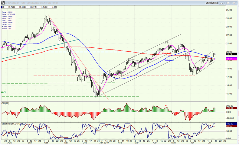
BNO (Brent Oil Fund daily
United States Brent Oil (NYSE:BNO) has pushed a little higher and has made an oscillator pattern which suggests that it is just about ready for a pull-back. If that pull-back can hold above the MA cluster around 19.00, it would likely extend its uptrend to or past 21.00.
Summary
The Fed chairman stymied short-term bears by announcing the near certainty of a rate cut on the 25th. Nevertheless, a short-term pull-back resulting from a minor cycle bottoming over the next week or so should still take place.
