During the past year we have been tracking the development of a long periodic bubble in the stock market, and the recent breakdown in January suggests that the bubble may have finally popped. As we often stress, a long-term top is a process, not an event, so it is too soon to conclude with a high degree of statistical confidence that a cyclical top is in place. However, stock market behavior during the past year bears a strong resemblance to the behavior at notable bubble tops of the past 100 years. In his latest weekly commentary, fund manager John Hussman reviewed the potential topping pattern and compared it to similar bubble tops in 1929, 1973 and 2000.
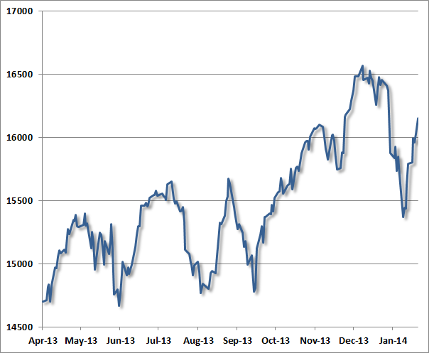
To offer some perspective of how major peaks have typically evolved, the following charts present the Dow Jones Industrial Average in the final advances toward, and the few weeks after, what turned out in hindsight to be major stock market peaks. For reference, let’s examine the recent market peak. Notice several features:
- A series of moderately spaced peaks forming a broad sideways “consolidation” over several months;
- A breakout from that consolidation, leading to a steep and only briefly corrected speculative blowoff into the market’s peak;
- A steep initial selloff from the market peak, and finally;
- A “reflex” rally (classically on low volume – indicative of a short-squeeze with sellers backing off) that retraces much of the initial selloff.

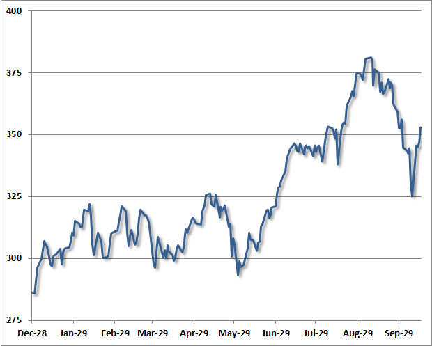
One can observe that same general dynamic in the chart below – a series of moderately-spaced peaks forming a largely sideways consolidation, a breakout to a steep and only briefly corrected speculative “blowoff”, an initial retreat, and finally a reflex rally. This chart depicts the final advance to the 1929 market peak.

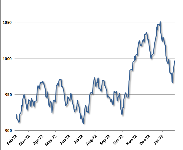
Largely the same dynamic was evident in the advance to the 1973 peak (after which the market lost half its value into late-1974): a series of moderately-spaced peaks comprising a broad consolidation, a breakout to a steep and only briefly corrected speculative blowoff and market peak, a steep initial decline, and a short-lived reflex rally after the peak.

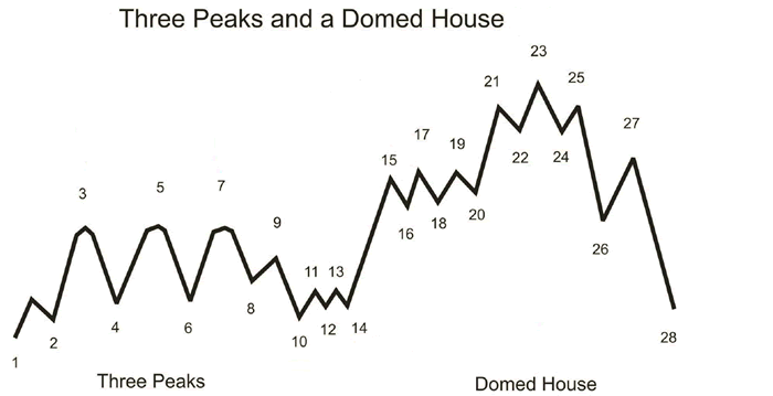
As it happens, the sequence described here is not at all new. Instead, it follows a pattern that technical analyst George Lindsay described in 1970 (and notably before even the 1973 instance above), which he called “Three Peaks and a Domed House.” Lindsay observed this pattern repeatedly across historical market cycles, describing about half of the bull market tops in the DJIA.
My sense is that it is enormously ambitious to label 28 separate points in a technical pattern, but the central observations do appear to nicely characterize many historical instances. Lindsay called points 8-10 a “separating decline” that distinguishes the series of consolidating peaks from first vertical portion of the speculative blowoff (the “wall of the first story”). Following a choppy correction, the pattern completes with the “domed house” – which is roughly the analog of a narrow head-and-shoulders pattern: “after peaking at 25, price tumbles to 26, retraces to 27, before heading lower to 28, completing the pattern.”

Though the “separating decline” after the mid-1999 consolidation was quite deep, as was the initial decline from the January 2000 peak in the Dow Industrials, the same essential features were evident then as well. The correspondence isn’t nearly as pretty as in the present instance, or those of 1973 or 1929. It’s worth keeping in mind that despite a hard initial decline, many (though not all) historical bull market peaks include an “exhaustion rally” anywhere between 2-9 months after the market peak, which can carry prices within a few percent of the high. The problem is that there is too much variability to count on either their timing or extent.
