This will be my last “live” post of 2013. As such, I want to thank all of you who have taken the time to read my articles, recommend them, re-tweet them, and re-blog them. Thanks, too, for your generous and insightful comments and reactions to my writing. One of the key reasons for writing this column (other than for the greater glory of Enduring Investments and to evangelize for the thoughtful use of inflation products by individual and institutional investors alike) is to force me to crystallize my thinking, and to test that thinking in the marketplace of ideas to find obvious flaws and blind spots. Those weaknesses are legion, and it’s only by knowing where they are that I can avoid being hurt by them.
In my writing, I try to propose the ‘right questions,’ and I don’t claim to have all the right answers. I am especially flattered by those readers who frequently disagree with my conclusions, but keep reading anyway – that suggests to me that I am at least asking good questions.
So thank you all. May you have a blessed holiday season and a happy new year. And, if you find yourself with time to spare over the next few weeks, stop by this blog or check your email (if you have signed up) as I will be re-blogging some of my (subjectively considered) “best” articles from the last four years. Included in that list is an article on long-run returns to equities, one on Yellen’s defense of large-scale asset purchases, an article on the Phillips Curve, one on why CPI isn’t a bogus construct of a vast governmental conspiracy, and so on.
And now, on to my portfolio projections as of December 13th, 2013.
.
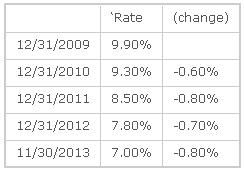
Last year, I said “it seems likely…that 2013 will be a better year in terms of economic growth.” It seems that will probably end up being the case, marginally, but it is less likely that 2014 improves measurably in terms of most economic variables on 2013 and there is probably a better chance that it falls short. This expansion is at least four years old. Initial Claims have fallen from 650k per week in early 2009 to a pace of just barely more than half that (335k) in the most-recent 26 weeks. About the best that we can hope for, plausibly, is for the current pace of improvement to continue. The table below illustrates the regularity of this improvement over the last four years, using the widely-followed metric of the Unemployment Rate:
Sure, I know that there are arguments to be made about whether the Unemployment Rate captures the actual degree of pain in the jobs market. It plainly does not. But you can pick any one of a dozen other indicators and they all will show roughly the same pattern – slow, steady improvement. There is no doubt that things are better now than they were four years ago, and no doubt that they are still worse than four years before that. My point is simply that we have been on the mend for four years.
Now, perhaps this expansion will last much longer than the typical expansion. But I don’t find terribly compelling the notion that the expansion will last longer because the recession was deeper. Was this recession deeper because the previous expansion was longer? If so, then the argument is circular. If not, then why would that connection only work in one direction? What I know is that the Treasury has spent the last four years running up large deficits to support the economy, and the Fed has nailed interest rates at zero and flooded the economy with liquidity. Those two things will at best be repeated in 2014, not increased; and there is a decent chance that one or the other is reversed. Another 0.8% improvement in the Unemployment Rate would put it at 6.2%, and I expect inflation to head higher as well. A taper will be called for; indeed, it should never have been necessary because policy is far too loose as it is. Whether or not an extremely dovish Fed Chairman will actually acquiesce to taper is an open question, but economically speaking it is already overdue and certainly will appear that way by the middle of the year, absent a crack-up somewhere.
Global threats to growth do abound. European growth is sluggish because of the condition of the financial system and the pressures on the euro (but they think growth is sluggish because money isn’t free enough). UK growth has been improving, but much of that – as in the U.S. – has been on the back of housing markets that are improving too quickly to make me comfortable. Chinese growth has recently been downshifting. Japanese growth has been irregularly improving but enormous challenges persist there. Globally, the bright spot is a modest retreat in Brent Crude prices and lower prices of refined products (although Natural Gas prices seem to be on the rise again despite what was supposed to be a domestic glut). Some observers think that a lessening of tensions with Iran and recovery of capacity in Libya, along with increasing US production of crude, could push these prices lower and provide a following wind to global growth, but I am less sanguine that geopolitical tensions will remain relaxed for long and, in any event, depending on a calm Iran as the linchpin of 2014 optimism seems pretty cavalier to me.
Note that the muddled growth picture contains some elements of risk to price inflation. The ECB has been kicking around the idea of doing true QE or experimenting with negative deposit rates. The UK housing boom, like ours, keeps the upward pressure on measures of core inflation. There is no sign of an end to Japanese QE, and the PBOC seems willing to let the renmimbi rise more rapidly than it has in the past. And all of these global risks to domestic price inflation are in addition to the internally-generated pressures from rapid housing price growth in the United States.
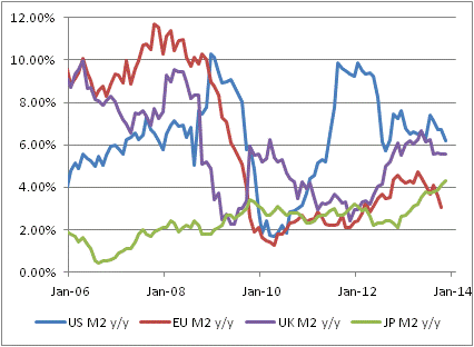
The good news on inflation domestically is that M2 money growth has slackened from the 8%-10% pace of last year to more like 6%-8% (see chart, source Bloomberg). This is still too fast unless money velocity continues to slide, but it is certainly an improvement. But the bad news is that money growth remains rapid in the UK and is accelerating in Japan. The only place it is flagging, in Europe, has a central bank that is anxious not to be last place on the global inflation scale. I expect core inflation (and median inflation) in the U.S. to rise throughout 2014 and for core inflation to end up above 3% for the year.
Now, I have just made a number of near-term forecasts but I need to change gears when looking at the long-term projections. In what follows, I make no effort to predict the 3-month, 6-month, or 12-month returns of any market. Indeed, although I will present long-term risk and return outlooks, and they are presented as point estimates, I want to make it very clear that these are not predictions but rather statements of relative risk and return possibilities. For many types of instruments, the error bars around the average annual performance are so large as to make point estimates (in my view) nearly useless. The numbers come from models of how markets behave when they are priced “like they are now” in terms of several important metrics. They are not prescient. However, that is what investing is really all about: not making the “right” bet in terms of whether you can call the next card off the deck, but making the “right” bet with respect to the odds offered by the game, and betting the right amount given the odds and the edge.
I also will not make portfolio allocation recommendations here. The optimal portfolio allocation for you depends on more variables than I have at my disposal: your age, your career opportunities, your lifestyle, your goals, any insurance portfolio and your risk tolerance, to name just a few.
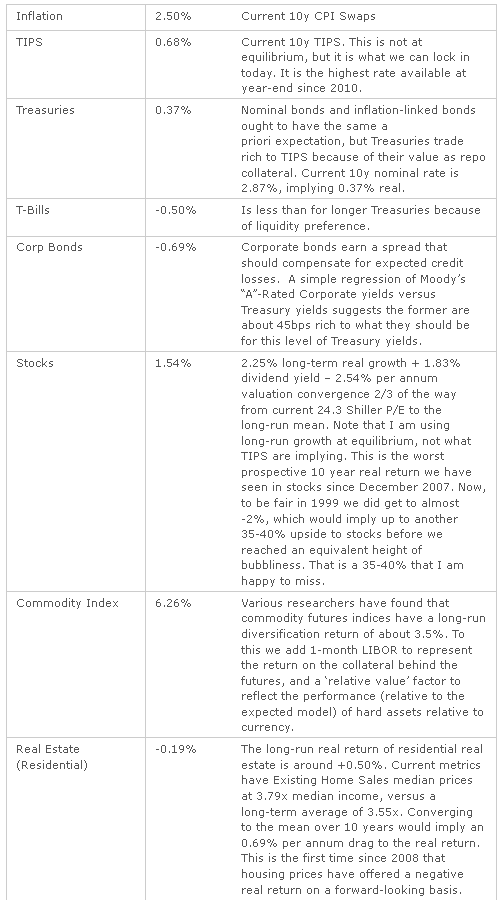
What I will do here, though, is to give top-down estimates of the long-run returns and risks of some broad asset classes, and make some general observations. I don’t analyze every possible asset class. For this exercise, I limit the universe to stocks, TIPS, nominal bonds (both long Treasury and corporate bonds), commodity indices and (since many of us already own it) residential real estate. My estimates and some notations about the calculations are in the table below.
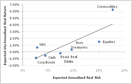
The results, using historical volatilities calculated over the last 10 years (and put in terms of ‘real annuitized income,’ a term that means essentially the variance compared to a fixed 10-year real annuity, which in this analysis would be the risk-free instrument), are plotted below. (Source: Enduring Investments).
Return as a function of risk is, as one would expect, positive. For each 0.33% additional real return expectation, an investor must accept a 1% higher standard deviation of annuitized real income. However, note that this is only such a positive trade-off because of the effect of commodities and TIPS. If you remove those two asset classes, which are the cheap high-risk and the cheap low-risk asset classes, respectively, then the tradeoff is worse. The other assets lie much more closely to the resulting line, which is flatter: you only gain 0.19% in additional real return for each 1% increment of real risk. Accordingly, I think that the best overall investment portfolio using public securities – which has inflation protection as an added benefit – is a barbell of broad-based commodity indices and TIPS.
TIPS by themselves are not particularly cheap; it is only in the context of other low-risk asset classes that they appear so. Our Fisher model is long inflation expectations and flat real rates, which merely says that TIPS are strongly preferable to nominal rates but not a fabulous investment in themselves (although 10-year TIPS yields are better now than they have been for a couple of years). Our four-asset model remains heavily weighted towards commodity indices; and our metals and miners model is skewed heavily towards industrial metals (50%, e.g. DBB) with a neutral weight in precious metals (24%, e.g. GLD) and underweight positions in gold miners (8%, e.g. GDX) and industrial miners (17%, e.g. PICK).
Disclosure: We have long positions in each of the ETFs mentioned
