The Personal Income and Outlays report for January was published today by the Bureau of Economic Analysis.
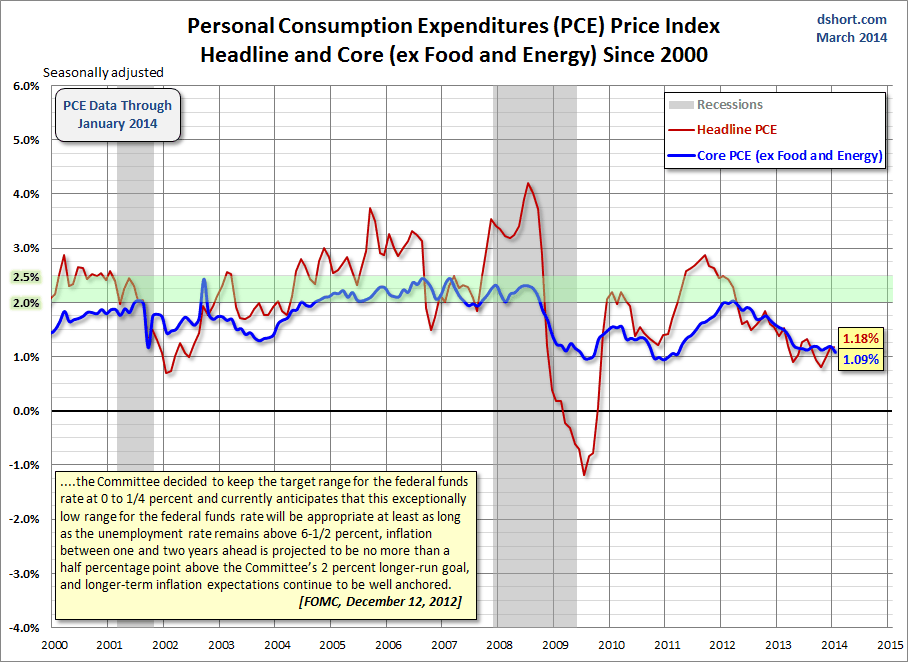
The latest Headline PCE price index year-over-year (YoY) rate of 1.18% is a small rise from the previous month's 1.15% (an upward adjustment from 1.07%). The Core PCE index of 1.09% is lower than the previous month's 1.19% (an upward adjustment from 1.16%).
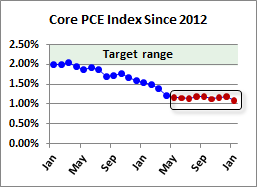
As I've routinely observed, the general disinflationary trend in core PCE (the blue line in the charts below) must be quite troubling to the Fed. After years of ZIRP and waves of QE, this closely watched indicator consistently moved in the wrong direction. Since April of last year it had hovered in a narrow YoY range of 1.21% to 1.13% and is now fractionally lower at the January 1.09%.

The adjacent thumbnail gives us a close-up of the trend in Core PCE since January 2012. The first chart below shows the monthly year-over-year change in the personal consumption expenditures (PCE) price index since 2000. I've also included an overlay of the Core PCE (less Food and Energy) price index, which is Fed's preferred indicator for gauging inflation. I've highlighted 2 to 2.5 percent range. Two percent had generally been understood to be the Fed's target for core inflation. However, the December 2012 FOMC meeting raised the inflation ceiling to 2.5% for the next year or two while their accommodative measures (low FFR and quantitative easing) are in place.

I've calculated the index data to two decimal points to highlight the change more accurately. It may seem trivial to focus such detail on numbers that will be revised again next month (the three previous months are subject to revision and the annual revision reaches back three years). But core PCE is such a key measure of inflation for the Federal Reserve that precision seems warranted.
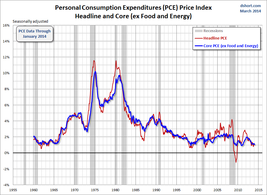
For a long-term perspective, here are the same two metrics spanning five decades.

Note: I use the data from Table 9 in the full release and tables available here.
