Further to my last Weekly Market Update, its subsequent Addendum, and my mid-Week Money Flow update, this week's update will look at:
- 6 Major Indices
- 9 Major Sectors
- Various World Markets
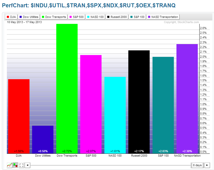
As shown on the Weekly charts and the percentage gained/lost graph below of the Major Indices, the largest gains were made in the Dow Transports, followed by the Russell 2000, S&P 500, Nasdaq 100, Dow 30, and Dow Utilities.
On a weekly basis, these indices remain in a highly elevated stance relative to their Stochastics cycle, and, with the exception of Utilities, they closed the week at or above their upper Bollinger Band.
The same can be said when one looks at a timeframe in which each candle represents a one-month Options Expiry period (the current candle closed on Friday), as is shown on the next charts...with one difference...Utilities closed at its upper Bollinger Band after pulling back from its prior close above at the end of the last options expiration period.
If one is just going long here, be aware that you are doing so, not only at the upper end of their weekly and options expiry time cycles, but also very mature cycles, as well as at or above their upper Bollinger Bands.
I'd suggest that if we don't see some sort of orderly pullback from these levels, we may see a parabolic move to the upside, followed by, what could be, a swift and violent/volatile correction -- something to which I alluded in my earlier post today (Friday) relative to this week's move in the U.S. $ [and for which I was ridiculed at another site where I guest-post articles...so no, I wasn't "smoking" anything (I'm a coffee-hound and teetotaller) and I always trade with a clear head (I take my work very seriously and my analyses are not done without careful scrutiny)...the only thing that may affect my mind is age...and I can't do anything about that!]. :-)
In any event, combine the high price of the U.S. $ with the high prices of equities (all-time highs in many cases), and that makes it unattractive for new foreign investment at the moment.


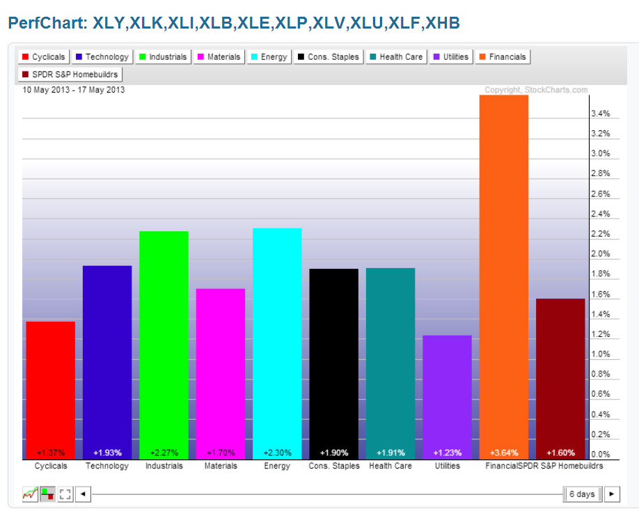
9 Major Sectors
As shown on the Weekly charts and the percentage gained/lost graph below of the Major Sectors, the largest gains were made in Financials, with the smallest gains made in Utilities.
What I said above for the Major Indices also applies for all Sectors -- On a weekly basis, these sectors remain in a highly elevated stance relative to their Stochastics cycle, and, with the exception of Utilities, they closed the week at or above their upper Bollinger Band.
The same can be said when one looks at a timeframe in which each candle represents a one-month Options Expiry period (the current candle closed on Friday), as is shown on the next charts...with one difference...Utilities closed at its upper Bollinger Band after pulling back from its prior close above at the end of the last options expiration period.
If one is just going long here, be aware that you are doing so, not only at the upper end of their weekly and options expiry time cycles, but also very mature cycles, as well as at or above their upper Bollinger Bands.
I'd suggest that if we don't see some sort of orderly pullback from these levels, we may see a parabolic move to the upside, followed by, what could be, a swift and violent/volatile correction. 


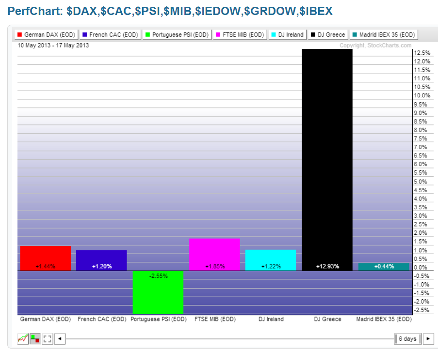
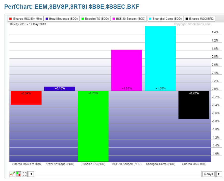
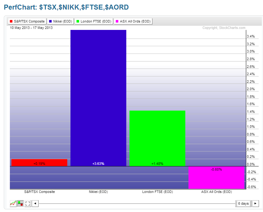
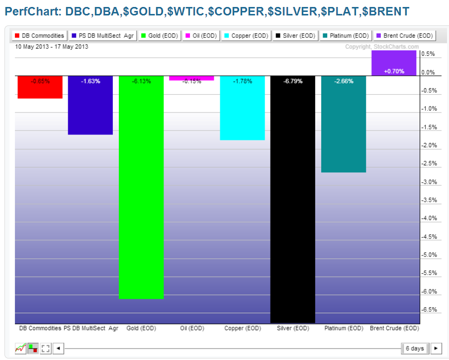
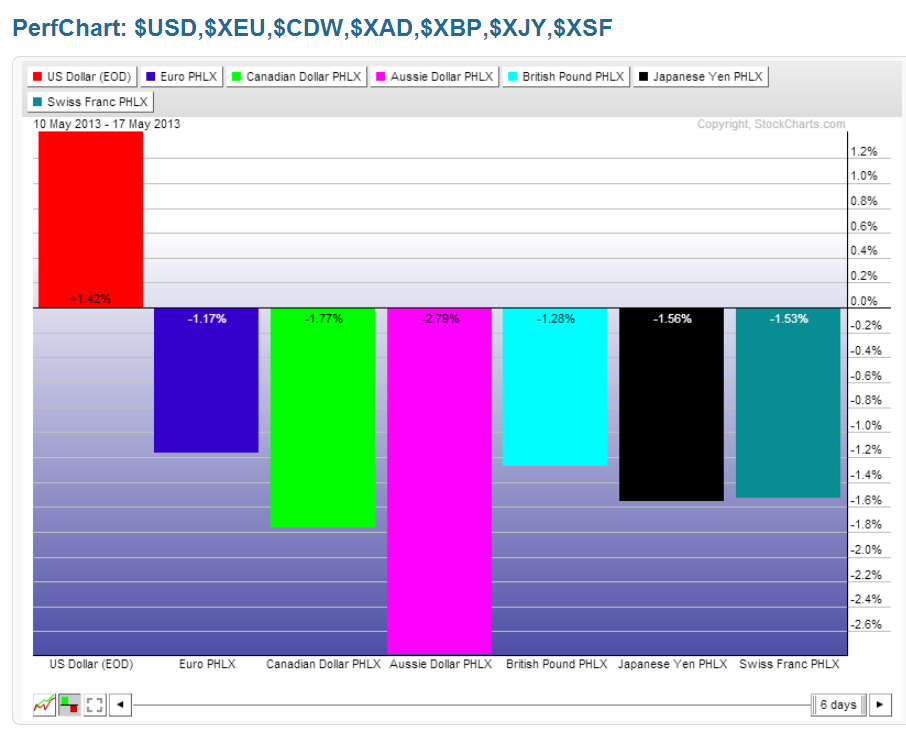
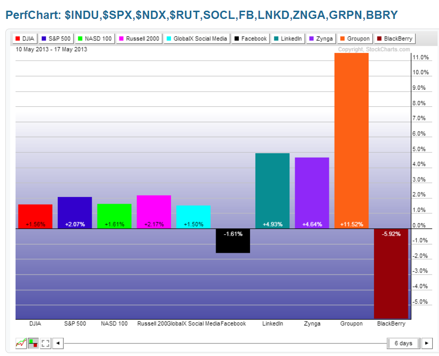
Various World Markets
I've provided the following percentage gained/lost graphs (without commentary) for the purposes of simply seeing, at a glance, where money flow has been directed this past week in various world markets, and to see the "outliers"...that is, which markets gained or lost an exceptional amount compared to the others (e.g., Greece makes the list again this week).
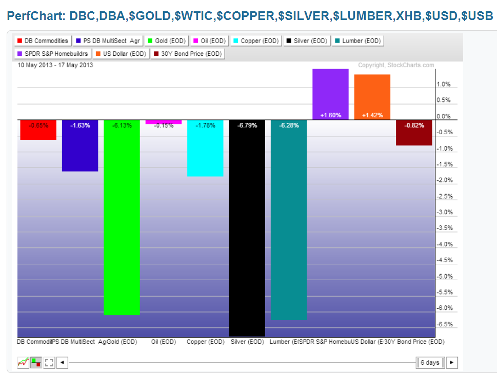
My one comment is that it was a "risk-on" week for equities, the U.S. $, most of the EU countries, and some of the social media stocks, and it was a "risk-off" week for commodities, emerging markets, and 30-Year Bonds, while BRIC countries were mixed.