Further to my last Weekly Market Update, this week's update will look at:
- 6 Major Indices
- 9 Major Sectors
- Social Media Stocks
- German, French, & PIIGS Indices
- Emerging Markets ETF & BRIC Indices & ETF
- Other World Indices
- Commodities
- Major Currencies
- 30-Year Bonds
- U.S. $
As shown on the Weekly charts below of the Major Indices, all of them ended the past week higher at or above their upper Bollinger Band.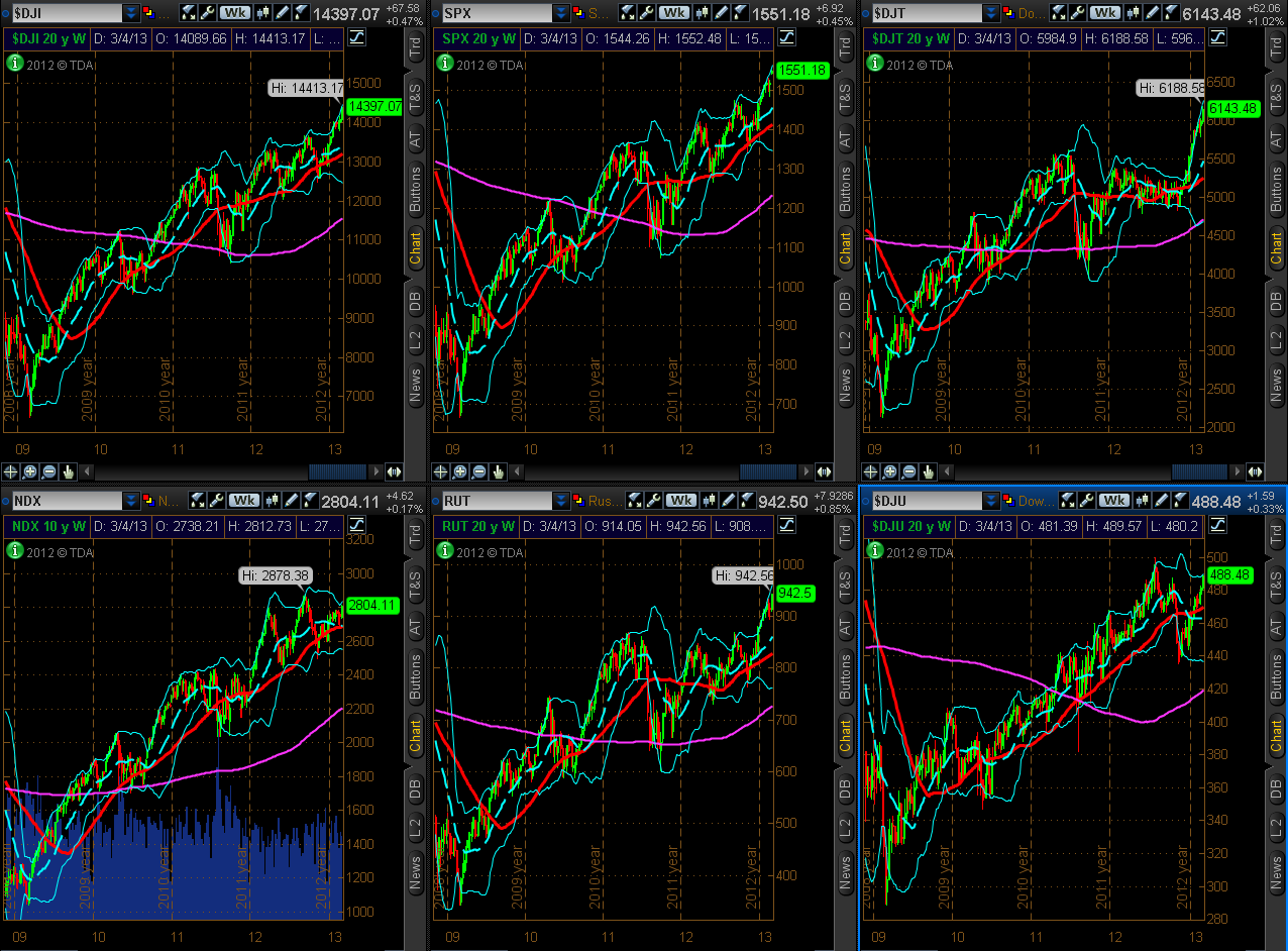
Below are 2 graphs showing percentage gained/lost for the Major Indices.
The first graph shows the gains that have been made for each one for 2013. The Dow Transports is the leader, so far this year, followed by the Russell 2000, Dow 30, S&P 500, Dow Utilities, and the Nasdaq 100 (the laggard for the year).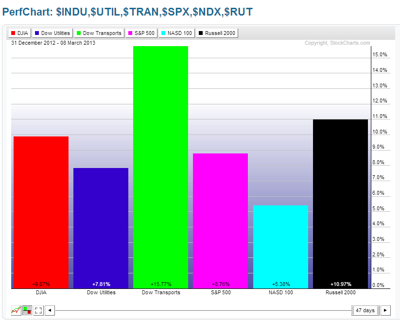
The second graph shows the gains made this past week. The largest gains were made in the Russell 2000 and buying stepped up in the Nasdaq 100...signalling to me that market participants were willing to take on more of the riskier, higher-beta stocks, rather than the larger-cap stocks that have been favoured of late.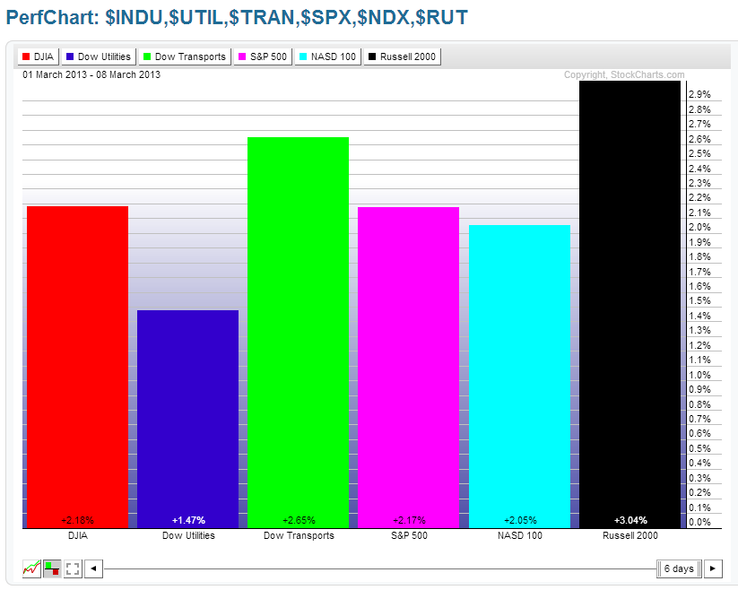
I've included the following Weekly chart of the 4 E-mini Futures Indices, the YM, ES, NQ & TF, to illustrate the overall uptrend that they've been in since 2009. You can see that the NQ, while it was leading in strength last year, is the clear laggard this year. It's definitely the one to watch to see if buyers step in any time soon to bring the Technology sector on board to support any further general rally in equities.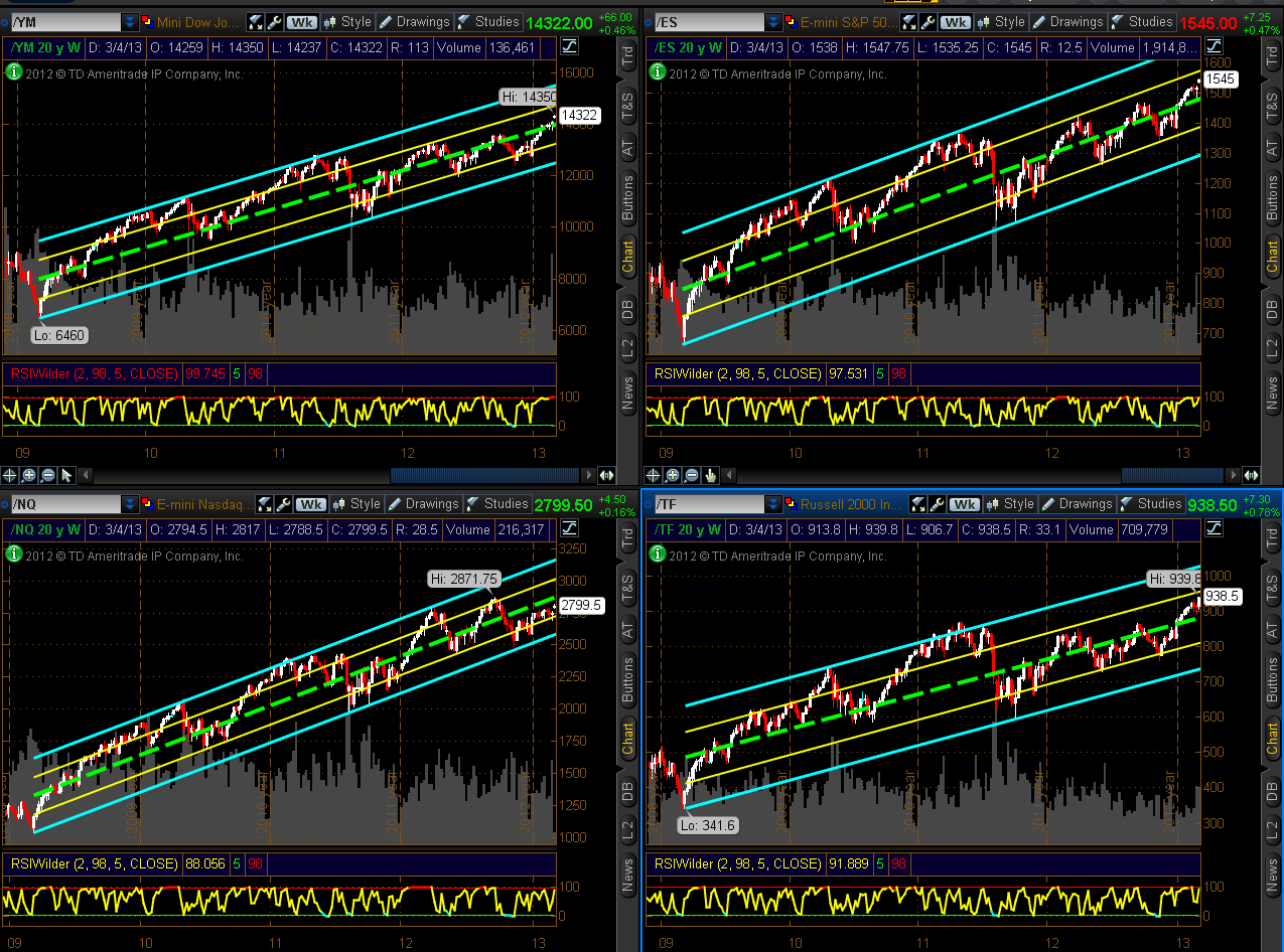
The 4-Hour chart of the YM, ES, NQ & TF below shows these to be trading within an uptrending channel, beginning from January 1st of this year. At the moment, they're all trading just above the 50% level of the channel. I'd like to see that level held on any further advance, particularly on the NQ. Otherwise, a drop and hold below 50% could send price down to the lower 25% channel level, or to the channel bottom.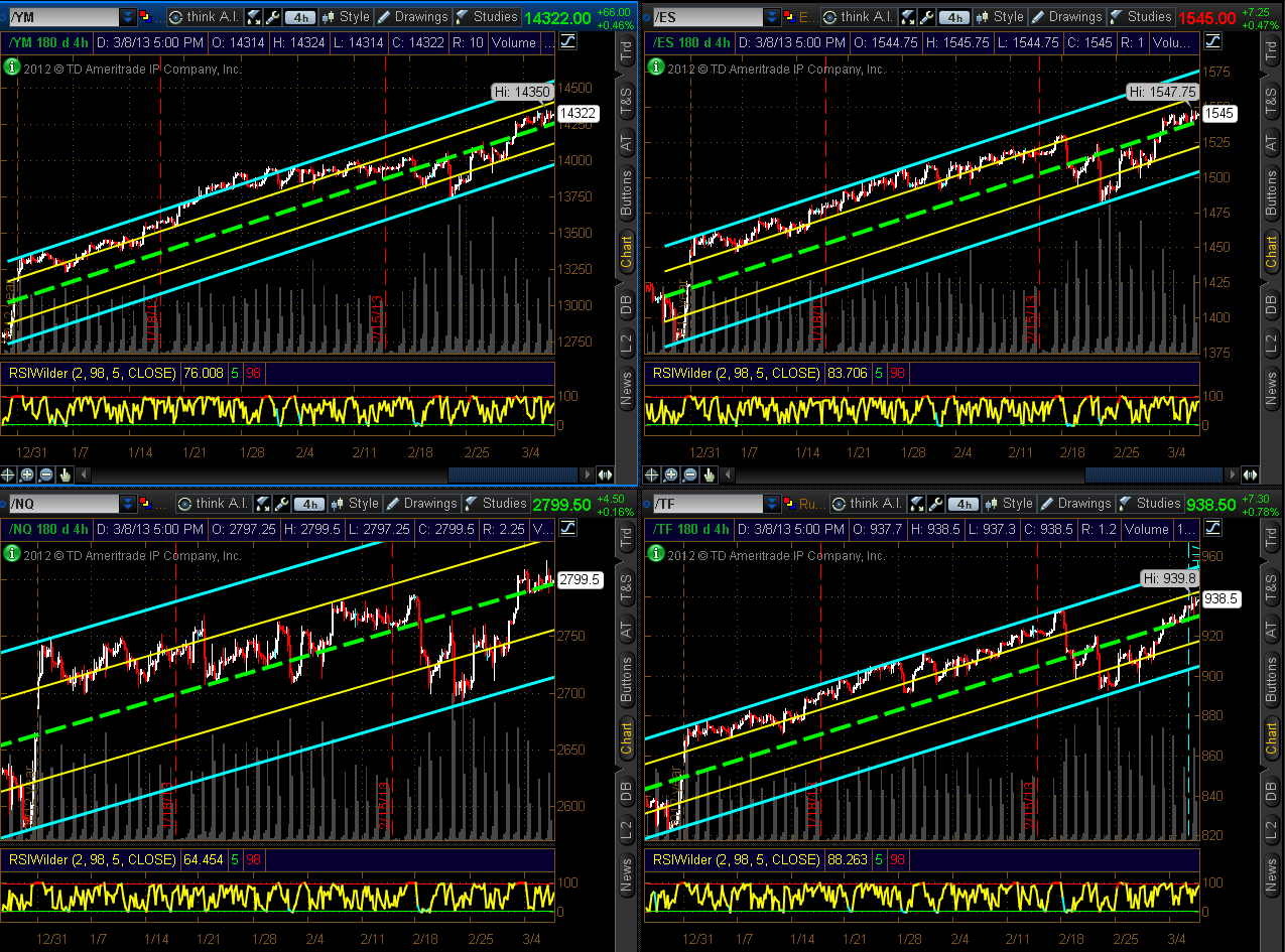
9 Major Sectors
As shown on the Weekly charts below of the Major Sectors, all of them closed higher this past week at or near their upper Bollinger Band. 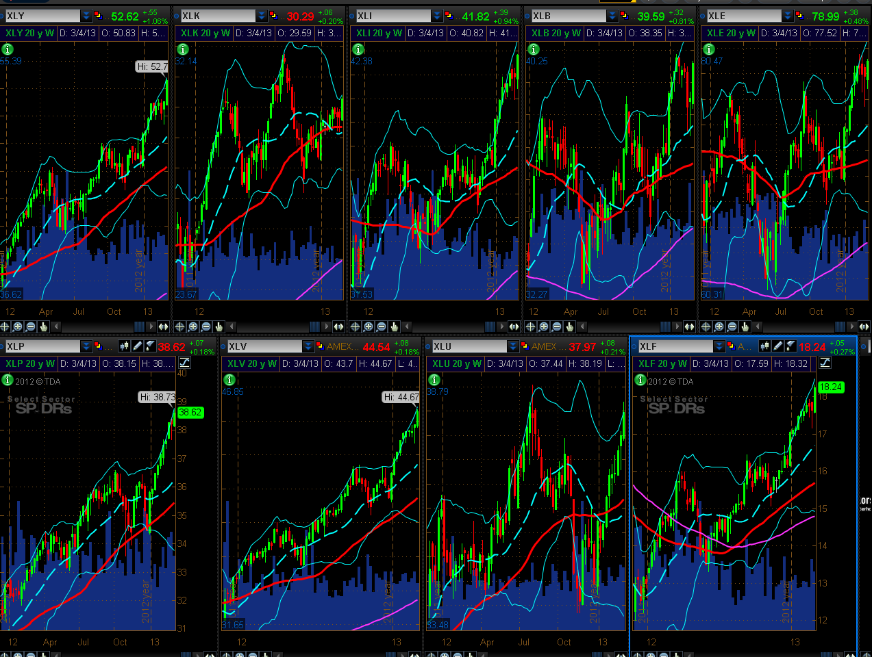
Below are 2 graphs showing percentage gained/lost for the Major Sectors.
The first graph shows the gains that have been made for each one for 2013. What stands out is that Technology and Materials are the laggards, so far, this year.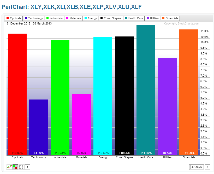
The second graph shows the gains made this past week. Financials made the largest gains, and there was a bit more buying activity in Technology and Materials. As well, the "Defensive Sectors" (Consumer Staples, Health Care, and Utilities) were the laggards, confirming that market participants were willing to take on more of the riskier, higher-beta stocks, rather than the larger-cap stocks that have been favoured, of late.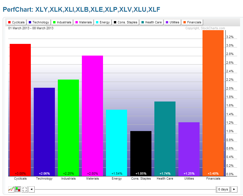
Social Media Stocks
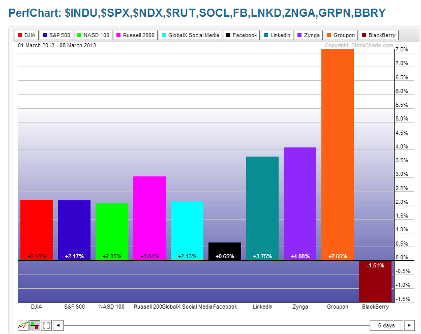
The following 2 graphs depict the market's willingness to take on riskier, high-beta stocks. You can see the comparison of percentage gained in some of the Social Media stocks compared with the 4 Major Indices, for both 2013 and for just last week. These are ones to watch for either continued buying or developing weakness as one gauge of market appetite for risk.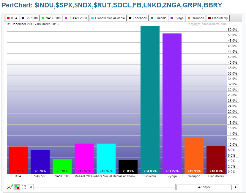
German, French, & PIIGS Indices
Below are 2 graphs showing percentage gained/lost for these European Indices.
The first graph shows the gains/losses that have been made for each one for 2013. What stands out is that Italy and Greece are the laggards, so far, this year. 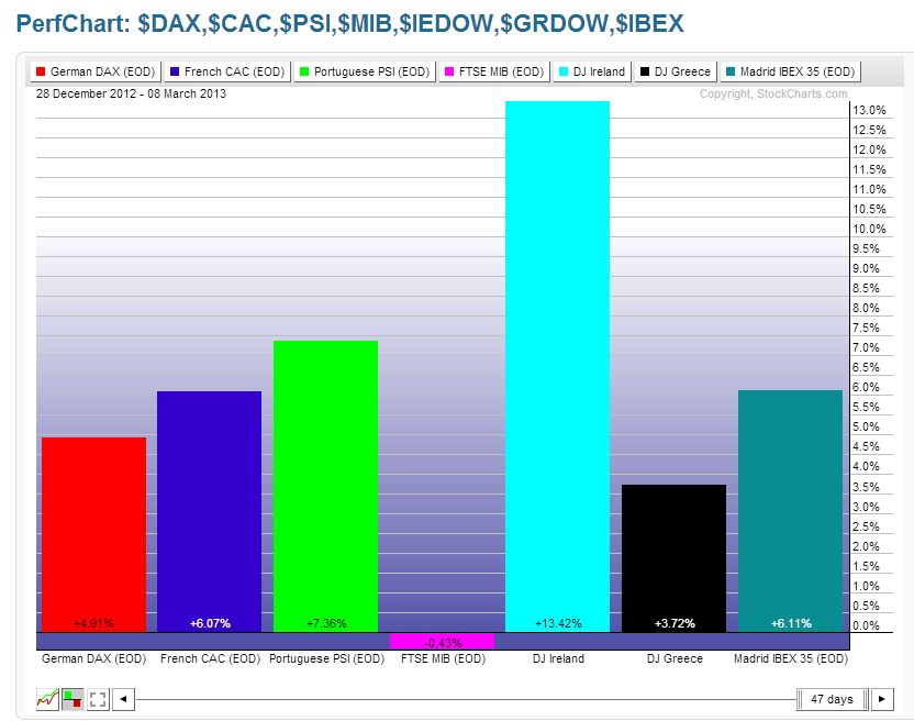
The second graph shows the gains/losses made this past week. While Italy gained just over 3%, Greece lost almost 4%, and Spain made the largest gains. These three are important ones to watch to gauge short-term sentiment towards the higher-debt-laden southern European countries. 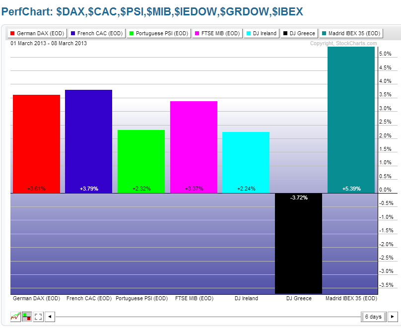
Emerging Markets ETF & BRIC Indices & ETF
Below are 2 graphs showing percentage gained/lost for the Emerging Markets ETF & BRIC Indices & ETF.
The first graph shows the gains/losses that have been made for each one for 2013. What stands out is that Brazil and Russia are the laggards, so far, this year, while China is in the lead. 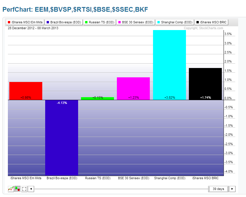
The second graph shows the gains/losses made this past week. While Brazil gained almost 3%, China lost almost 2%, and India made the largest gains. China is the one to watch for either further weakness, or a return to strength.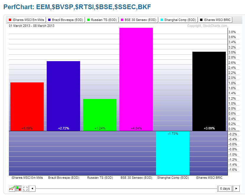
Other World Indices
Below are 2 graphs showing percentage gained/lost for Canadian, Japanese, London, Australian, and World Indices.
The first graph shows the gains that have been made for each one for 2013. What stands out is that Japan leads by a huge margin, so far, this year (thanks to their Central Bank's massive stimulus program), while Canada lags the others. 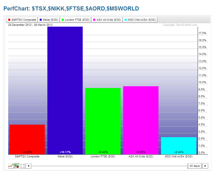
The second graph shows the gains made this past week. While Canada lagged behind even the World Index, Australia also made only minor gains. These two commodity-producing countries are the ones to watch going forward, along with Commodities, which I'll be discussing below.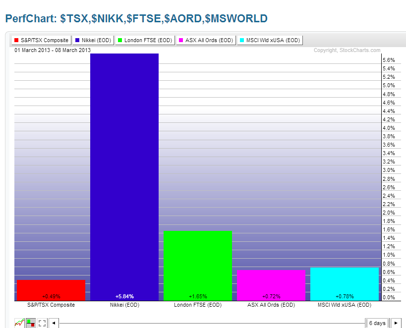
Commodities
Below are 2 graphs showing percentage gained/lost for the Commodities ETF (DBC), the Agricultural ETF (DBA), Gold, Oil, Copper, and Silver.
The first graph shows the gains/losses that have been made for each one for 2013. What stands out is that the largest losses have been made in Agriculture, Gold, and Silver, with Oil, essentially, flat for the year.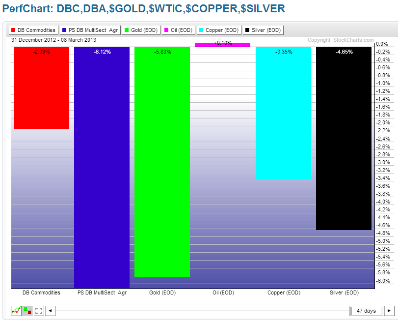
The second graph shows the gains/losses made this past week. Money flowed into Silver, Oil, and the Commodities ETF, while Agriculture, Gold, and Copper were flat.
I last wrote about Commodities on March 5th. There are additional charts and ratio charts shown in that post that I'll be monitoring over the coming days/weeks to gauge weakness or strength in Commodities, as well as the Aussie $ (which I'll be discussing below).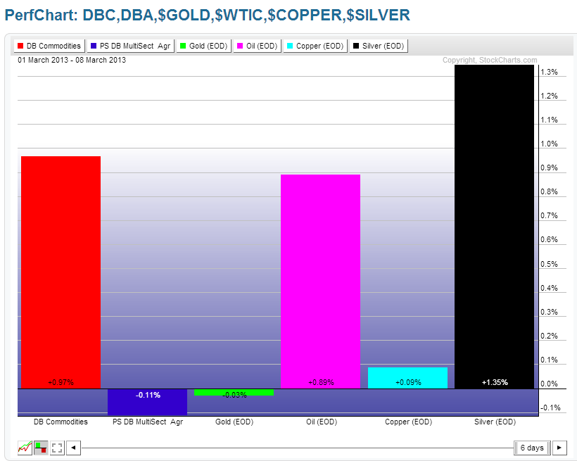
Major Currencies
Below are 2 graphs showing percentage gained/lost for the major Currencies.
The first graph shows the gains/losses that have been made for each one for 2013. What stands out is that the largest losses against the U.S. $ have been in the Japanese Yen, followed by the British Pound.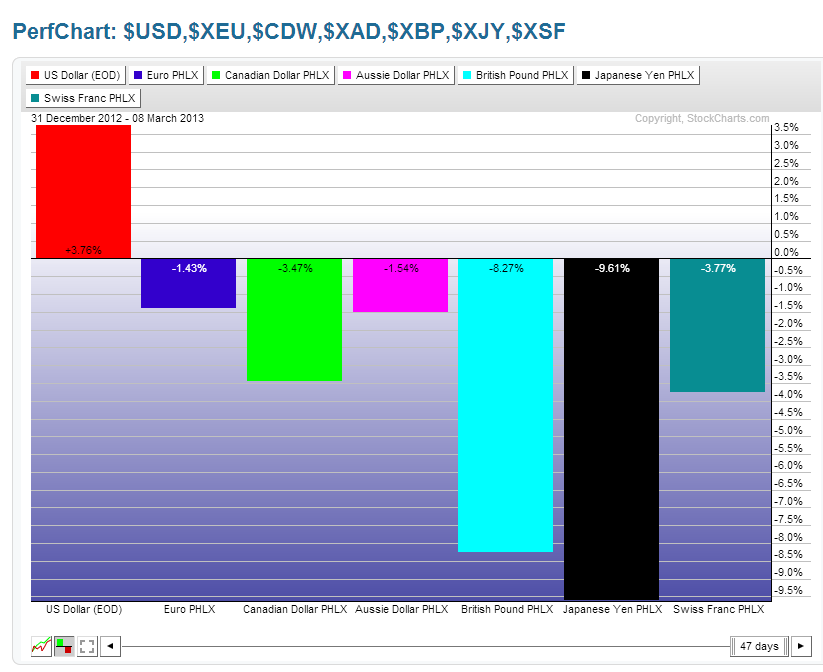
The second graph shows the gains/losses made this past week. Money began flowing into the Aussie $, while the Canadian $ and the Euro were flat...ones to watch, along with Australia, China, Canada, and Commodities as a gauge of further strength or weakness in commodity production and consumption.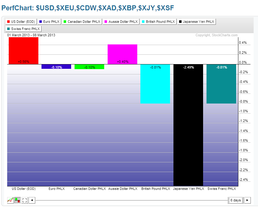
30-Year Bonds
The 5-Year Weekly chart below of 30-Year Bonds shows that price finally broke and closed below what I'd now call a weekly bear flag. Price is now sitting at the lower Bollinger Band and just above the next support level. A break and hold below that could send price tumbling on increasing momentum. High volumes, of late, show the level of buying/selling that has occurred within these Bonds. Should this high level continue on a further drop, no doubt, we'll see the selling pace accelerate. It's, potentially, a signal that money is flowing out of Bonds to be deployed into equities, and/or commodities, and/or currencies, and/or other instruments.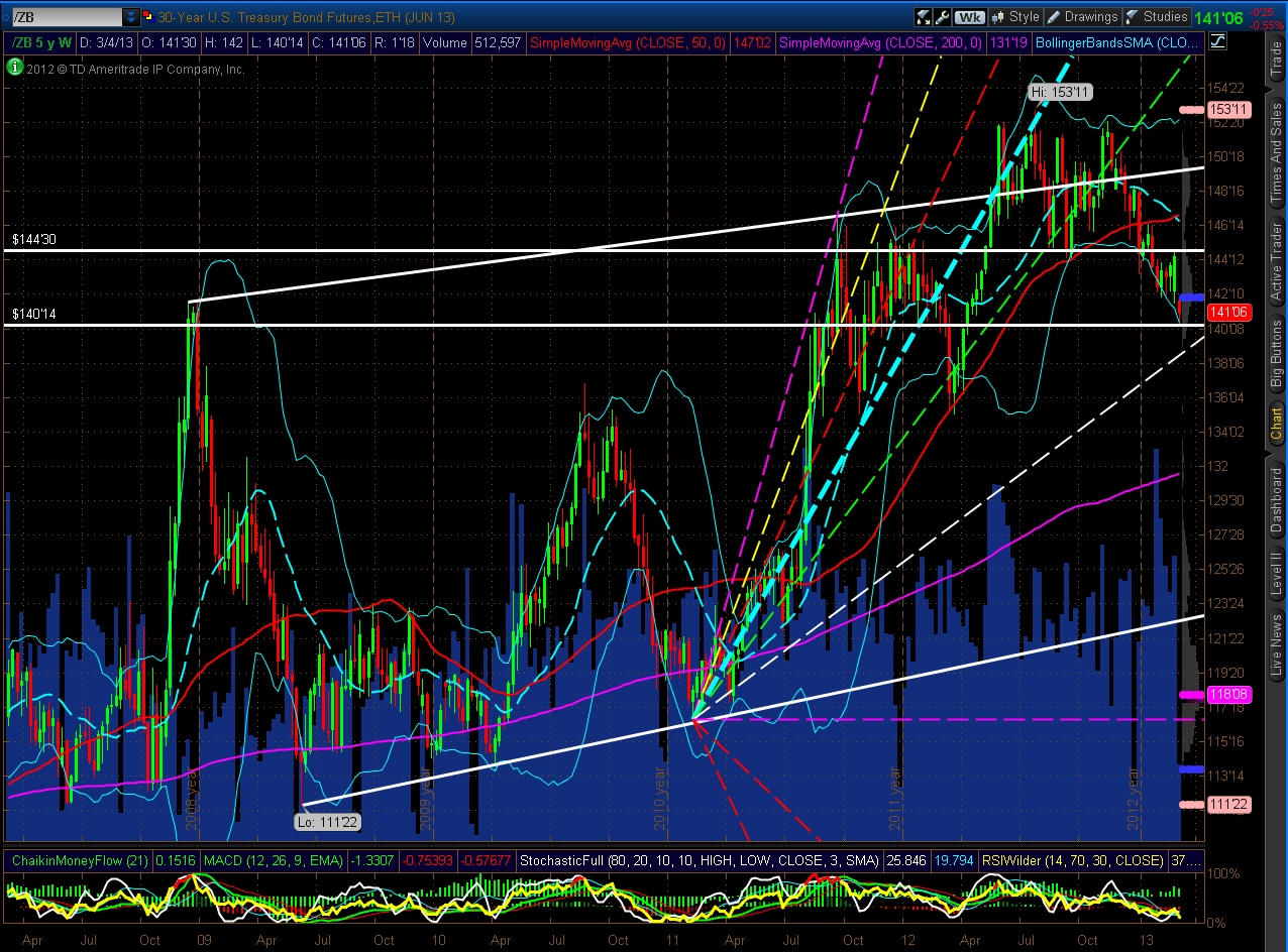
U.S. $
As shown on the 5-Year Weekly chart below of the U.S. $, price continued to rally this past week to close at the 61.8% Fibonacci level of 82.77. A hold above this level could see price climb further to its next resistance level at 83.45.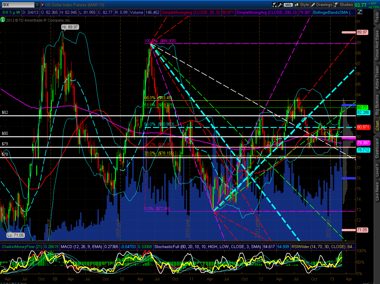
Summary
In summary, last week we saw a wild swing in Asian markets, an increase in intraday volatility and volumes in Small-Caps, considerable activity in the EUR/USD Forex pair, and a range breakout in the YM, ES, NQ & TF as the Dow 30 set new all-time highs.
This coming Friday is Quadruple Witching Options Expiration. We could see some wild swings in various Sectors as profits are taken and portfolios rebalanced, and in preparation for the results of the next FOMC meeting on March 19/20 (NOTE: the results are being released on March 20th at 12:30 pm EST, and will be followed by the release of FOMC Economic Projections at 2:00 pm EST, and Ben Bernanke's press conference at 2:15 pm EST).
As mentioned above, I'll be watching to see if buying picks up in the Technology and Materials Sectors, if buying continues in Financials and the higher-beta sectors and social media stocks, if buying picks up in Italy and Greece, if buying picks up in Brazil, Russia and China, if buying picks up in Canada and Australia and their currencies, as well as in Commodities, if selling continues in 30-Year Bonds, and if buying continues in the U.S. $ (presumably as a hedge against further risk to the upside). If such buying occurs, no doubt, we'll see the S&P 500 Index also make a new life-time high (the current high is 1576.09). In any event, I'll be monitoring the price action of the YM, ES, NQ & TF within their 4-Hour channels to gauge strength (above the 50% channel level) and weakness (below the 50% level).
