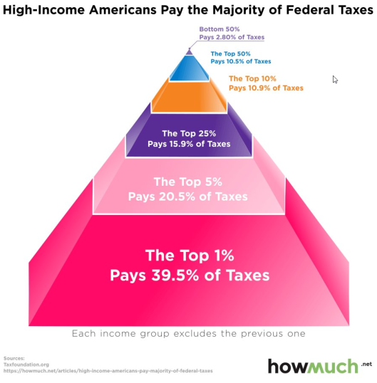
Those who claim the to 10% don’t pay their fair share of income taxes need to consider the following chart.

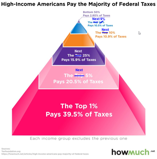
Allegedly, the top 50% pays 10.5% of the taxes and the bottom 50% pays 2.8% of the taxes. This is mathematical idiocy.
Nonetheless, that chart is making the rounds.
I believe this is what they mean, but I did not verify.

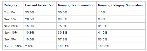
Cross Check

Allowing for a small rounding error, the numbers cross check in two ways, both totalling 100%.
I recall HowMuch (or someone else) approaching me a while back with that or a similar chart. I would not post it because it was mathematically incorrect. Instead, it is now floating around, flaws and all.
Note to HowMuch: Fix your chart because your presentation looks ridiculous.
Nonetheless, the key idea is the top 6% pay 60% of income taxes and the bottom 50% pay 2.8% of income taxes. Is that fair?
