We thank readers for their gracious comments on our markets and metaphors missive, examining historical periods that “rhyme” in one way or another with the circumstances we find ourselves in today. To recap for those who missed it, the historical references we examined were as follows: (1) almost a decade ago the financial meltdown required a massive central bank response, and some of the crisis issues still remain unresolved; (2) in the 1960s inflation and interest rates were both low, and then a rapid acceleration occurred and the Federal Reserve was caught unprepared; and (3) in the 1937–38 post-Great Depression period, the Federal Reserve triggered a recession by raising interest rates too soon.
In our metaphors piece we did not purposefully ignore labor markets; we just thought they would complicate the writing. So the readers who offered that criticism are correct. Today, we want to expand the metaphor set to include labor markets. We will start with the three charts below:


The charts were updated for us by Bob Brusca, and the equation was his idea. I wish we had thought of it, but we didn't, so the dinner has to be on me when we grab a meal in New York. For those who do not know Bob, I recommend his newsletter as tough, no-nonsense analysis.
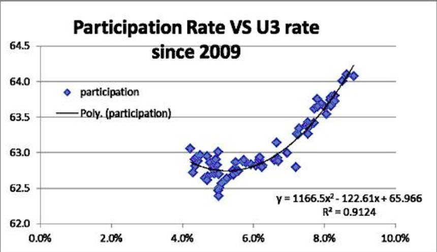
Let’s get to the three charts. The first one shows the relationship between the labor participation rate and the U-3 unemployment rate. As you can see, about 91% of the drop in the unemployment rate cited by the Fed – and used in its dot plots – is attributable to the drop in labor participation. In other words, nearly all of the improvement in the unemployment rate was due to millions of folks dropping out of the labor force for one reason or another (further education to enhance opportunities, working underground and off the books, or dropping out because of disabilities, opioid addictions, caregiving responsibilities, sheer discouragement, or criminal records that deterred firms from hiring them, etc.).
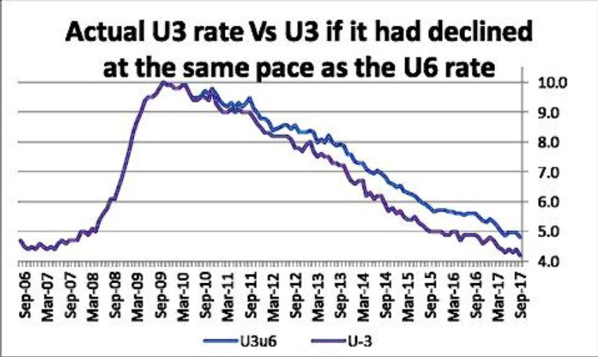
The second chart shows the decline in the traditional (U3) unemployment rate versus what it would look like had the rate of change been the same as for the U6 rate. The U6 is a much broader definition of the unemployed and underemployed than the U3 is. Note that the U6 is not forecast in the Fed’s dot plots, although we can estimate what it would be based on this relationship between the U3 and the U6. To summarize, the U3 would be higher than it is if its rate of change were the same as for the U6. The Fed talks about this but it doesn't make policy pronouncements based on this gap.
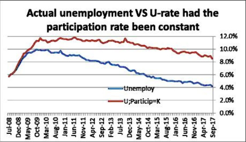
The last chart is most instructive about the risk of the Fed’s current policy stance. It shows what the U3 unemployment rate would be had the labor participation rate been constant since the financial crisis. Now, we expect some critical emails from this analysis. Readers will say that this is a counterfactual, that it’s just an application of a theory, that there have been changes in demographics. Yes, all these criticisms will be correct.
But a thoughtful examination also confirms that the fall in the labor participation rate is the single biggest factor explaining the very low 4% level of the U3 unemployment rate. Does that explanation appeal to those who are wildly optimistic about today’s economy? We think not. But are we, in fact, really getting a robust economic recovery when many millions of people are not seeking work and have dropped out of participating in the pool of American workers and American wannabe workers?
Note also that other indicators of labor market conditions are giving very mixed signals. Barclays computes indicators of labor market conditions and of labor market momentum. Those two indicators are now out of synch and heading in opposite directions. Conditions improved in September, says Barclays (LON:BARC); but meanwhile, momentum fell by a large amount. The October 13 report from Barclays warns about hurricane distortions of the data. So in the end, what do we really know? We know that we don't know.
But we also have the survey data compiled by Bill Dunkelberg and the National Federation of Independent Business. Remember, this is data that reflects the views of those companies that are not trading on the stock exchanges. About half of the private-sector economy in the United States is implied from NFIB, which has several hundred thousand members. That data also conveys a cautionary message. It jumped after the Trump victory. It peaked. And the figures in many categories are now lower than they were at the peak, and the trend is down in many cases. We read Dunk's report regularly and track those changes.
Back again to Bob Brusca, who summarized the NFIB’s latest revelations with this assessment:
“So what firms (these are the NFIB members who answered the monthly survey) say they are planning to do and what they are really doing are two different things. And on top of that, poor plans for capital spending are not reassuring. Firms have given very tepid responses to the question about raising or planning to raise their selling price. Worker comp firms admit a greater tendency to having paid higher comp (a 70th percentile standing, but on a lower reading this month), but plans to raise worker comp are an extremely low 16th percentile. Maybe firms in their answers are reflecting that minimum wage legislation forced them to hike wages. In any event there is no sense of a wage price spiral here.”
Bottom line: We do not know whether our 1960s metaphor is the path that lies before us or whether the 1937–38 Fed mistake is about to be repeated. We do know that the Fed seems determined to hike rates before year-end and to simultaneously start the gradual shrinking of its balance sheet.
If we were voting on this policy, we would do these things one at a time. But we do not have a vote on the FOMC. We would remind colleagues of all those research papers that tried to determine what QE meant in terms of an equivalent drop in interest rates. Suddenly they have disappeared from the scene. We wonder, if that argument had merit and QE was the equivalent of lowering rates, isn’t QT the equivalent of raising them?
In our US portfolios we now have a small cash reserve. We have ceased being fully invested. Of course, we must warn this could change at any time.
In the bond space we remain bullish on tax-free bonds, which are trading in many maturities above the taxable references. We do not see any new tax bill as threatening to the tax-free municipal bond market.
Lastly, credit surveillance is very important. It cannot be taken for granted. Here is a link to a long report on municipal credit. It may spoil your dinner, but it proves the need for muni credit research in bond management. And here is an article that cites that report in establishing that New Jersey has the worst finances in the nation.
