Note from dshort:Here is a revised update. In an update I posted earlier today, I used a Total Market Full Cap version of the Wilshire 5000 in the second chart below. I've now replaced it with the Wilshire 5000 Full Cap Price Index, which is a more appropriate numerator for the GDP denominator.
From time to time I'm asked why I don't include Market Cap to GDP among the long-term valuation indicators I routinely follow. The metric gained popularity in recent years thanks to Warren Buffett's remark in a 2001 Fortune Magazine interview that "it is probably the best single measure of where valuations stand at any given moment."
My friend and guest contributor Chris Turner offered some analysis along those lines last year using the S&P 500 as the surrogate for the market (When Warren Buffett Talks ... People Listen). For a broader measure of Market Cap, VectorGrader.com uses line 36 in the Federal Reserve's B.102 balance sheet (Market Value of Equities Outstanding) as the numerator. Since both GDP and the Fed's data are quarterly, the folks at VectorGrader.com do some interpolation and extrapolation to produce monthly estimates. Their latest chart is available to the general public here.
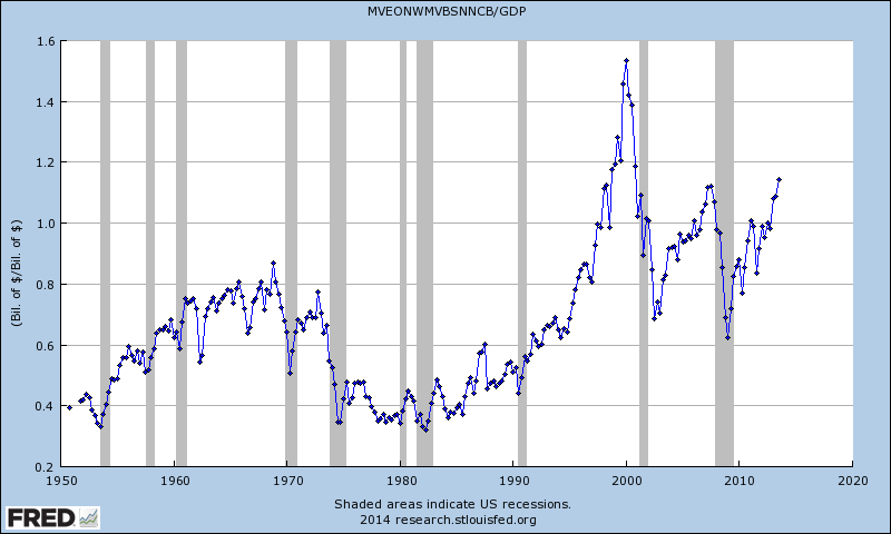
The four valuation indicators I track in my monthly valuation overview offer a long-term perspective of well over a century. The raw data for the "Buffett indicator" only goes back as far as the middle of the 20th century. Quarterly GDP dates from 1947, and the Fed's B.102 Balance sheet has quarterly updates beginning in Q4 1951. With an acknowledgement of this abbreviated timeframe, let's take a look at the plain vanilla quarterly ratio with no effort to interpolate monthly data or extrapolate since the end of the most recent quarterly numbers. Here is a chart I created using the Federal Reserve Economic Data (FRED) data and charting tool.
That strange numerator in the chart title, MVEONWMVBSNNCB, is the FRED designation for Line 36 in the B.102 balance sheet (Market Value of Equities Outstanding), available on the Federal Reserve website here in PDF format.
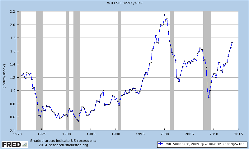
For those of you who may have reservations about the Federal Reserve economists' estimation of Market Value, I can offer a more transparent alternate snapshot over a shorter timeframe. Here is the Wilshire 5000 Full Cap Price Index divided by GDP, again using the FRED repository charting tool.
A quick technical note: To match the quarterly intervals of GDP, for the Wilshire data I've used the quarterly average of daily closes rather than quarterly closes (slightly smoothing the volatility). The vertical axis in the chart above is the result of using an index scale for GDP set to 100 at the US Recession trough in June 2009. I also used the same date for the Wilshire index. Regardless of how you chain the index values, the chart contour is unaffected. Here is a link to the FRED page containing my calculations.
What Do These Charts Tell Us?
Both the "Buffett Index" and the Wilshire 5000 variant suggest that today's market is at lofty valuations. In fact, the latest quarter in the Wilshire version is the third highest in its history, fractionally topped by two quarters in 2000.


