This past week I found a post worth reading from the Peterson Institute for International Economics is a private, nonprofit, nonpartisan research institution devoted to the study of international economic policy.
Follow up:
A quote from the beginning of that post:
Labor economics used to be easy. All you had to do was watch the unemployment rate and that told you most of everything. As it went up things were bad and pay weakened. When the unemployment rate fell that meant the economy was getting better and that meant pay rises. Low unemployment meant big pay rises. High unemployment meant smaller rises. Simple. At some point the unemployment rate hit a brick wall as the economy reached full employment, and that point was well above zero, because in a capitalist economy firms die and are being born all the time. Once full employment is reached firms struggle to find workers and have to bid them away from other firms, so wages start to rise. Easy peasy. Sadly not any more.
A slight complication was that in bad times the unemployment rate tended to understate how bad things were. As the unemployment rate rose, workers lost their jobs, but instead of moving to unemployment they withdrew from the labor force to inactivity. Labor economists call these folks out-of-the-labor-force (OLF). Youngsters who couldn't find jobs became students in bad times, and this also causes inactivity to rise. In the upswing, employment often rose as these OLFs moved back to jobs. And it rose before unemployment fell.
This post makes two important points:
- It suggested without proof that there was a correlation between wage growth and participation rate;
- Wages are not going to improve before the unemployment rate gets below 4 percent.
In the graph below, the year-over-year change in per capita income (blue line) is plotted against the participation rate (red line). It does appear to have reasonable correlation between income and participation rates after the mid-1990s.
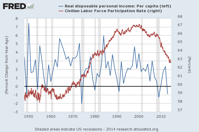
I am not a fan of the labor force participation rate which is the ratio between the labor force (sum of employed and unemployed disregarding those who would work if given an opportunity) and the overall size of the national population of the same age range. My belief is that the employment population provides a better correlation to personal income as shown in the graph below.
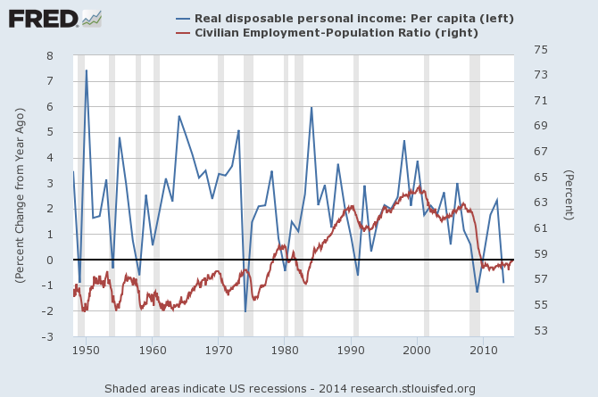
There are a lot of issues when one begins to try to define the workforce - and using simple employment to population ratio requires no gyrations to define the workforce. Also consider that defining the potential workforce has to take in elasticities such as whether a family will use the potential of a second wage earner.
In any event, the simple argument that there is correlation between employment levels and wages seems valid. Family income and spending correlate over time, and personal spending drives over two-thirds of GDP. So without improvement in the participation rates (or employment-population ratio), there seems little to drive economic growth rate higher.
Other Economic News this Week:
The Econintersect Economic Index for September 2014 is showing our index declined from last months 3 year high. Outside of our economic forecast - we are worried about the consumers' ability to expand consumption although data is now showing consumer income is now growing faster than expenditures growth. The GDP expansion of 4.2% in 2Q2014 is overstated as 2.1% of the growth would be making up for the contraction in 1Q2014, and 1.4% of the growth is due to an inventory build. Still, there are no warning signs that the economy is stalling.
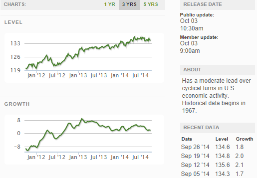
The ECRI WLI growth index value has been weakly in positive territory for almost two years. The index is indicating the economy six month from today will be slightly better than it is today.
Current ECRI WLI Growth Index
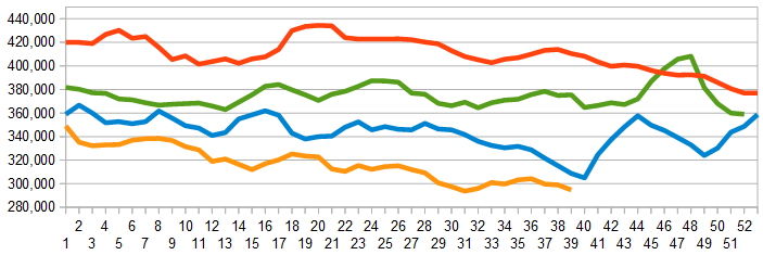
The market was expecting the weekly initial unemployment claims at 285,000 to 311,000 (consensus 297,000) vs the 287,000 reported. The more important (because of the volatility in the weekly reported claims and seasonality errors in adjusting the data) 4 week moving average moved from 299,000 (reported last week as 298,500) to 294,750.
Weekly Initial Unemployment Claims - 4 Week Average - Seasonally Adjusted - 2011 (red line), 2012 (green line), 2013 (blue line), 2014 (orange line)
Bankruptcies this Week: Reichhold Holdings
Click here to view the scorecard table below with active hyperlinks
