Last week I presented a picture of Joe’s portion of the economy being in a recession. Richjoy403 wondered:
….. do you suppose there could be relevant factors affecting Joe’s ‘world’ that are not reflected in your charts?
My answer is absolutely there are both good and bad factors which are not considered. All forms of measures of economic metrics (GDP, disposable income, industrial production, employment, wealth) suffer from:
- generalization – statistically yah gotta average the data to put forth an understandable and simple argument – and nobody is average, and arguments are usually never simple.
- perspective – Each of us lives in a different neighborhood, and each relates to their economy in different ways.
- definition – human’s make up rules on what metrics are important, and the way these metrics should be read. Being real here, somebody please convince me this is not the worst “economic expansion” they have ever seen. Something is wrong but there is no word that defines what is wrong in this economy except for “sucks” or “muddle”.
- adjustment – One cannot compare data realistically between periods without some form of adjustment factor – and this adjustment always creates an interpretation error. This post recession period has data not acting in historically predictable patterns magnifying the error in seasonal and real dollar adjustments.
- data errors or omissions – most of our data is modeled, extrapolated or done by survey. Few are by actual count. Most are plagued with backward revision, both large and small. Most of this data is dead wrong at economic turning points. Errors start to be built in. Portions are missing (such as underground economy). New patterns are invisible because of old data gathering methodology does not track new avenues.
Note that this pundit believes there is overall real economic growth at this time between 2% to 3% in many sectors of the economy using non-monetary pulse points – with growth trend lines stable for now. It is just Joe’s world (not the 0.1%) which is rife with unemployment, loss of average earning power, and home value collapse.
There are several positive trends in Joe’s world not put forth in last week’s post.
I know many Joes have made changes to the way they spend money. One example is that some Joes have cut back on their debt either by defaulting in some manner on mortgages or credit, or simply rearranging things. This little chart from FRED – Household Debt Service Payments as a Percent of Disposable Personal Income (TDSP), Quarterly, Not Seasonally Adjusted – includes consumer credit and mortgage payments (caveats apply):
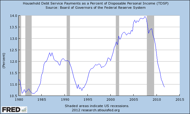
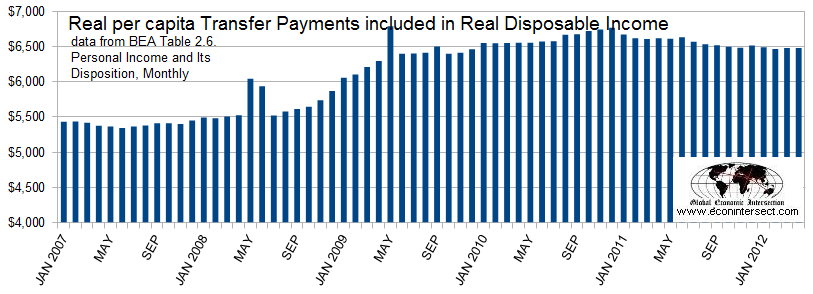
My take on the above chart is that Joe has found another 3%+ of spending money. Further, transfer receipts (e.g. social security, medicare, medicaid, unemployment, veteran’s benefits, etc) grew by $1,000 per capita since the beginning of the recession, and only $145 per capita of the growth was attributable to unemployment. Joe is getting more money from the government and this trend will grow as boomers retire and medical costs grow.
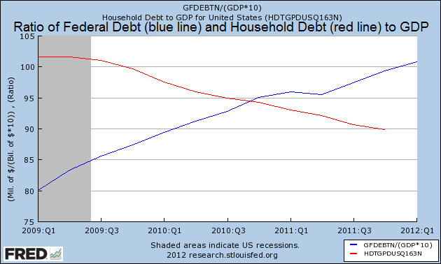
There are social reasons for a government to spend money. All I can say for sure is that the government is unlikely to pay off their debt accumulation – and as I have a more modern view of monetary operations, I see no reason the government who issues the major world’s currency should even borrow money. Still, I find the following graphic interesting where the Federal debt growth is being offset somewhat by a decline in household debt.
So Richjoy403, there are many positive trends in Joe’s world – and from my view many more metrics are improving than declining. But Joe literally is clawing his way out of a cesspool – and it is the position of Joe in relation to his past position that is causing Joe to be a minor player in the USA’s “economic expansion” (the economy sucks).
Other Economic News this Week:
The Econintersect economic forecast for June 2012 shows continues to show moderate growth – although marginally weaker. There was degradation both in our government pulse point,and in some of our transport related pulse points. There are no recession flags showing in any of the indicators Econintersect follows which have been shown to be economically intuitive.
ECRI has called a recession. Their data looks ahead at least 6 months and the bottom line for them is that a recession is a certainty. The size and depth is unknown but the recession start has been revised to hit around mid-year 2012.
The ECRI WLI index value is now solidly in negative territory with a downward trend. The index is indicating the economy six month from today will be slightly worse than it is today.

Initial unemployment claims increased from 386,000 (reported last week) to 387,000 this week. Historically, claims exceeding 400,000 per week usually occur when employment gains are less than the workforce growth, resulting in an increasing unemployment rate (background here and here). The real gauge – the 4 week moving average – rose from 382,000 (reported last week) to 386,250. This is the largest unemployment number this year. Because of the noise (week-to-week movements from abnormal events AND the backward revisions to previous weeks releases), the 4-week average remains the reliable gauge.

Data released this week which contained economically intuitive components (forward looking) was rail movements (which is still indicating a moderate expansion if one ignores coal).
Weekly Economic Release Scorecard:
Click here to view the scorecard table below with active hyperlinks.
News Posts By Econintersect this Week:
Bankruptcies this Week: HWI Global (dba Haddad-Wylie Industries)
