Will Greece Be The Bearish Straw?
The debt clock continues to tick in Greece, which is something the stock market bulls need to respect. From CNBC:
“What is coming into focus is an alternative approach. Instead of forcing Greece into a Grexit (a Greek exit of the euro zone), they will simply force Greece into a default – an inability to pay not just the IMF but also internal payments,” Anatole Kaletsky, co-founder and chief economist at Gavekal Dragonomics, told CNBC. “Literally, the Greek government is running out of money to pay its own wages, pensions, public spending,” he added. “At that point they have to say: ‘We either have to tighten our belts even more than we would under the austerity program or we have to do a deal with the EU’.”
Is Fear Picking Up In The Background?
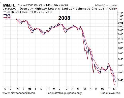
Markets are always reassessing the balance between bullish information and bearish information. If concerns about anything, including Greece, were significant relative to bullish information, we would expect to see a look of “increasing fear” on market charts. The 2007-2008 chart below provides us with an example of what fear looks like. The chart shows the performance of growth-oriented small caps (ARCA:IWM) relative to defensive-oriented Treasuries (ARCA:TLT). The negative slope of the ratio is a fearful look.

How Does The Same Ratio Look Today?
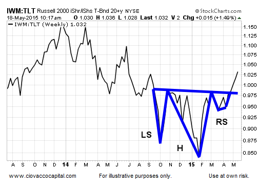
Instead of making a series of lower highs and lower lows as it did in 2008, the 2015 version of the same small-caps vs. Treasuries ratio recently pushed to a new high favoring growth-oriented small caps.

How About A Normal Stock Correction?
The charts above tell us the present day does not have a bear market look, but what about a garden-variety 10-15% correction in stock prices? This week’s video compares numerous ratios during a corrective period in 2011 to the present day.
Back To The Bear Market Comparisons
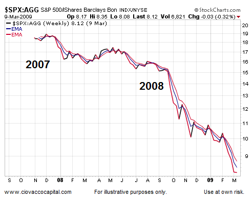
Corrections and bear markets tend to be fear-based and deflationary events. For example, the chart below shows the demand for more inflation-friendly stocks was significantly lagging the demand for deflation-friendly bonds during the last crisis in the United States.

Is There Fear In The 2015 Ratio?
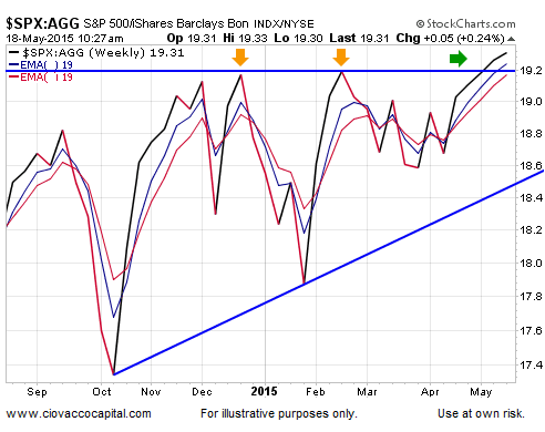
The 2015 version of the same stock/bond ratio recently pushed to a new high in favor of equities. Notice in the chart below, the ratio has broken above previous areas of resistance (see orange arrows).

Investment Implications – The Weight Of The Evidence
Is it possible all the charts shown in this article begin to morph into a more bearish look in the coming days, weeks, and months? Yes, it is quite possible, but under our approach we need to see a shift in the hard evidence rather than anticipating a shift that may or may not occur. Given the facts we have in hand, our market model continues to favor growth assets relative to defensive assets.
